
By Peter Ramsey
17 Jan 24
When (and why) noise creates churn
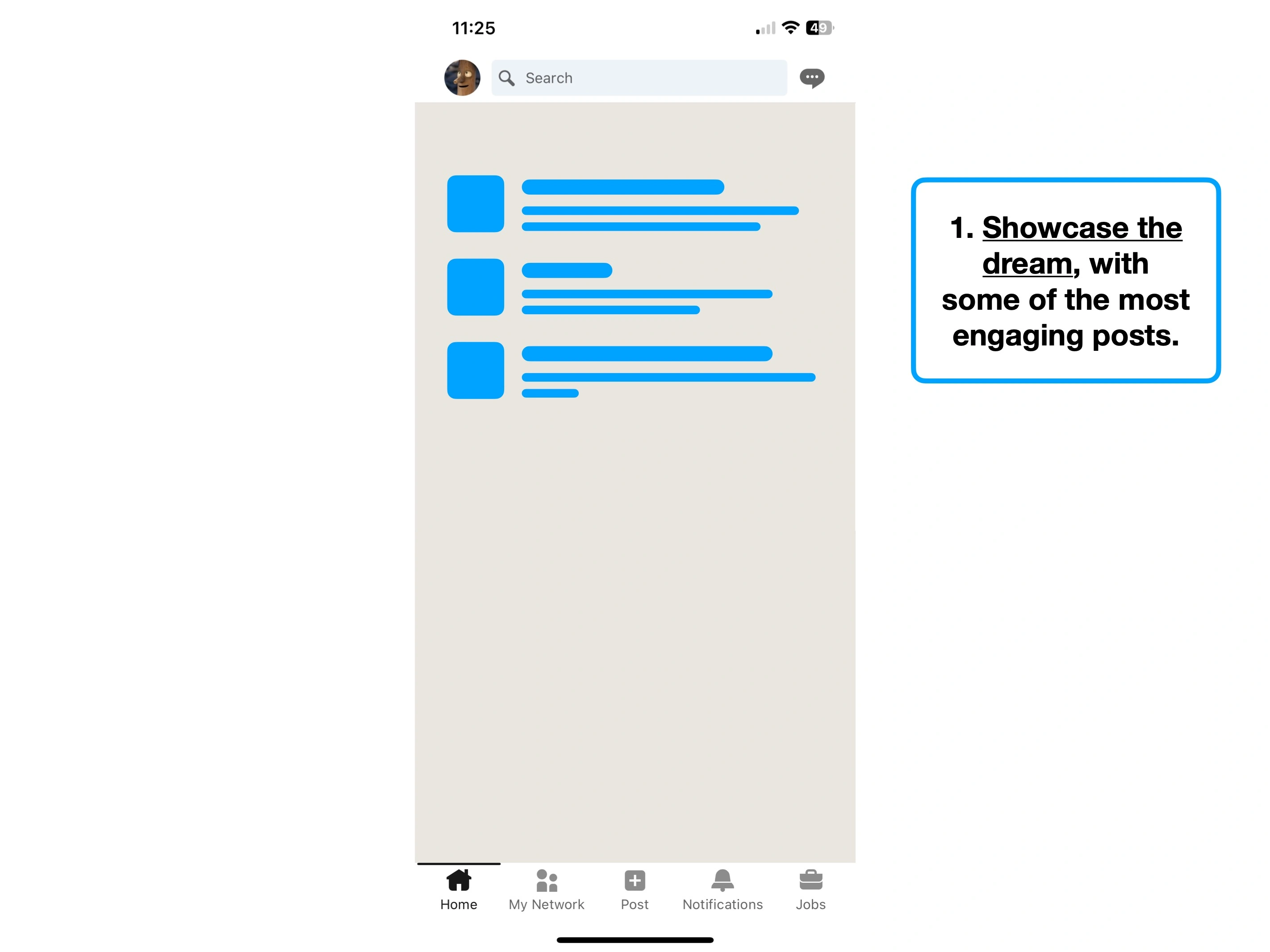
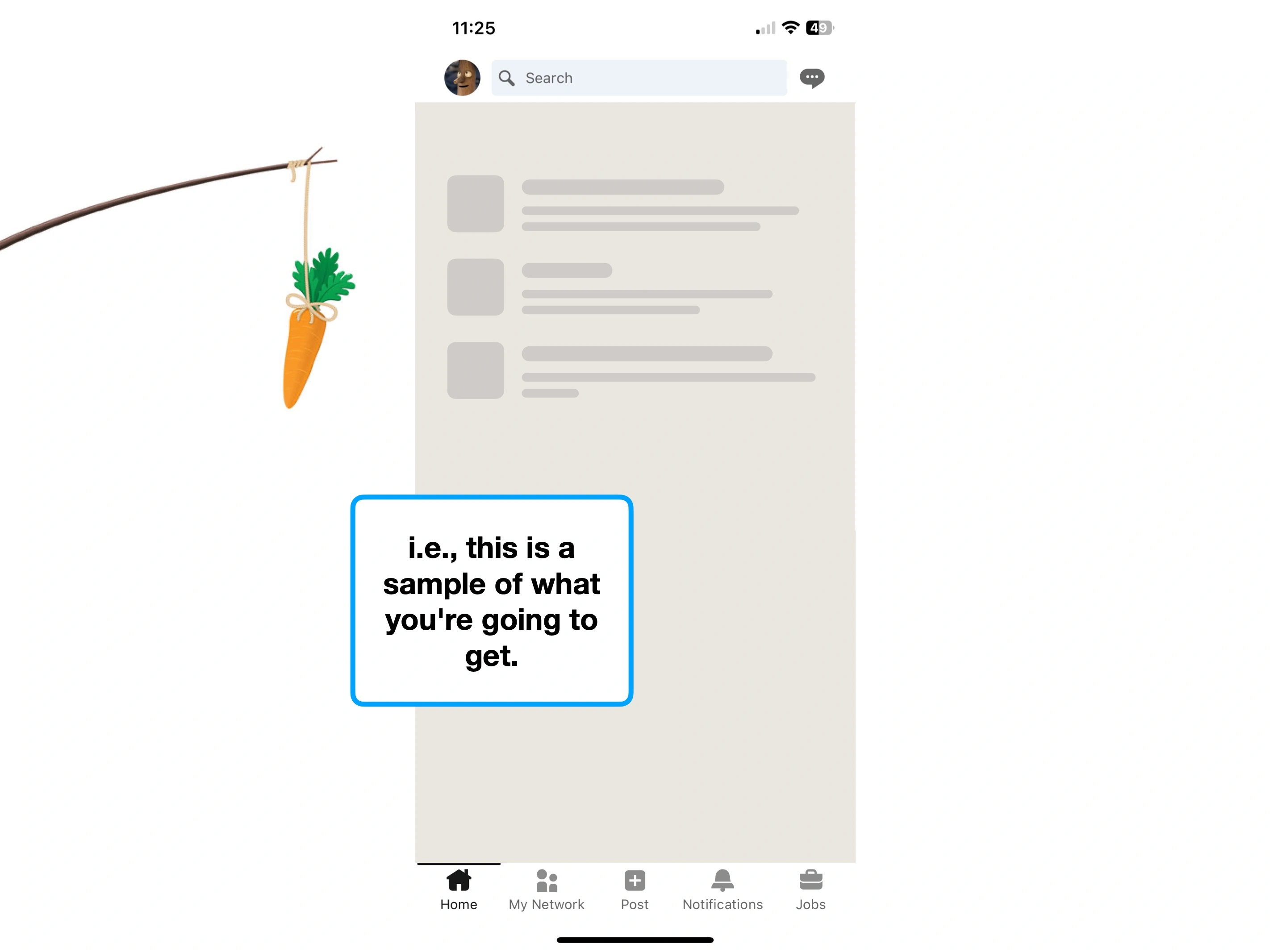
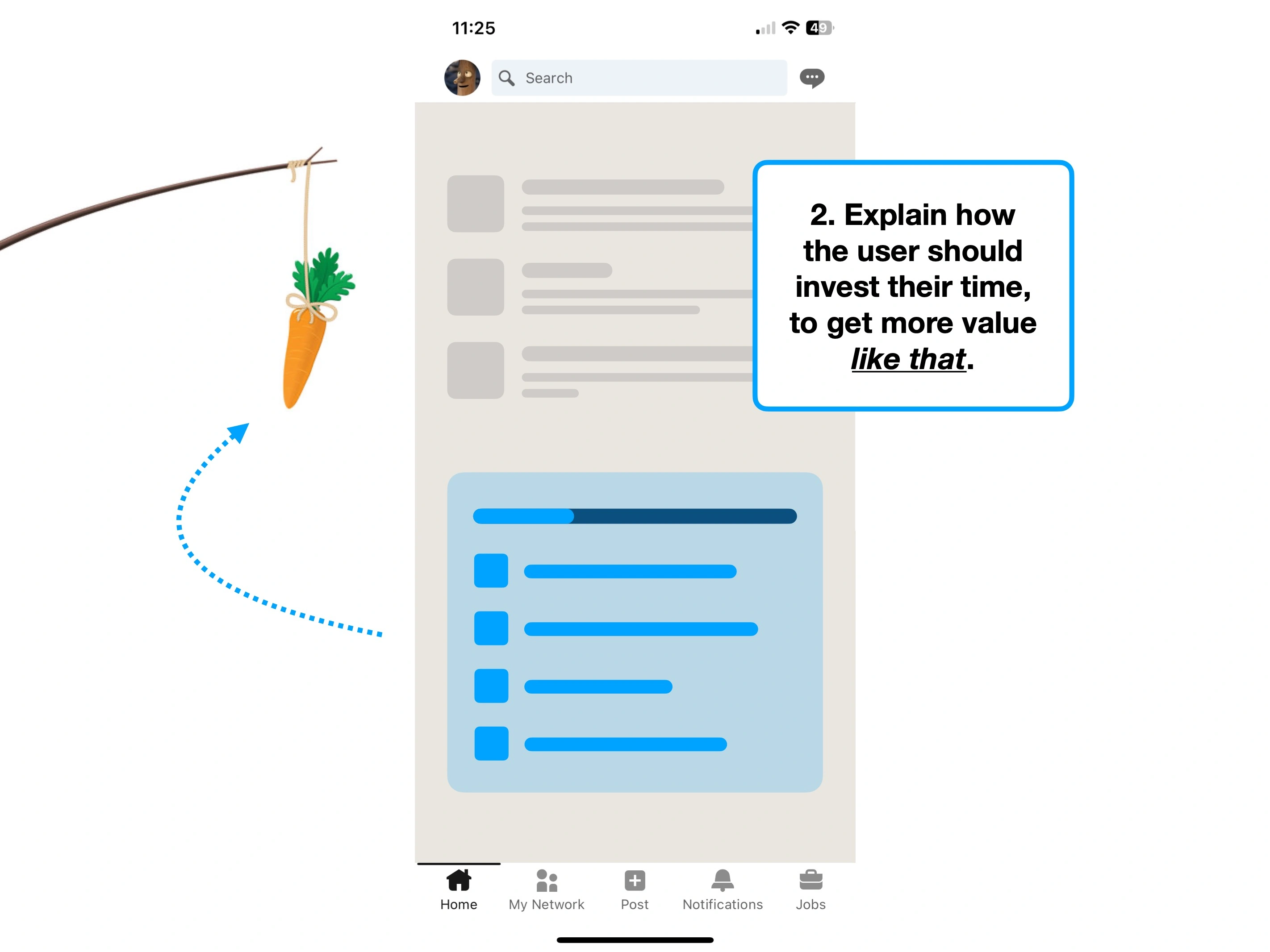
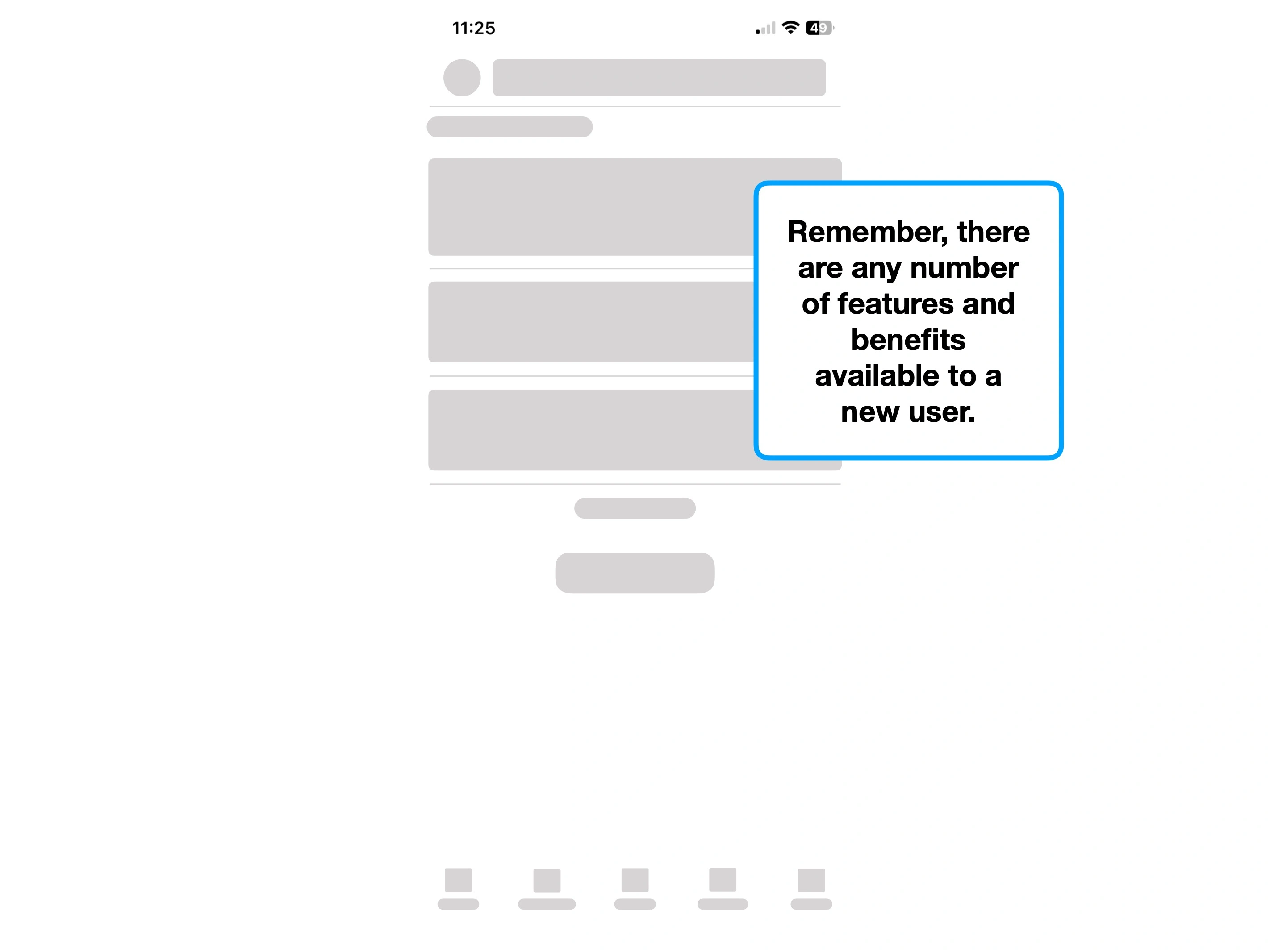
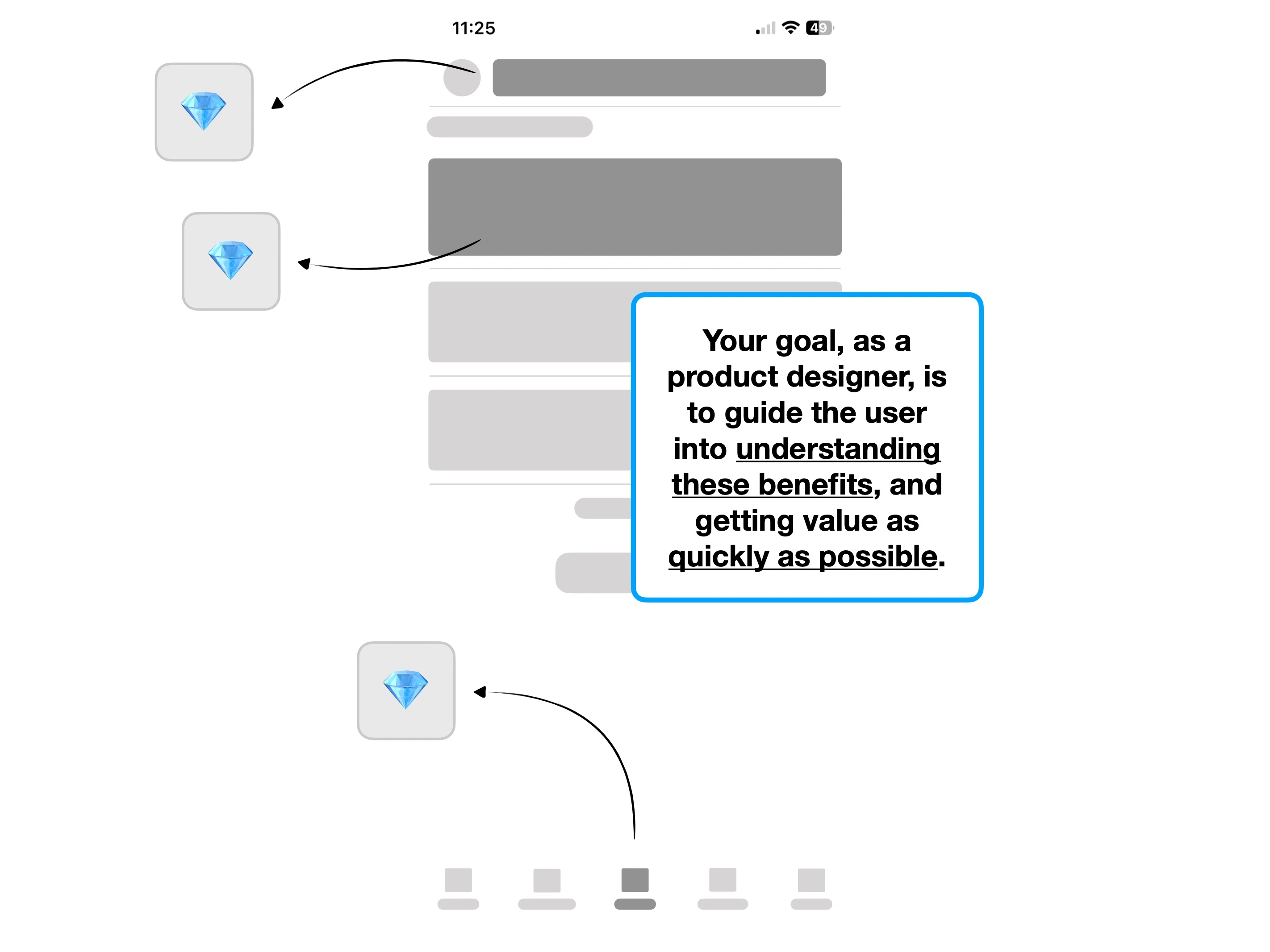
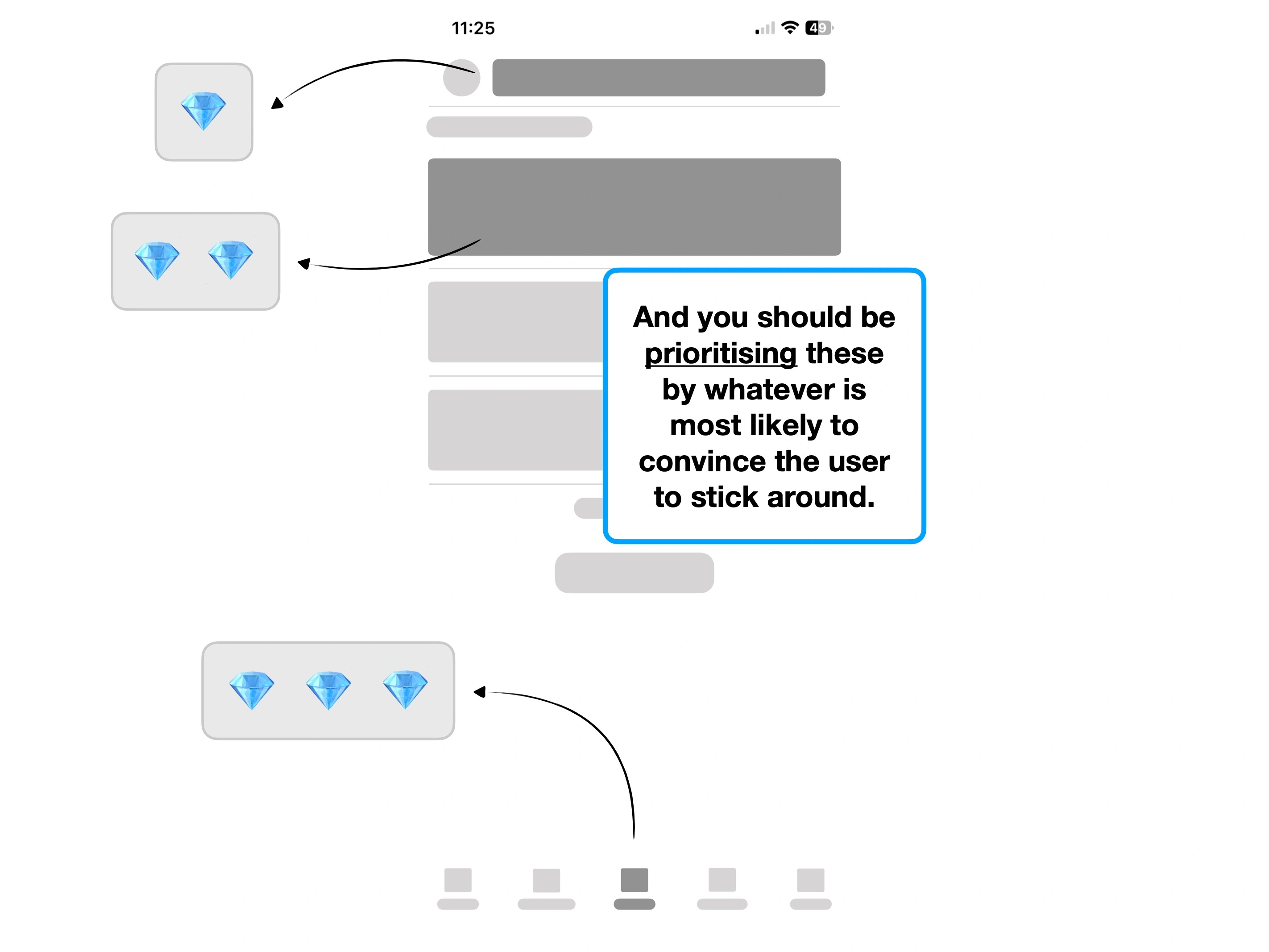
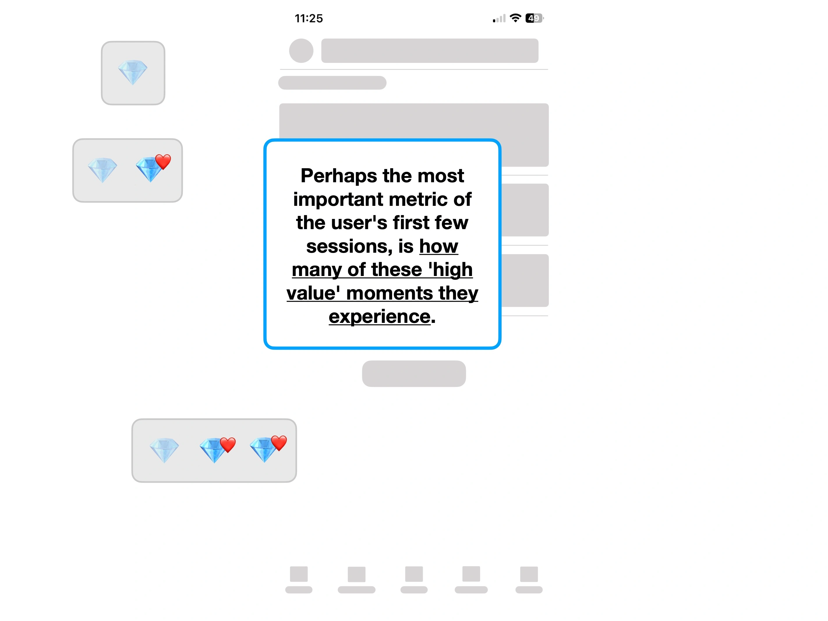
Some services have a relatively low time-to-value.
For example, you can send an email immediately after signing up to Gmail. Or create an account and book an Airbnb in a single, short session.
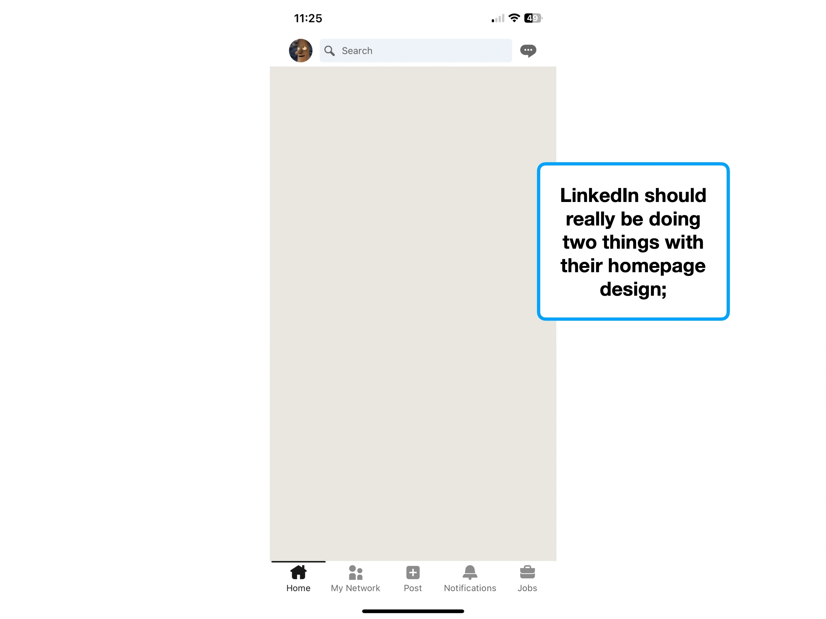
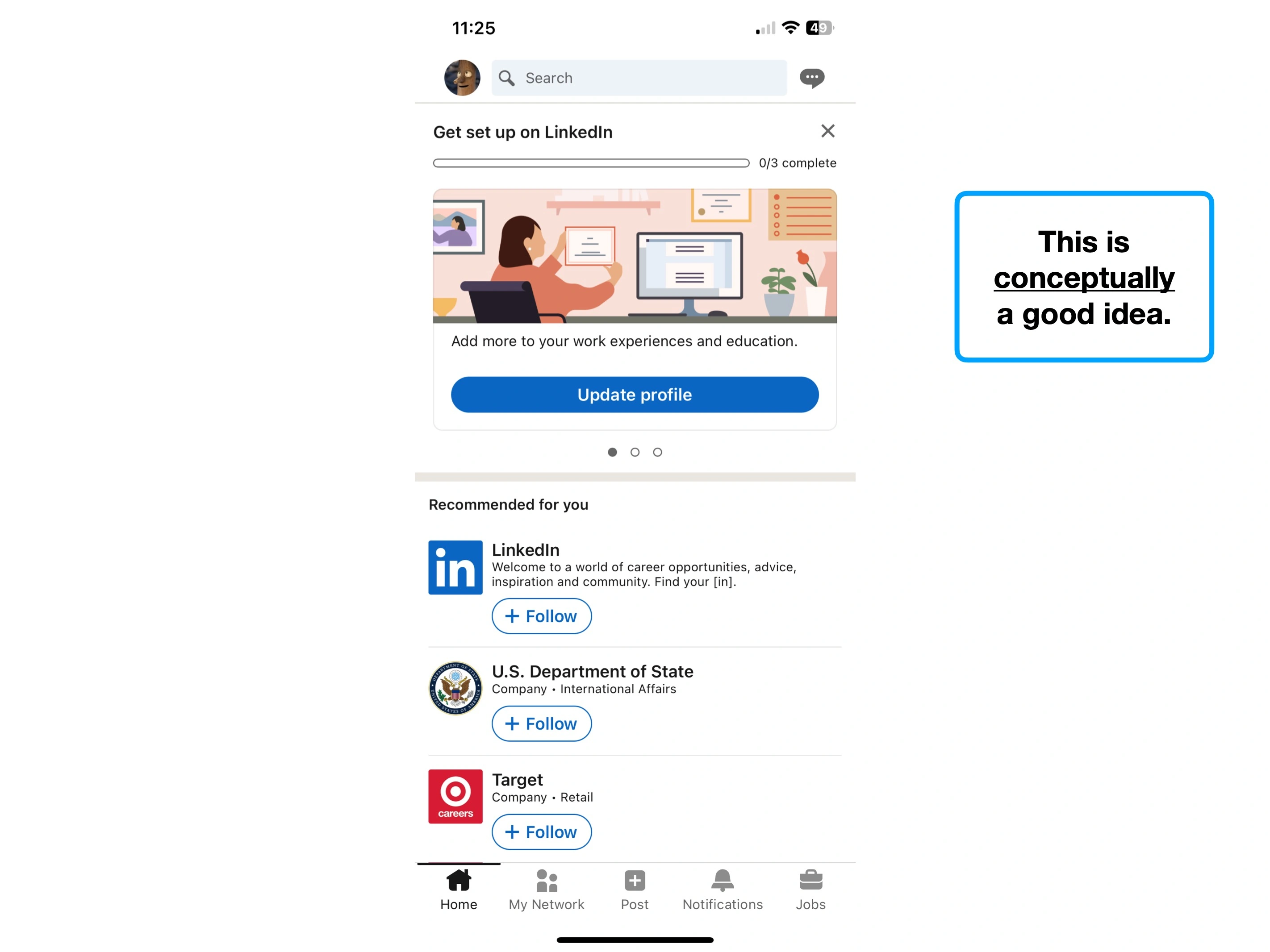
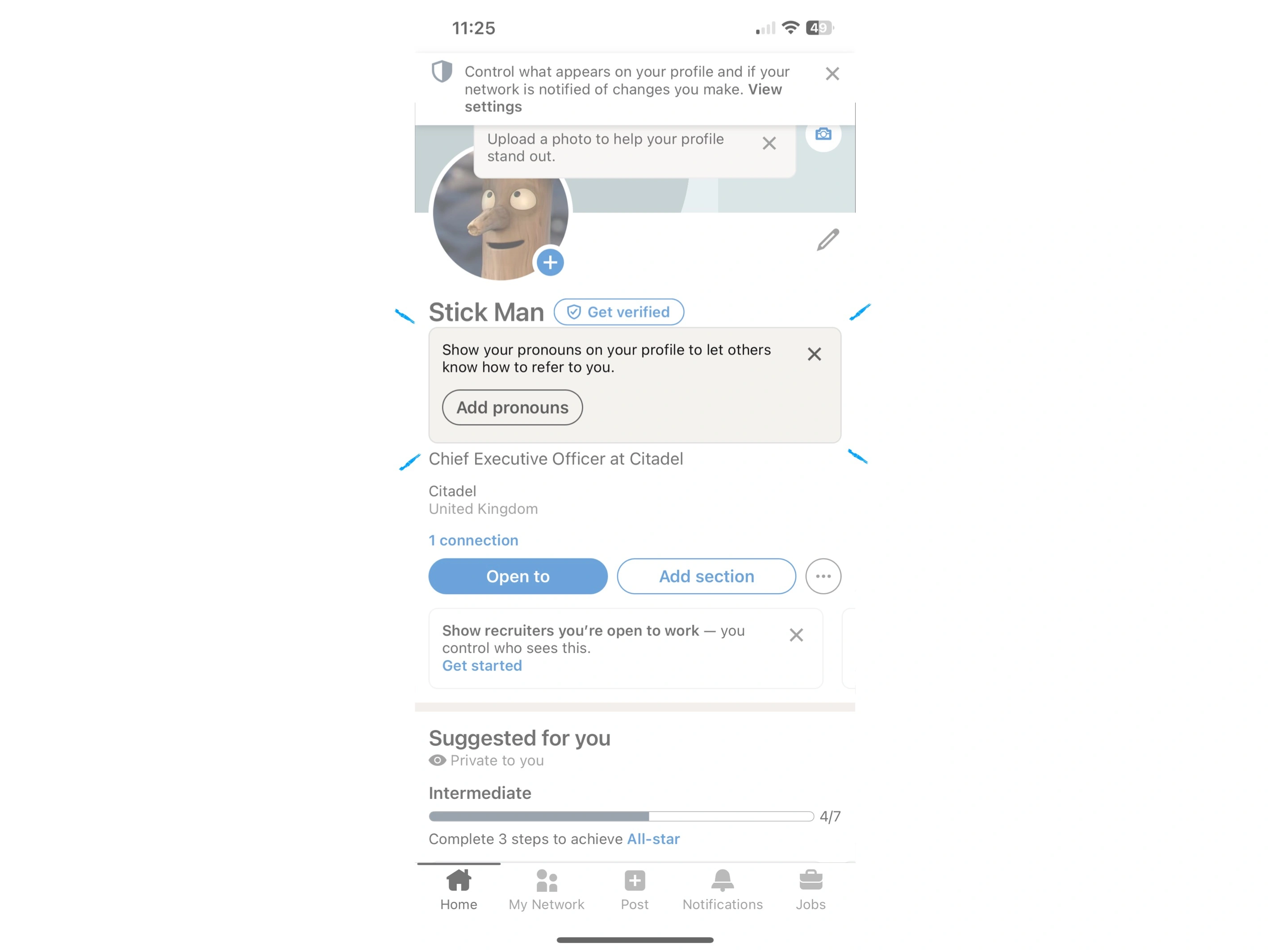
But often, as is the case with LinkedIn, there are factors that make it harder to provide real value so quickly.
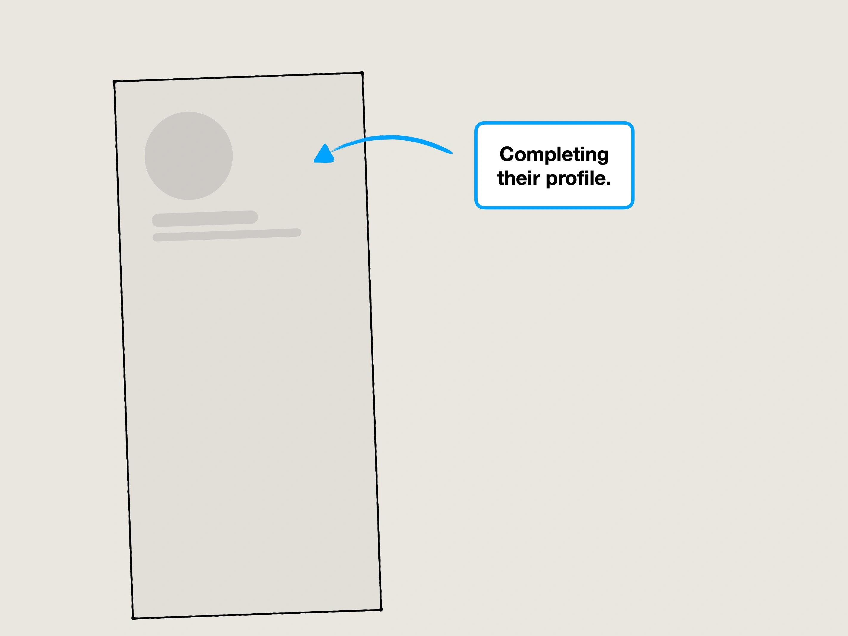
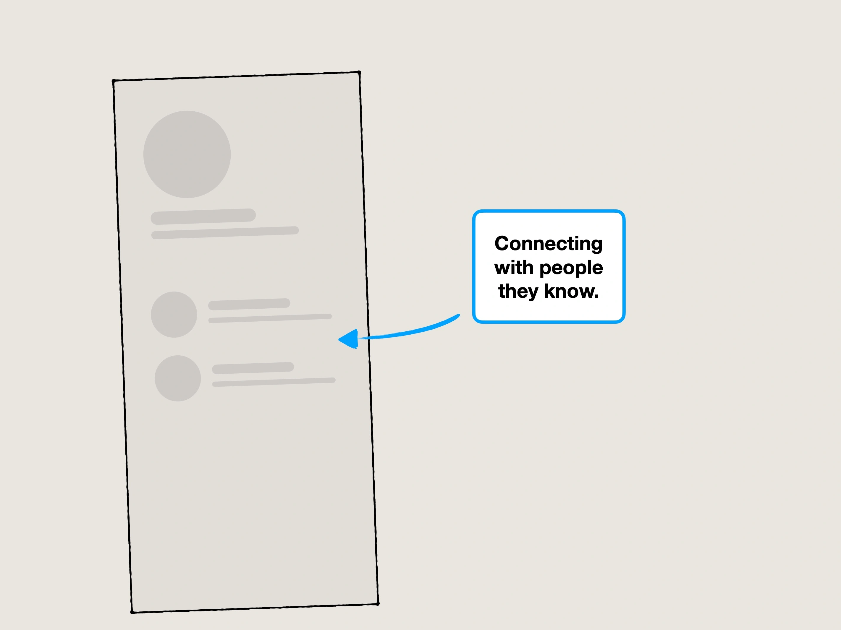
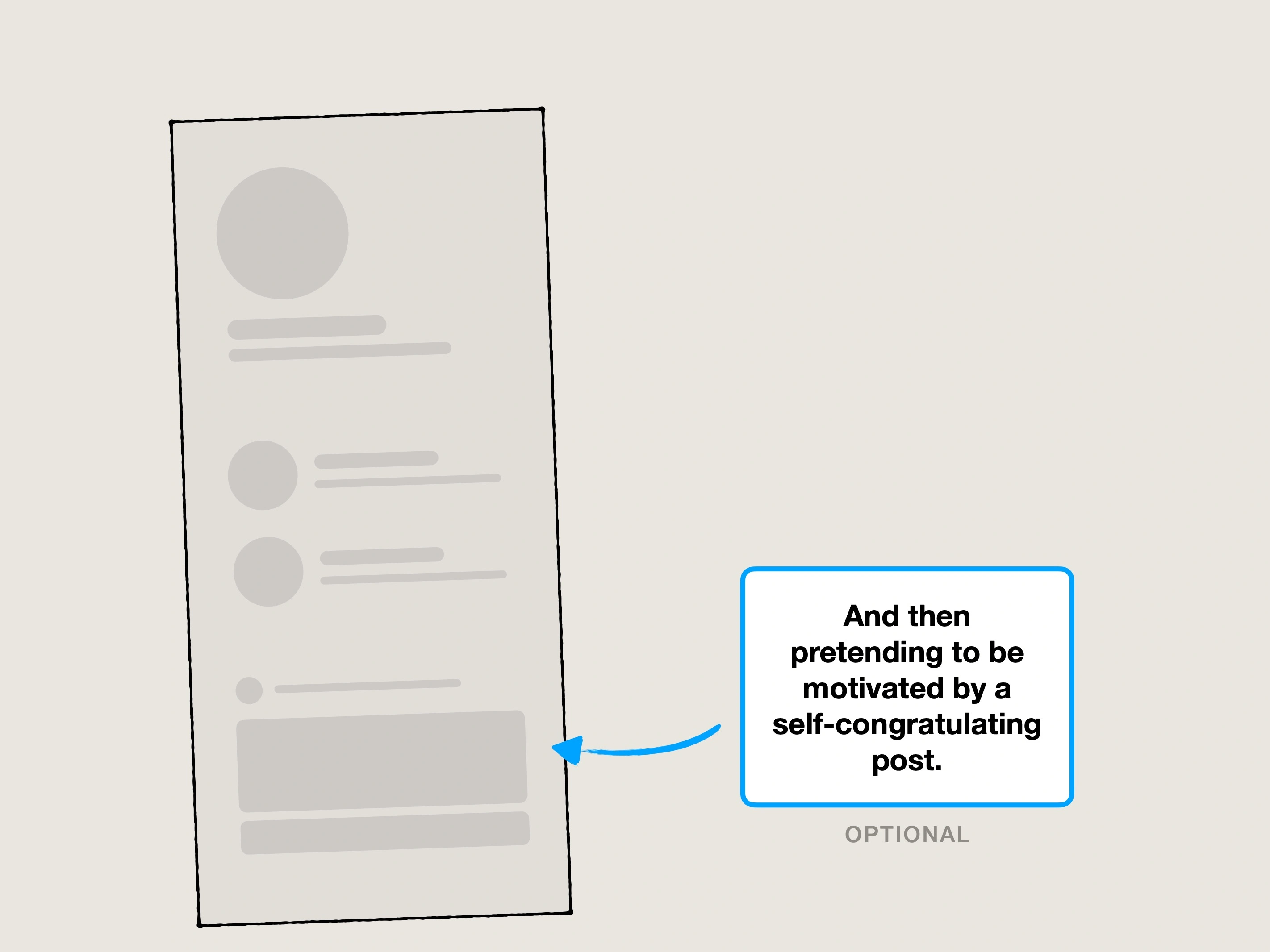
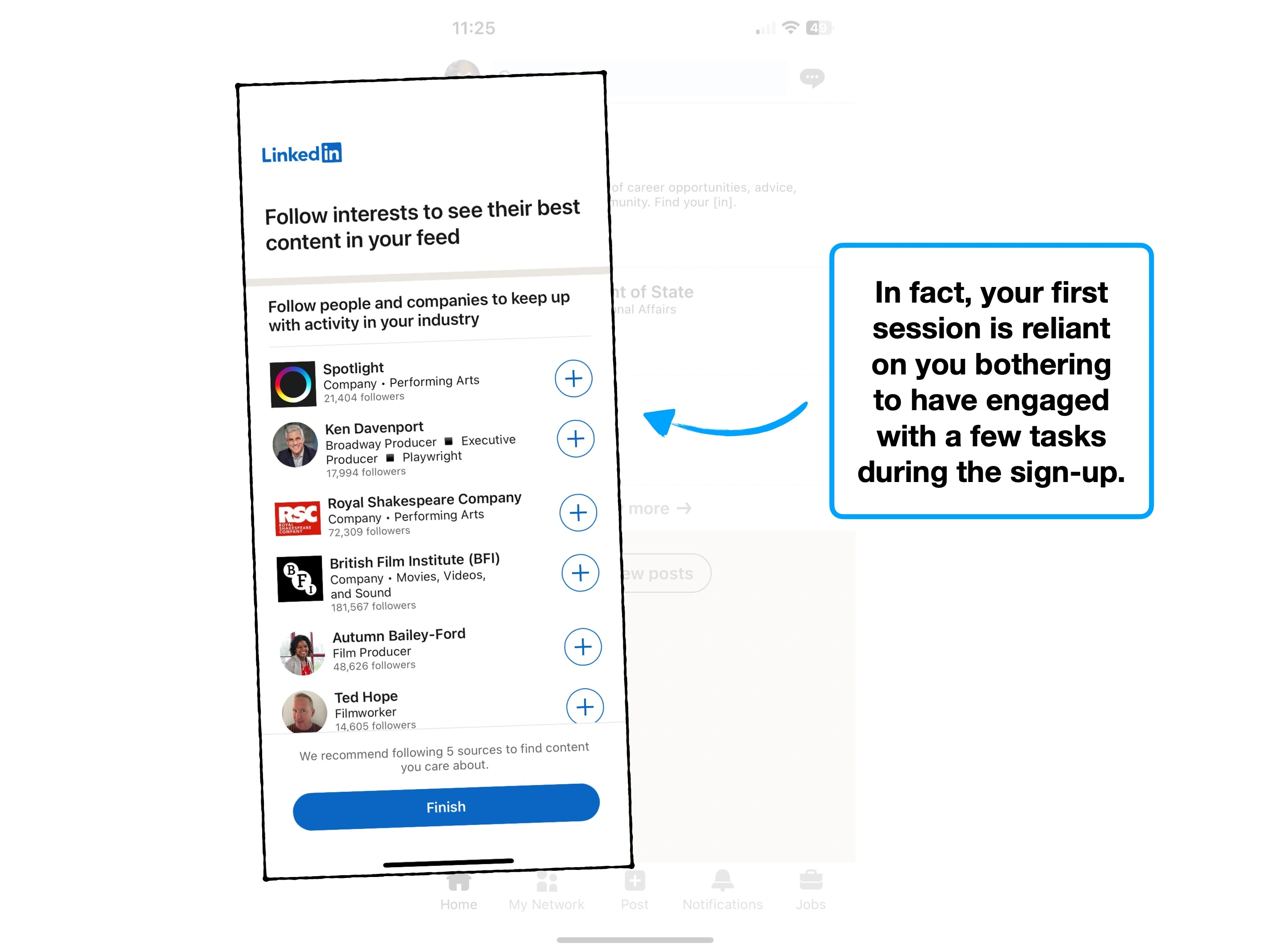
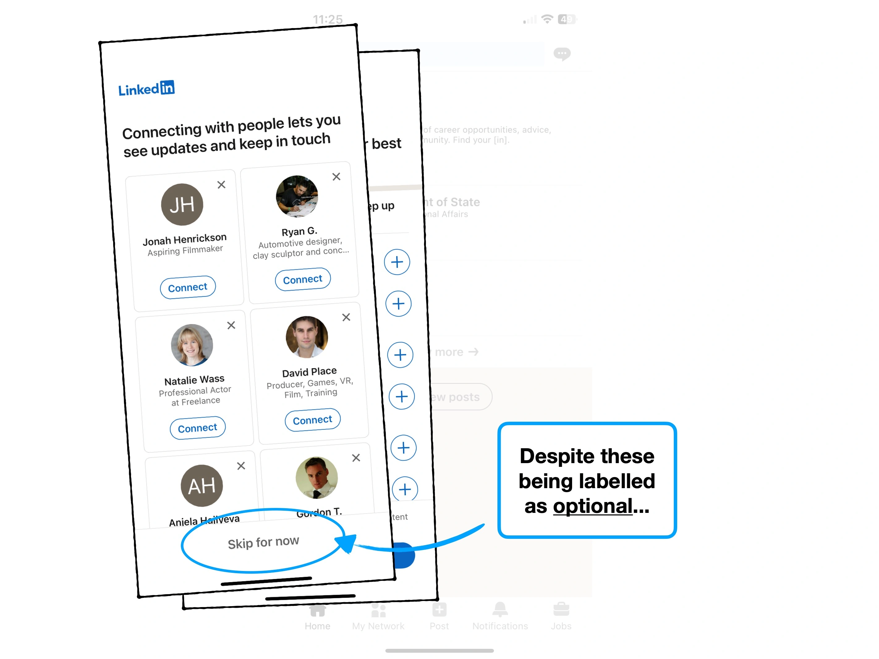
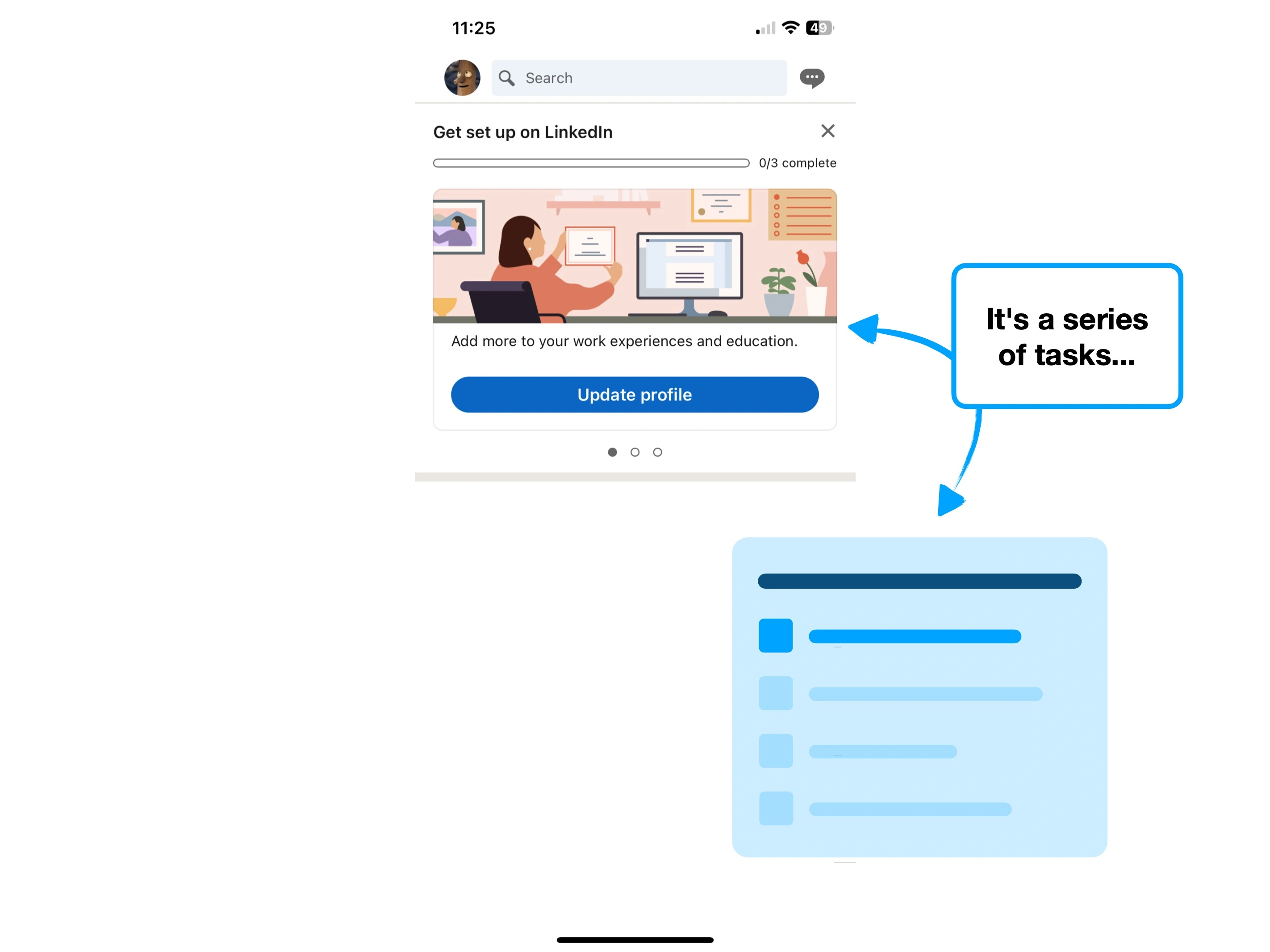
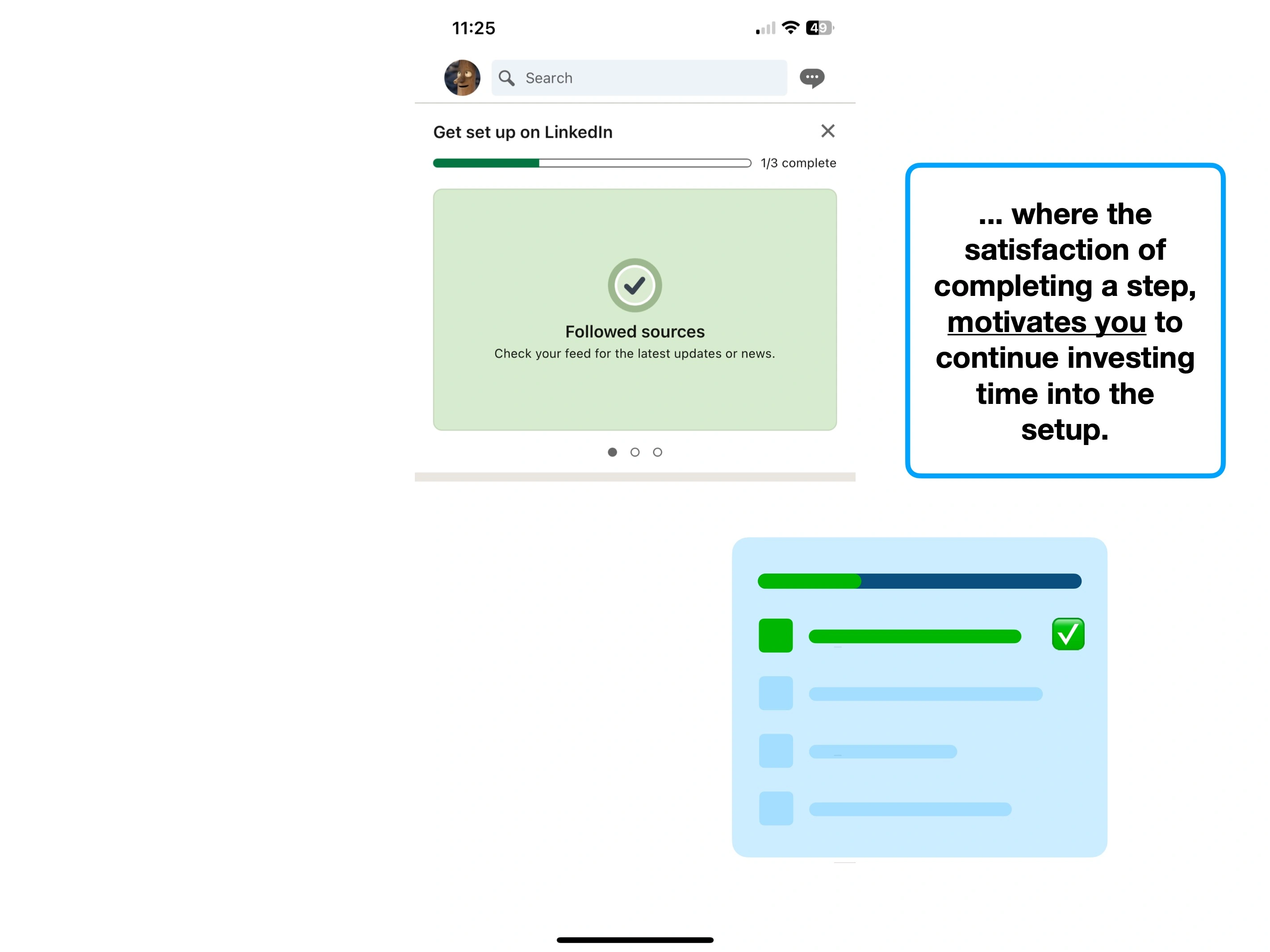
A new user has to create their own profile, creatively talk about their experiences, and connect with others. It's a combination of tasks, decisions and upskilling to use new features.
It requires a willingness to invest in a set-up process—something that hurts the likes of CRMs, note-taking apps, to-do lists and accounting software.
And in trying to factor all of that in, LinkedIn creates 'noise'.
But what exactly is 'noise' in product design? And is it why your onboarding isn't sticky?
Let's dive in, and cover some advanced onboarding techniques and tips.
Case Study
Please rotate your device to view this slideshow
Note, this won’t work if ‘rotate: lock’ is on in your device settings.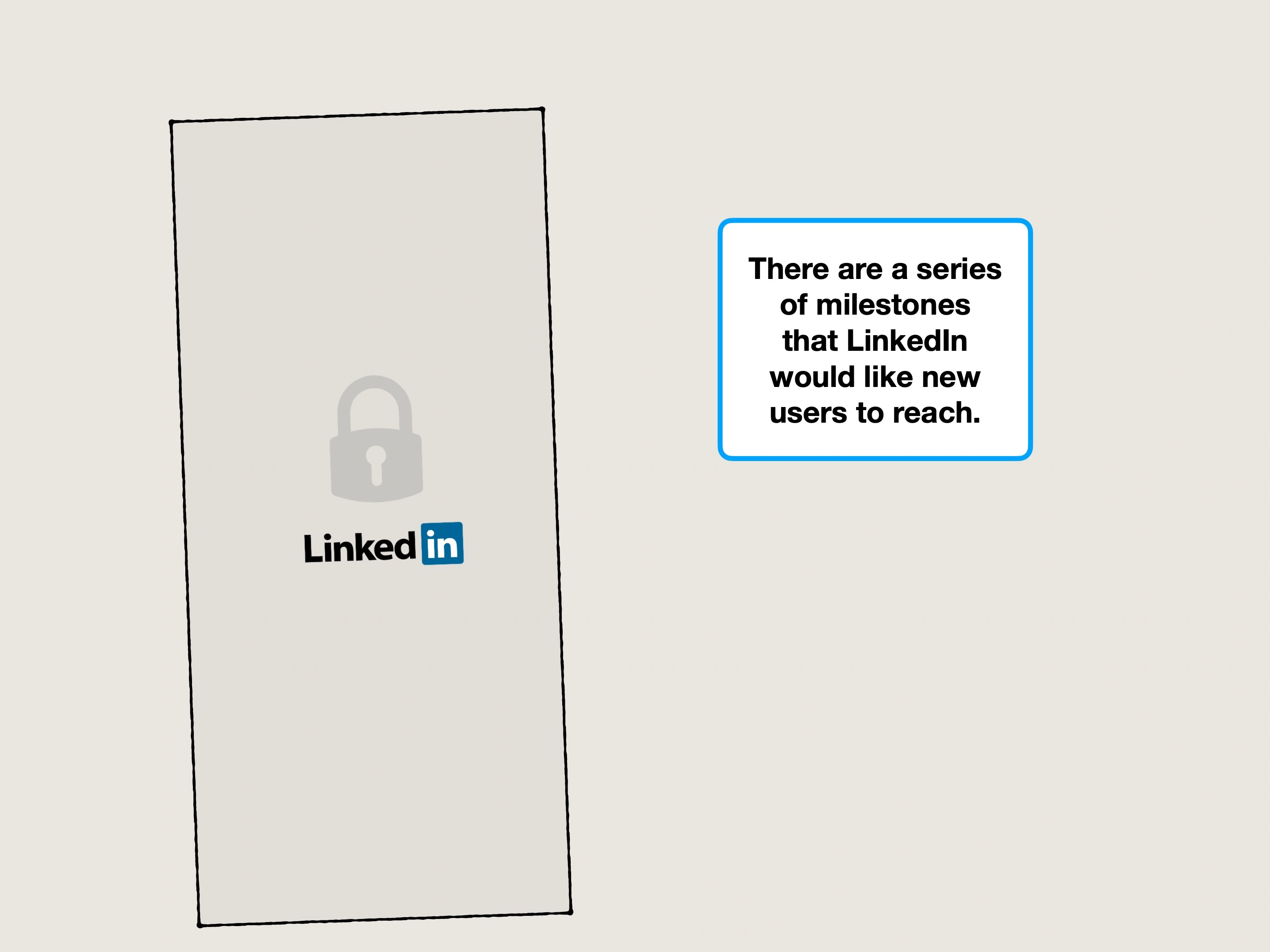


Key UX takeaways
1. Anti-noise
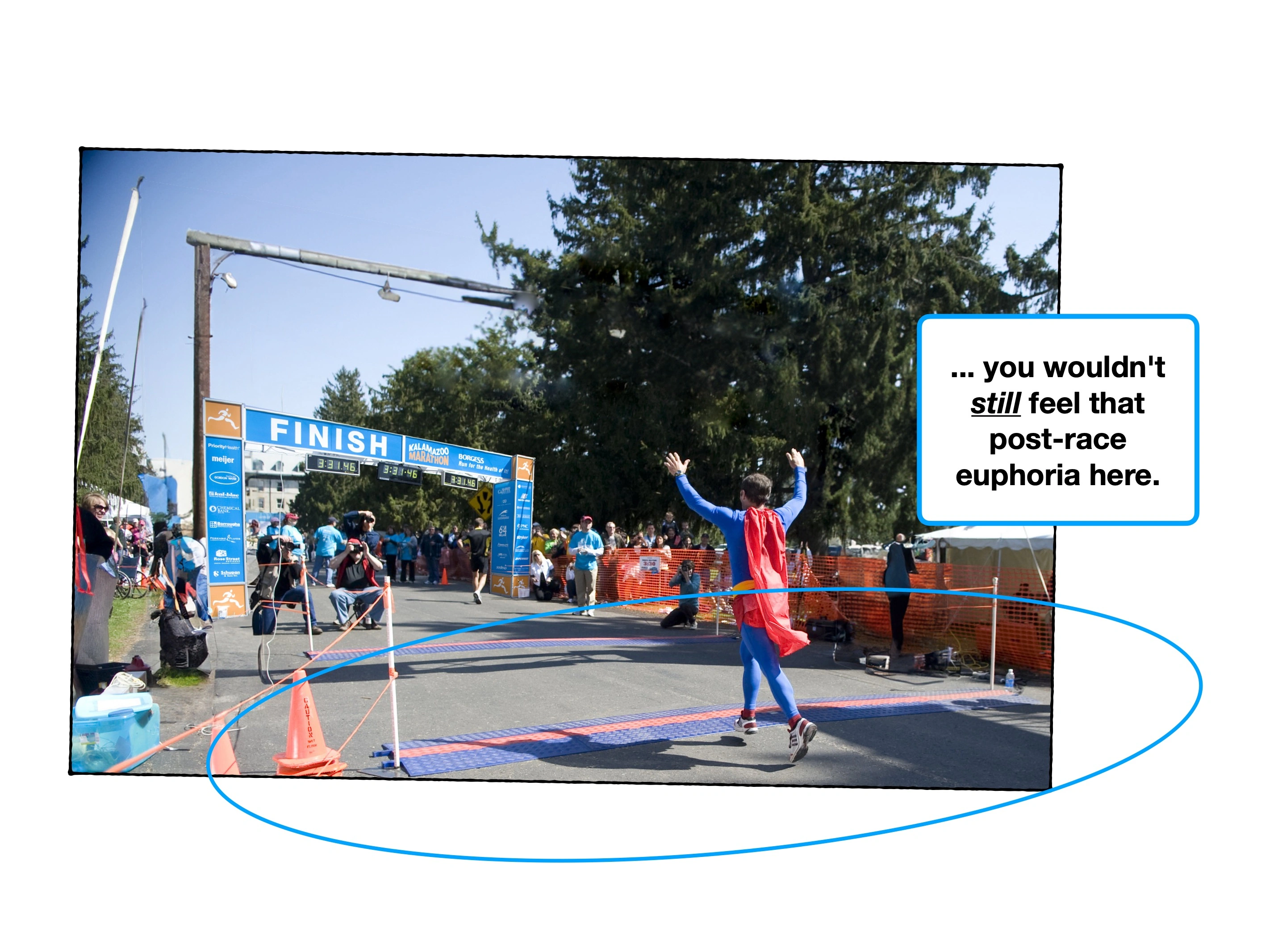
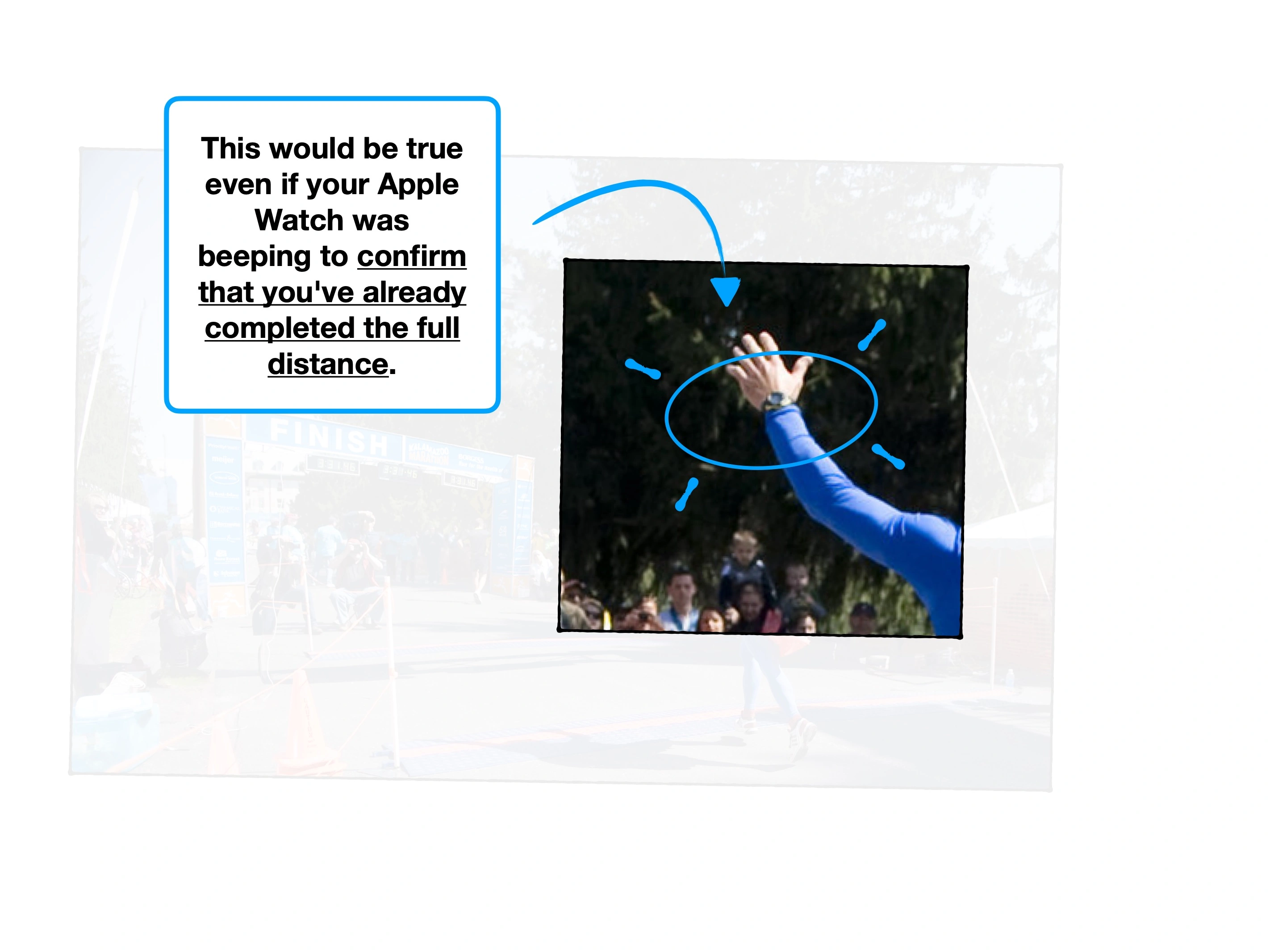
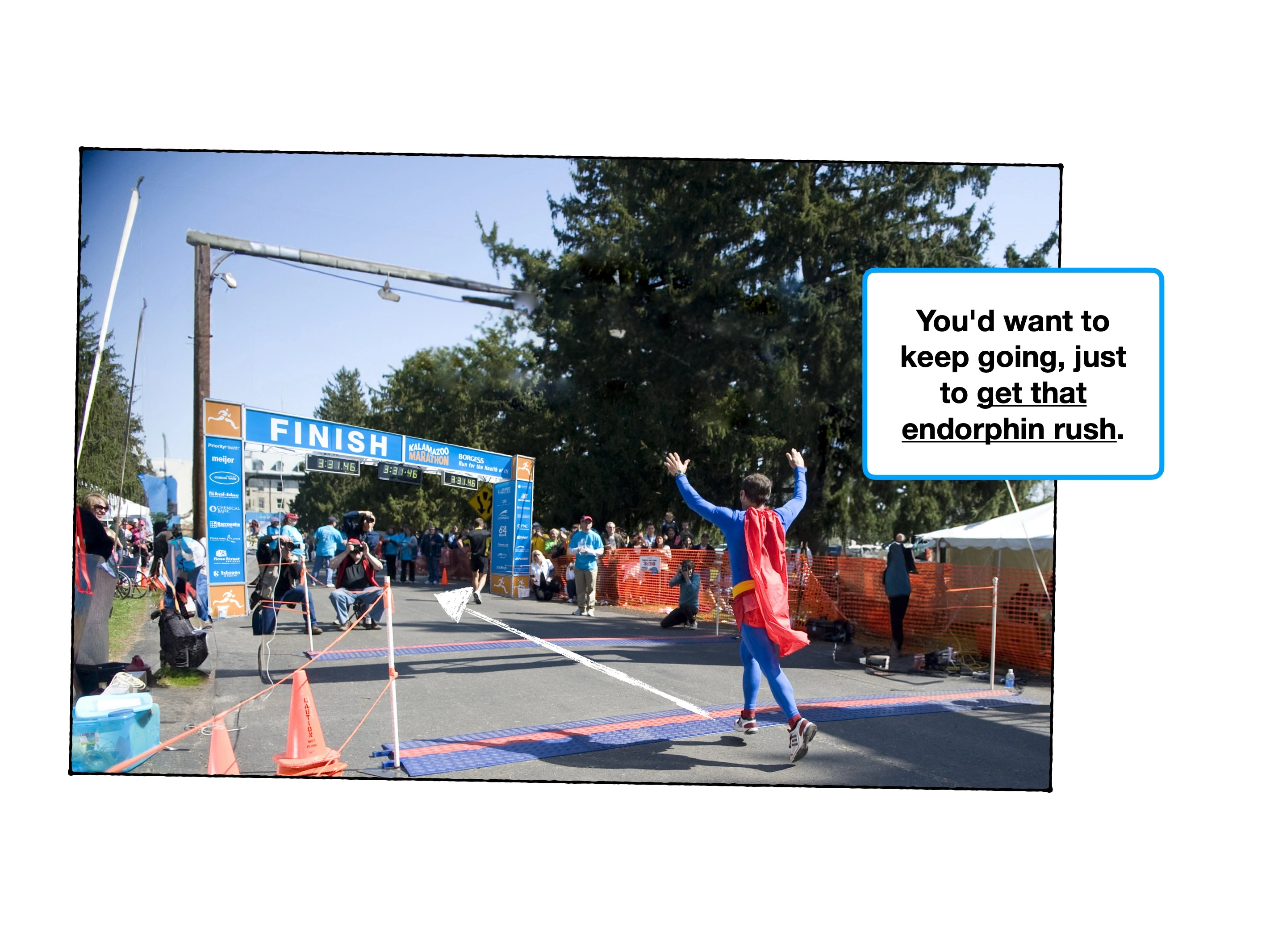
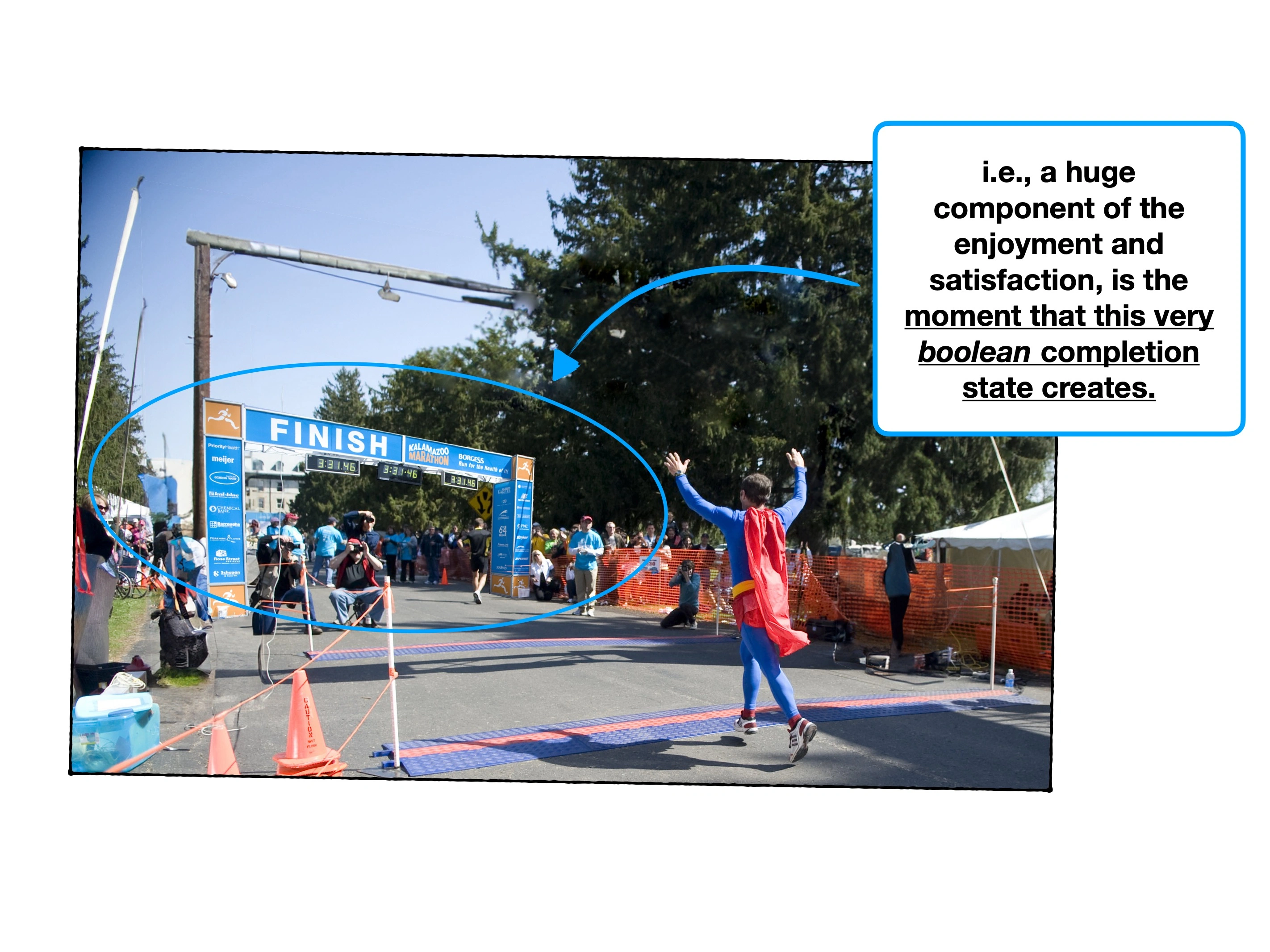
Have you ever turned off an extractor fan, and been immediately surprised by how much quieter the room is?
The human brain has an amazing ability to "turn down" a specific stimulus, but the relief of sudden silence demonstrates that it was still weighing on your subconscious.
This is one reason why true focus can be so exhausting—it requires a higher 🧠 Cognitive Load to shut out everything else.
In other words, noise carries a cost. Attention is relatively finite, potential distractions are not.
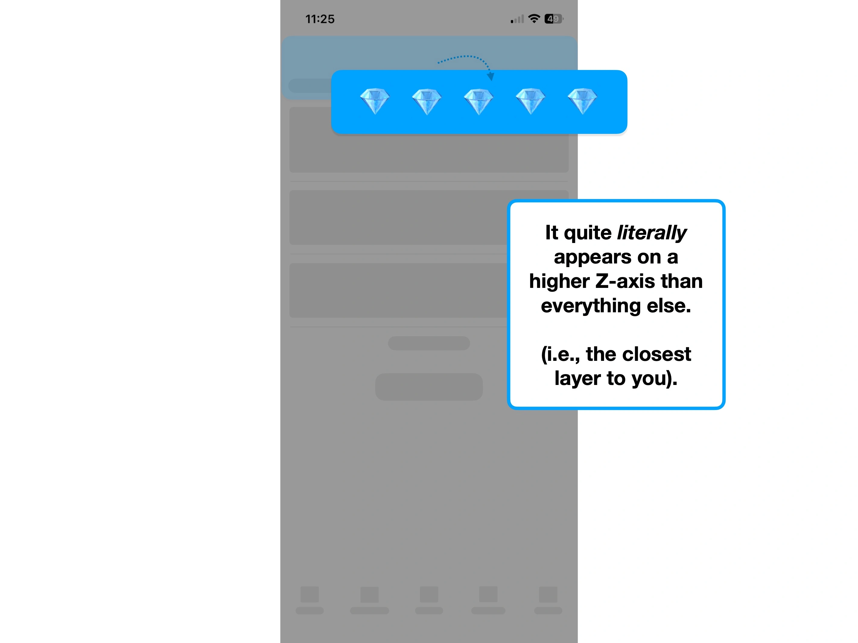
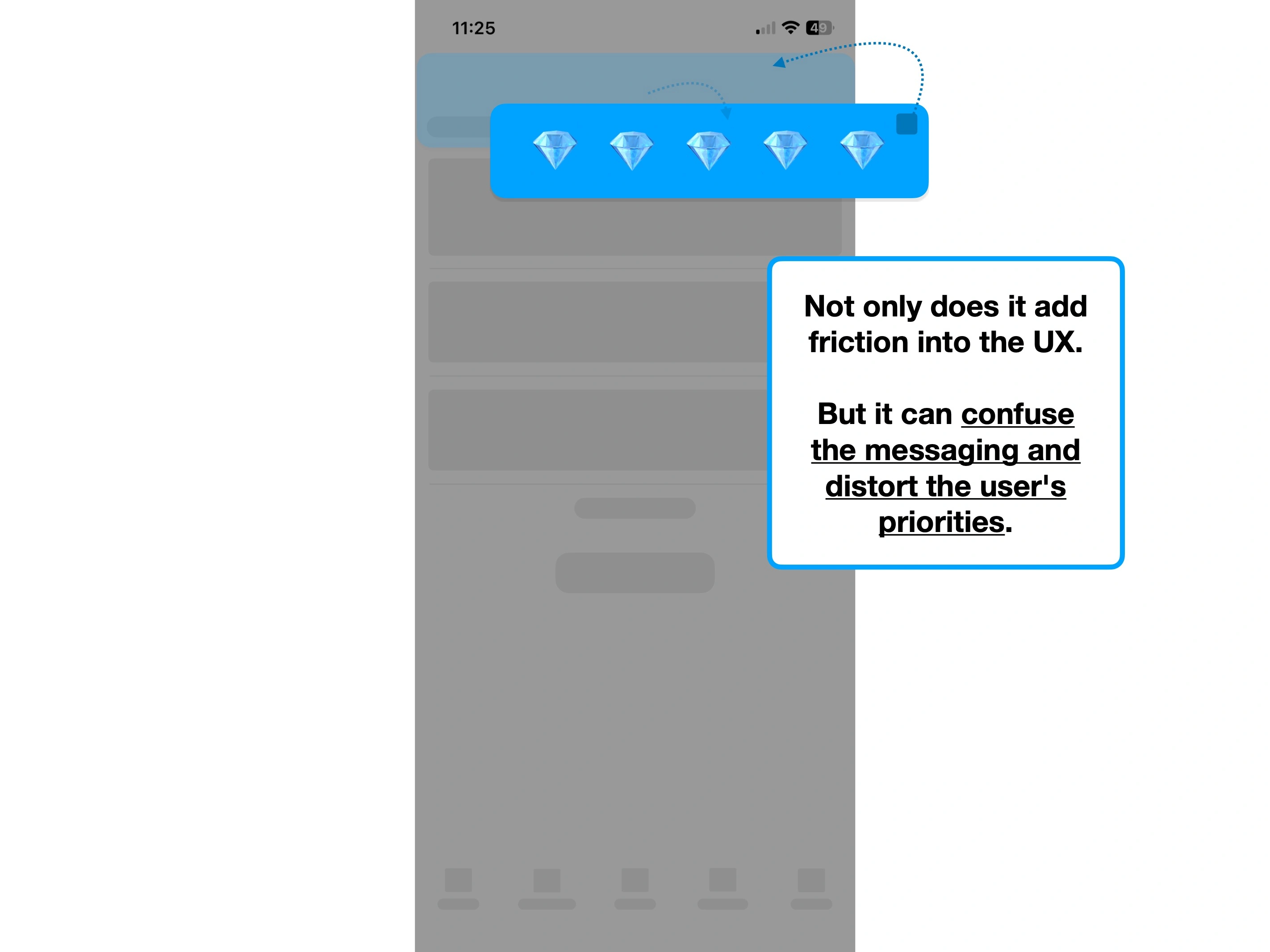
And the scary thing about product design, is that everything can be noise.
Bugs, design inconsistencies, advertising new features, pop-ups and animations can all distract the user from what they're trying to do.
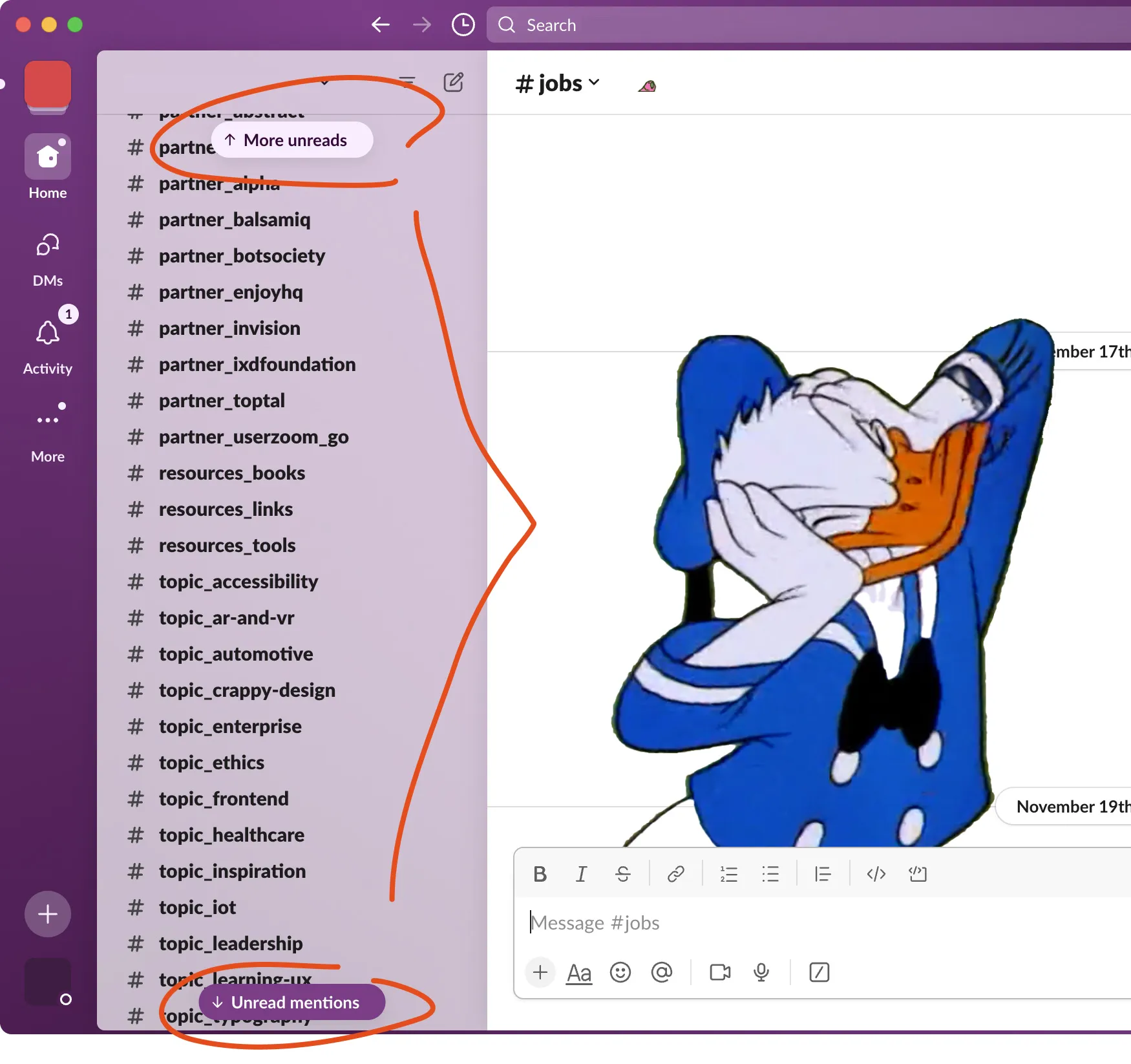
For example, large Slack groups can be incredibly 'noisy', with feeds of channels, unread messages and notifications everywhere.
In this instance, noise isn't a bug—it's a byproduct of how your customers are using your product at scale.
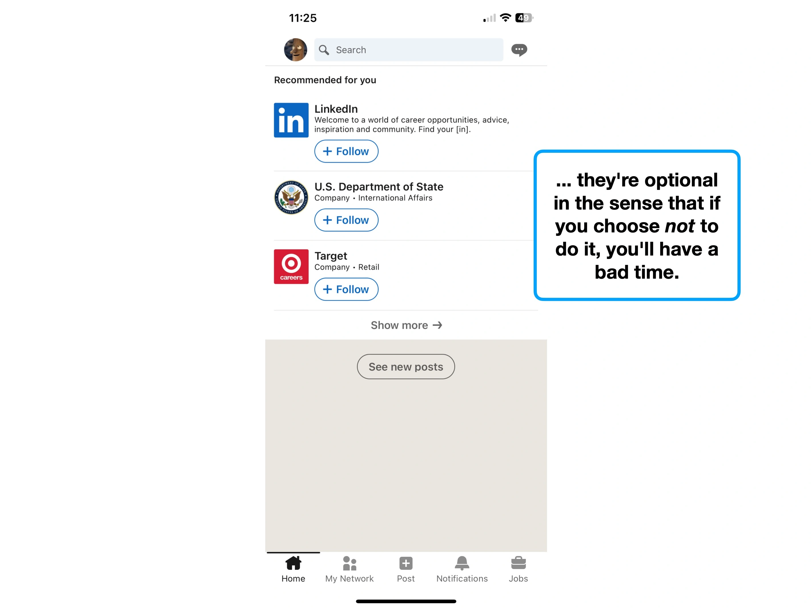
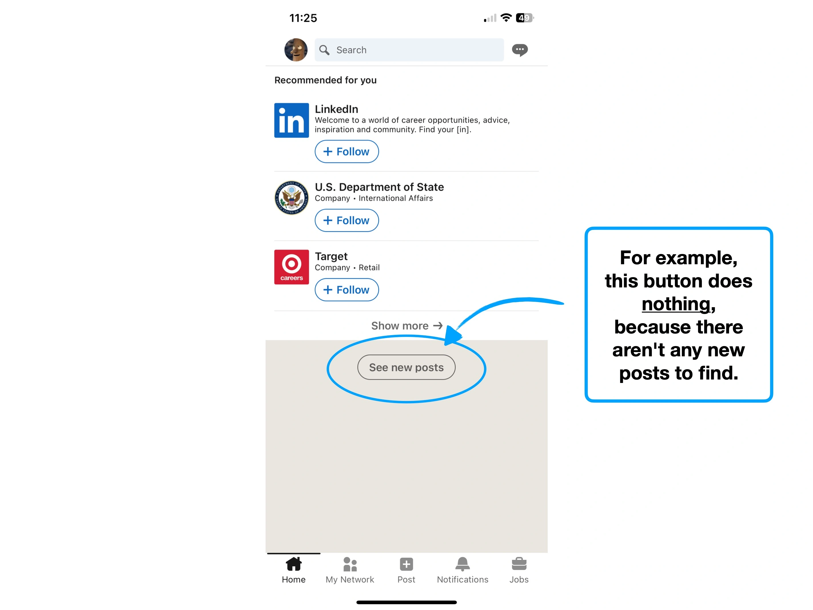
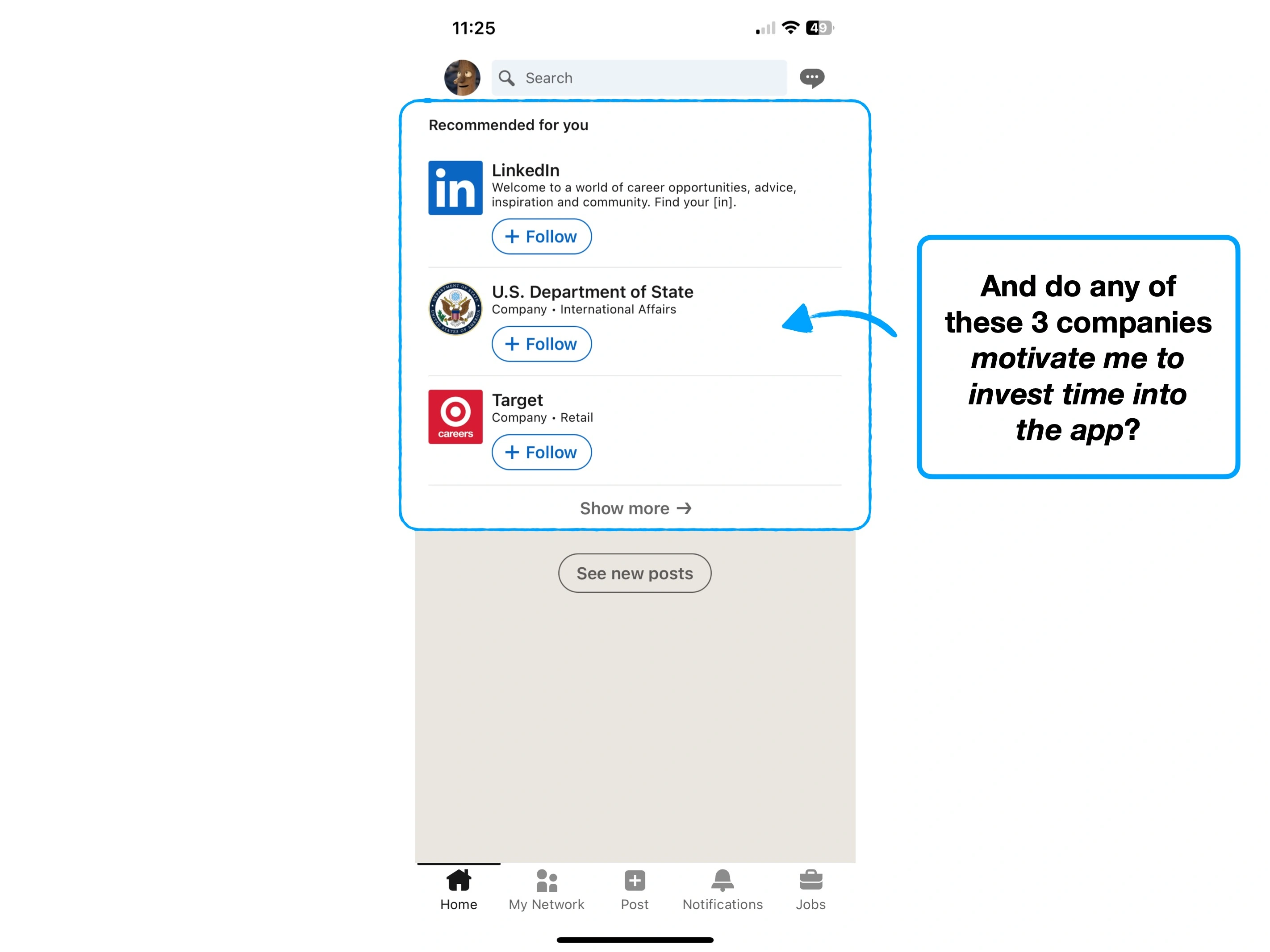
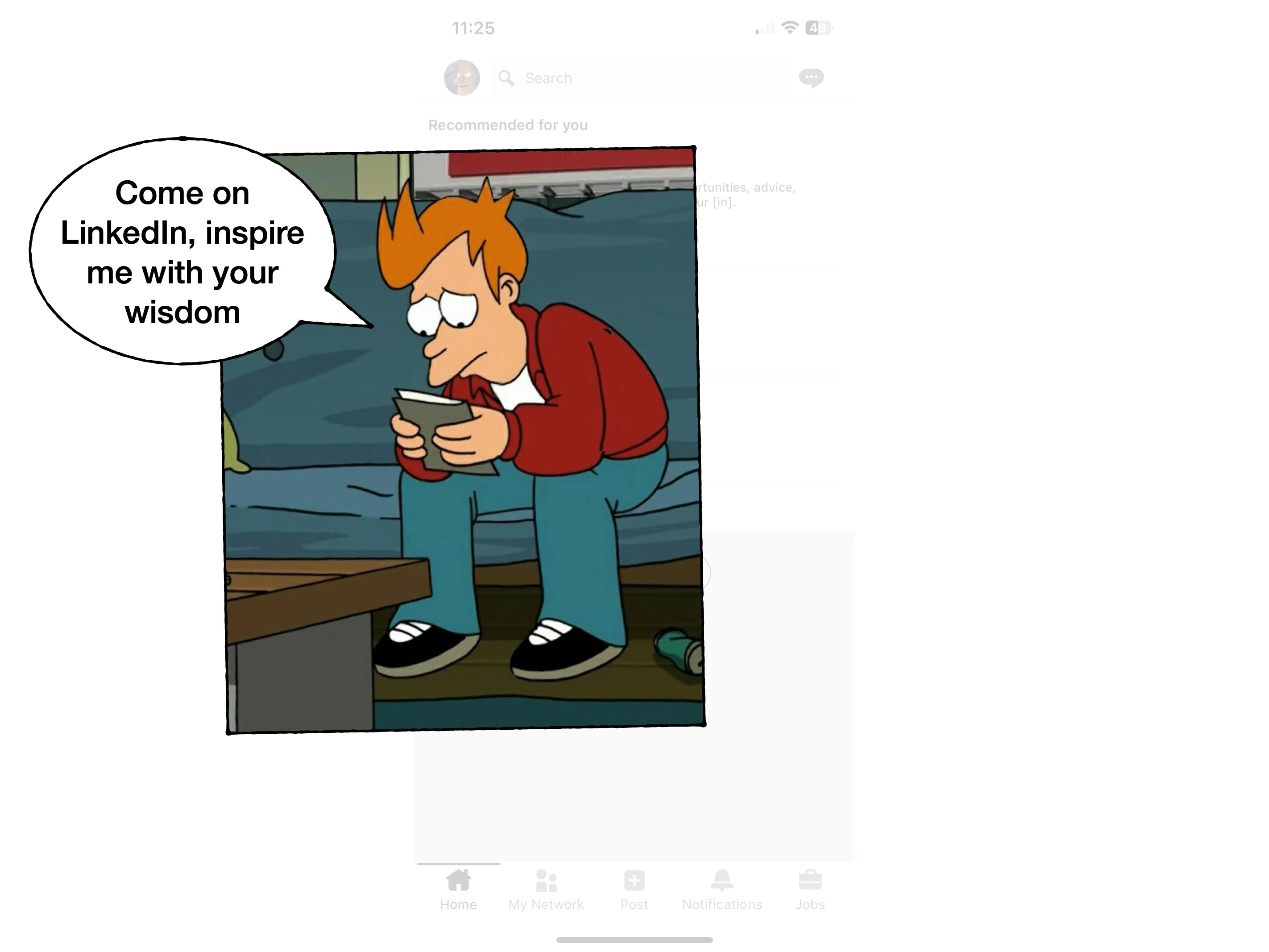
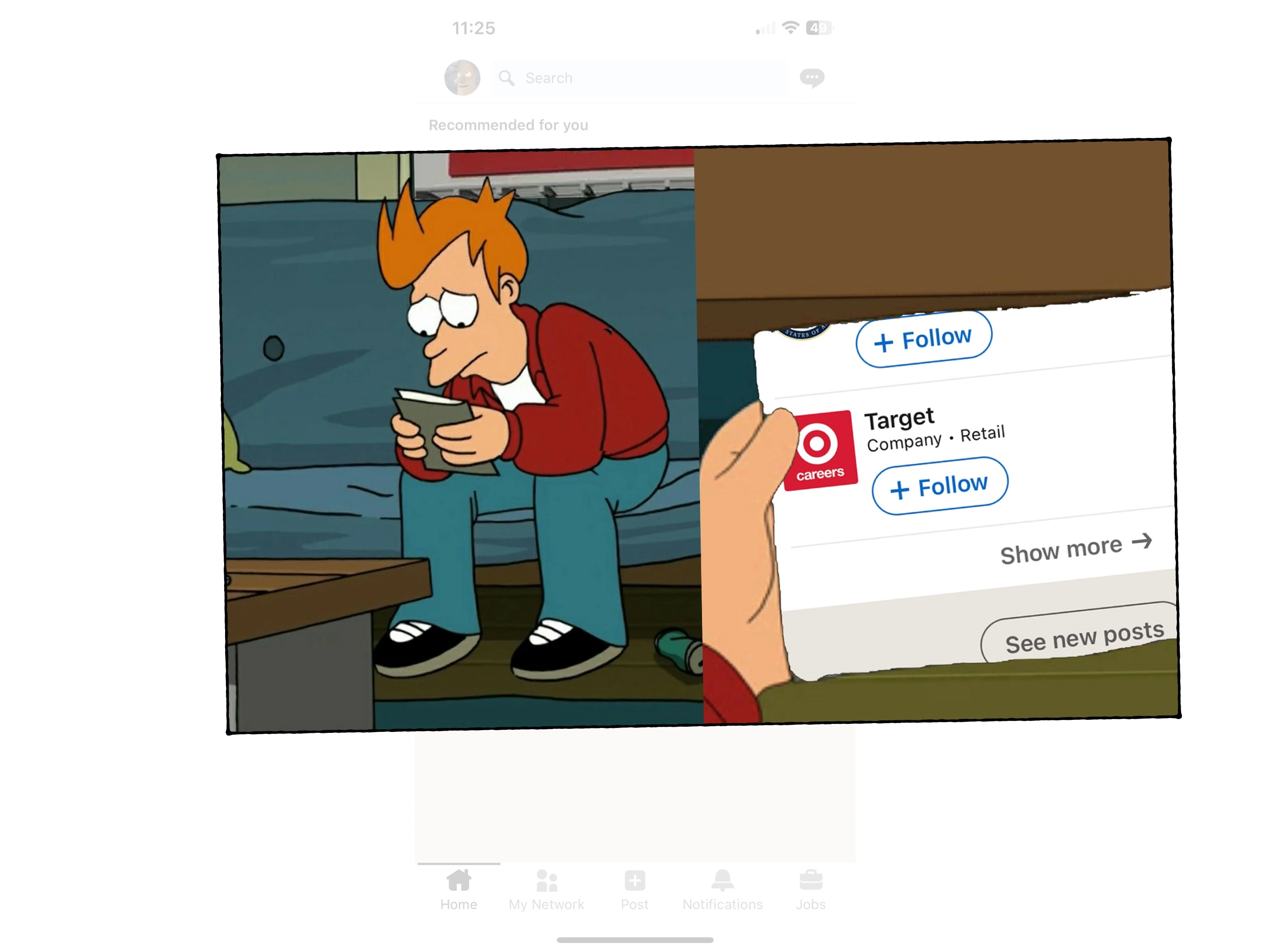
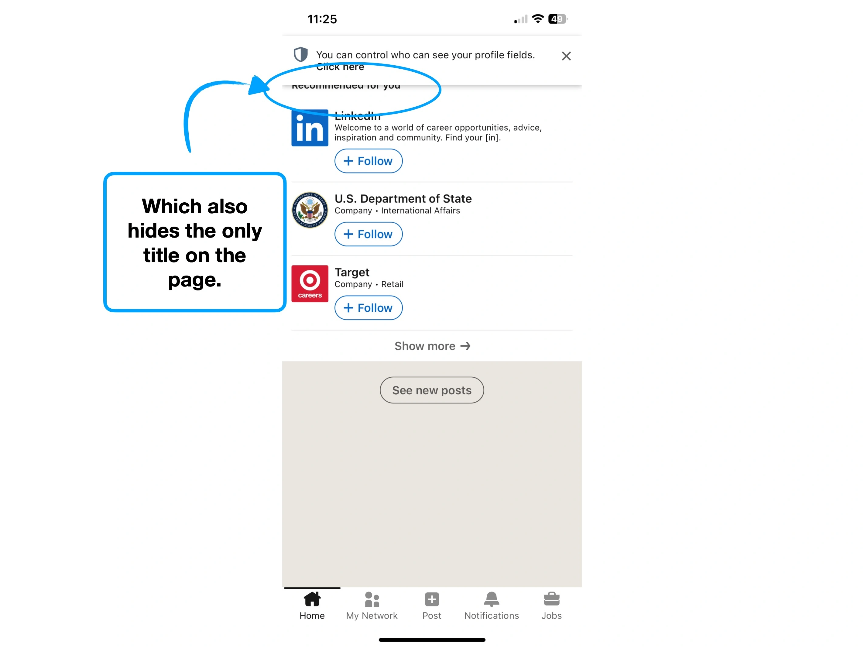
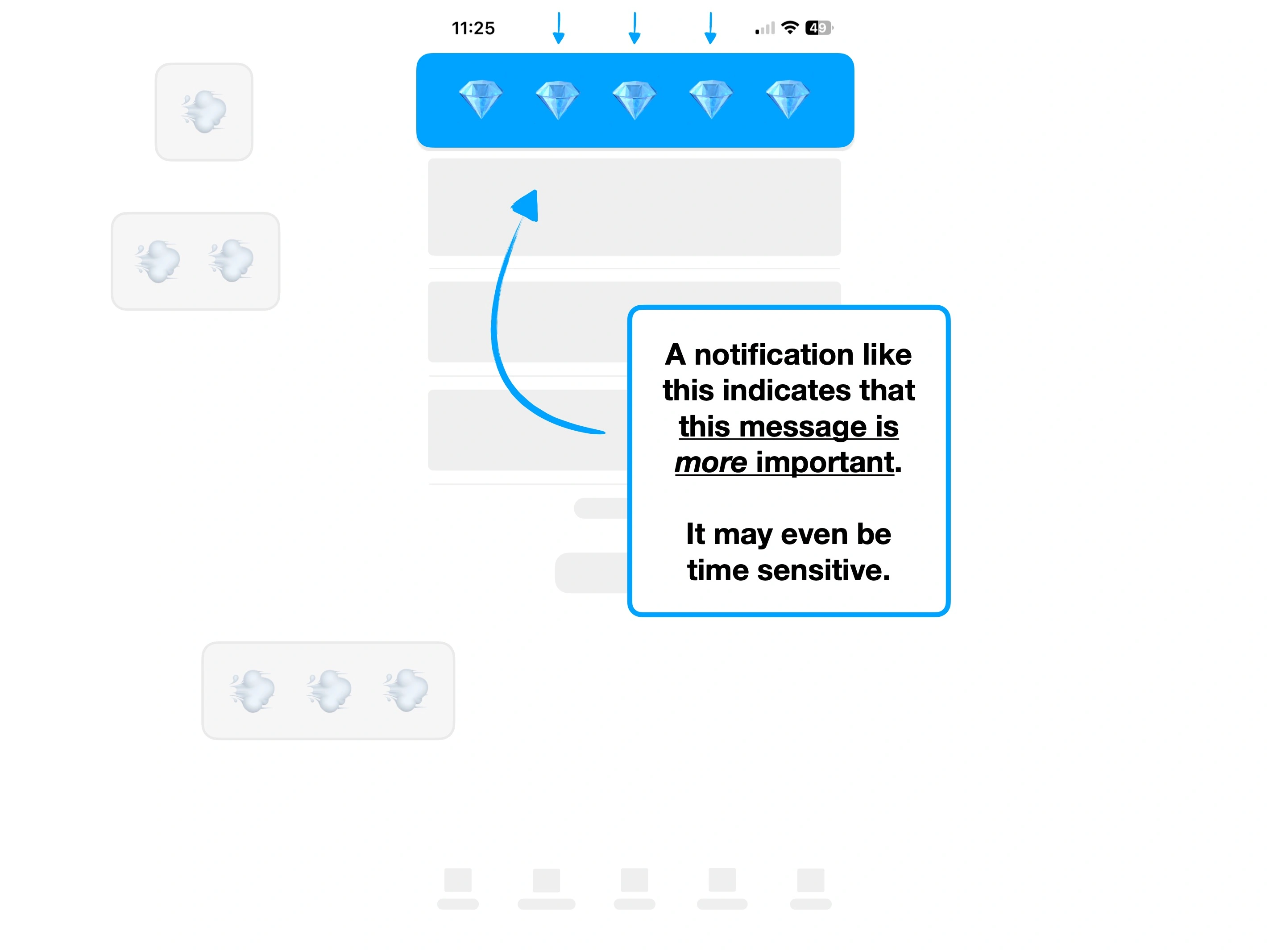
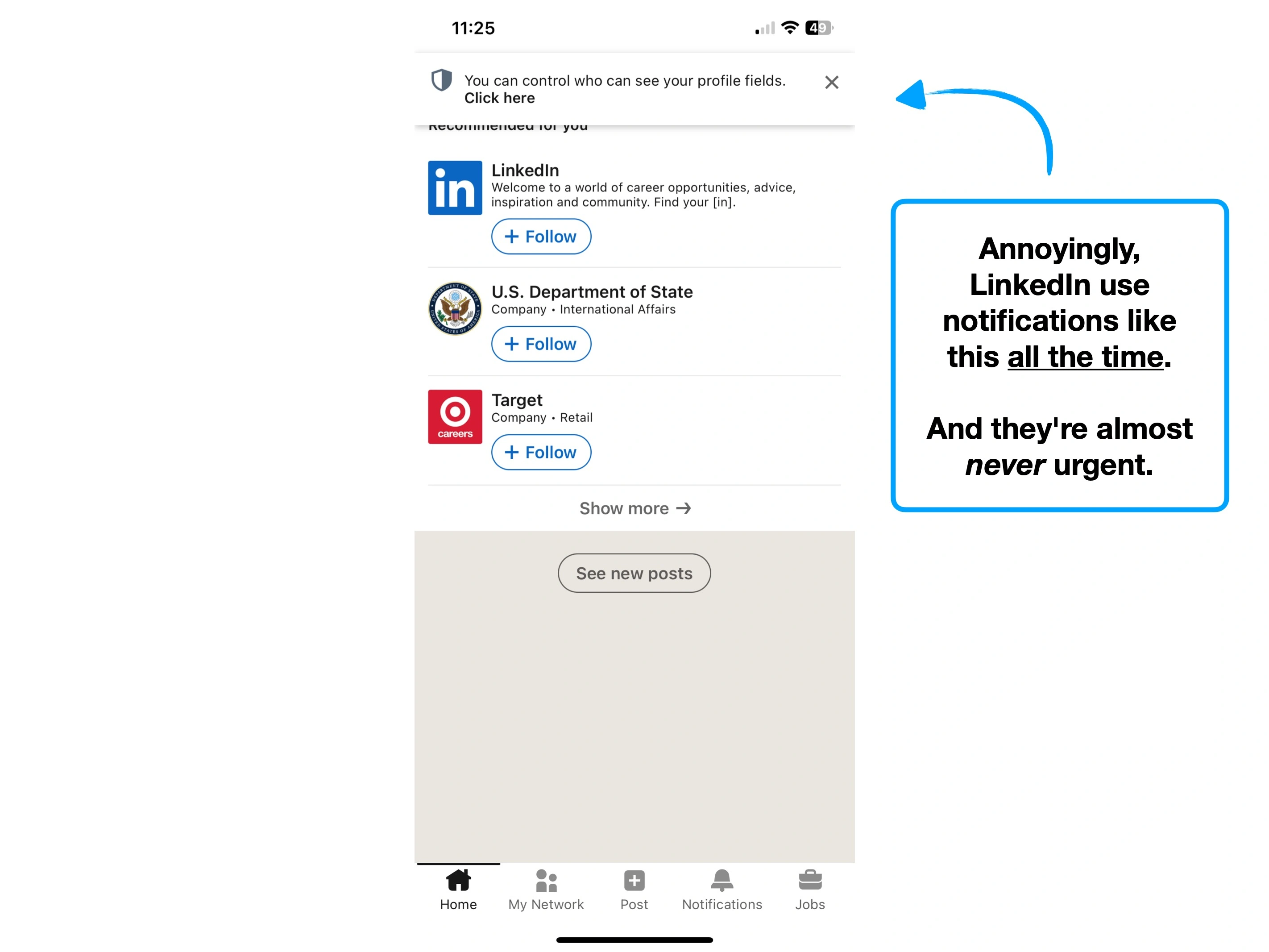
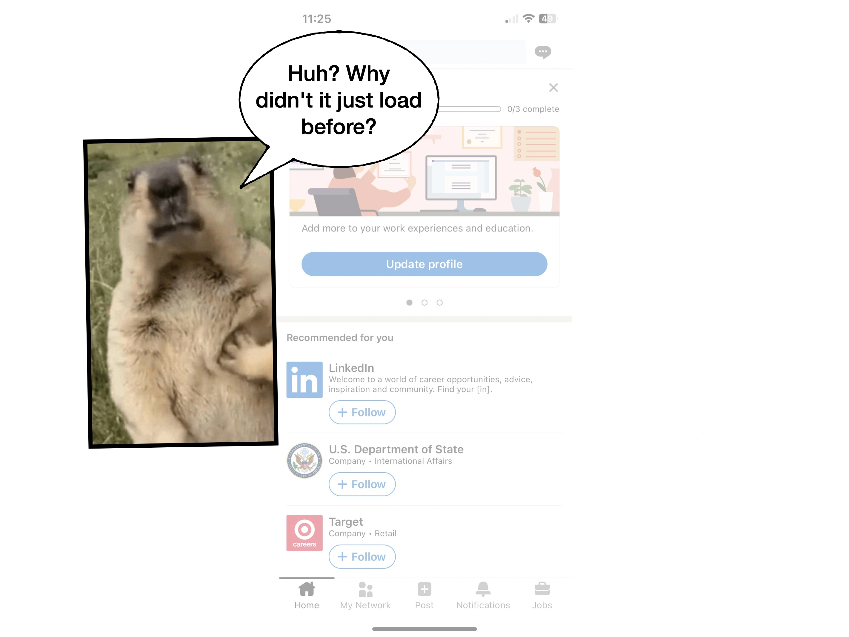
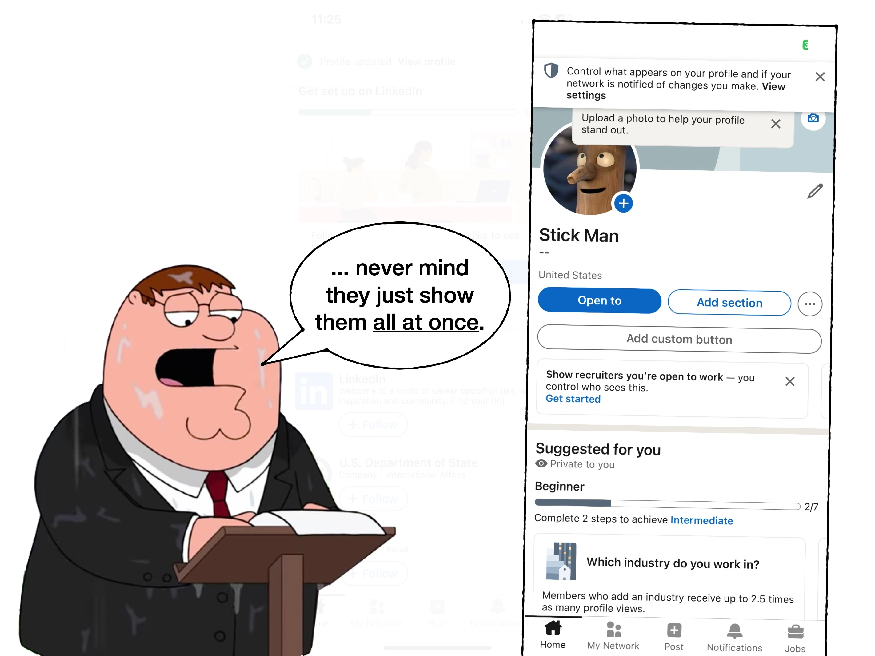
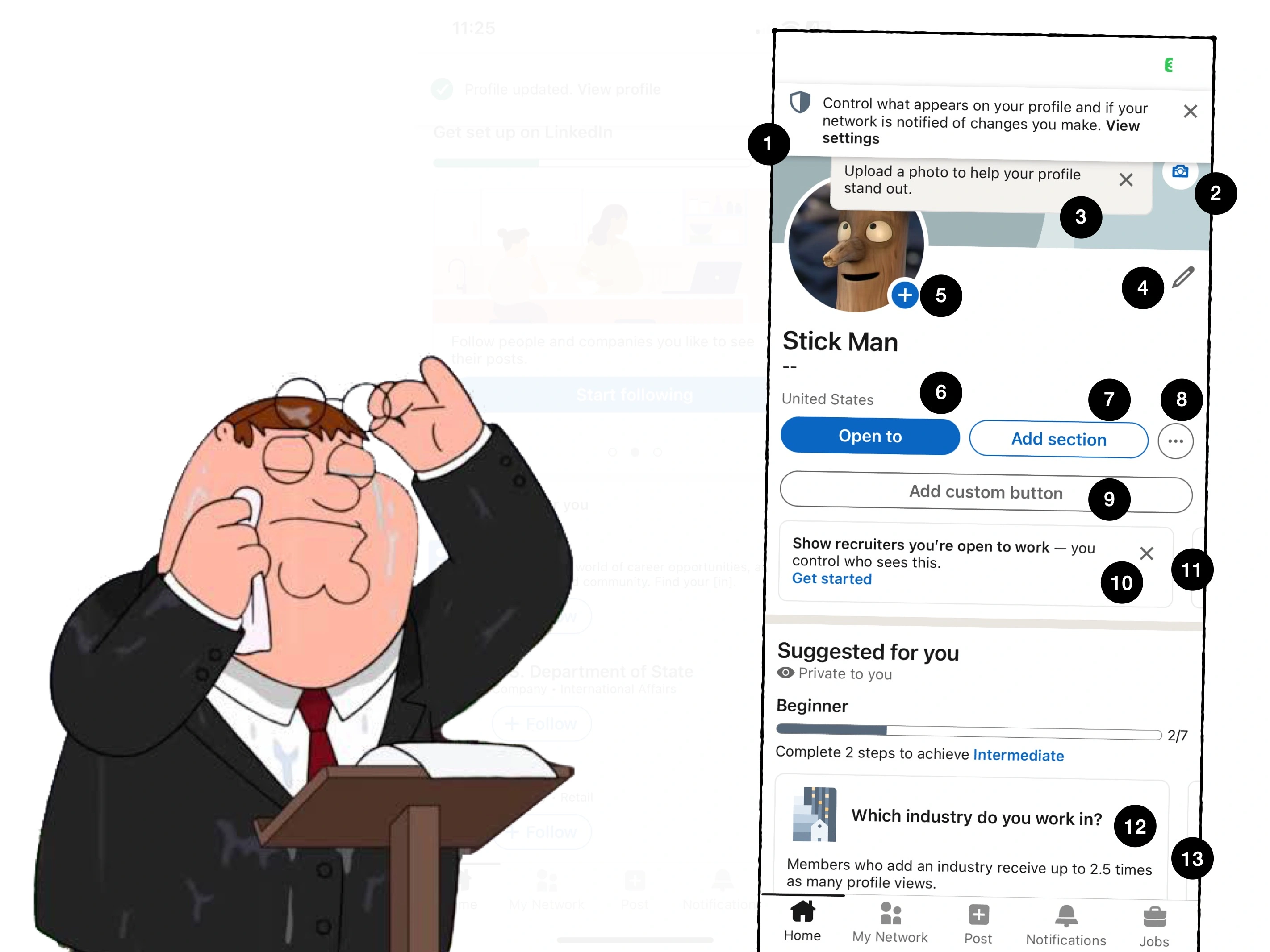
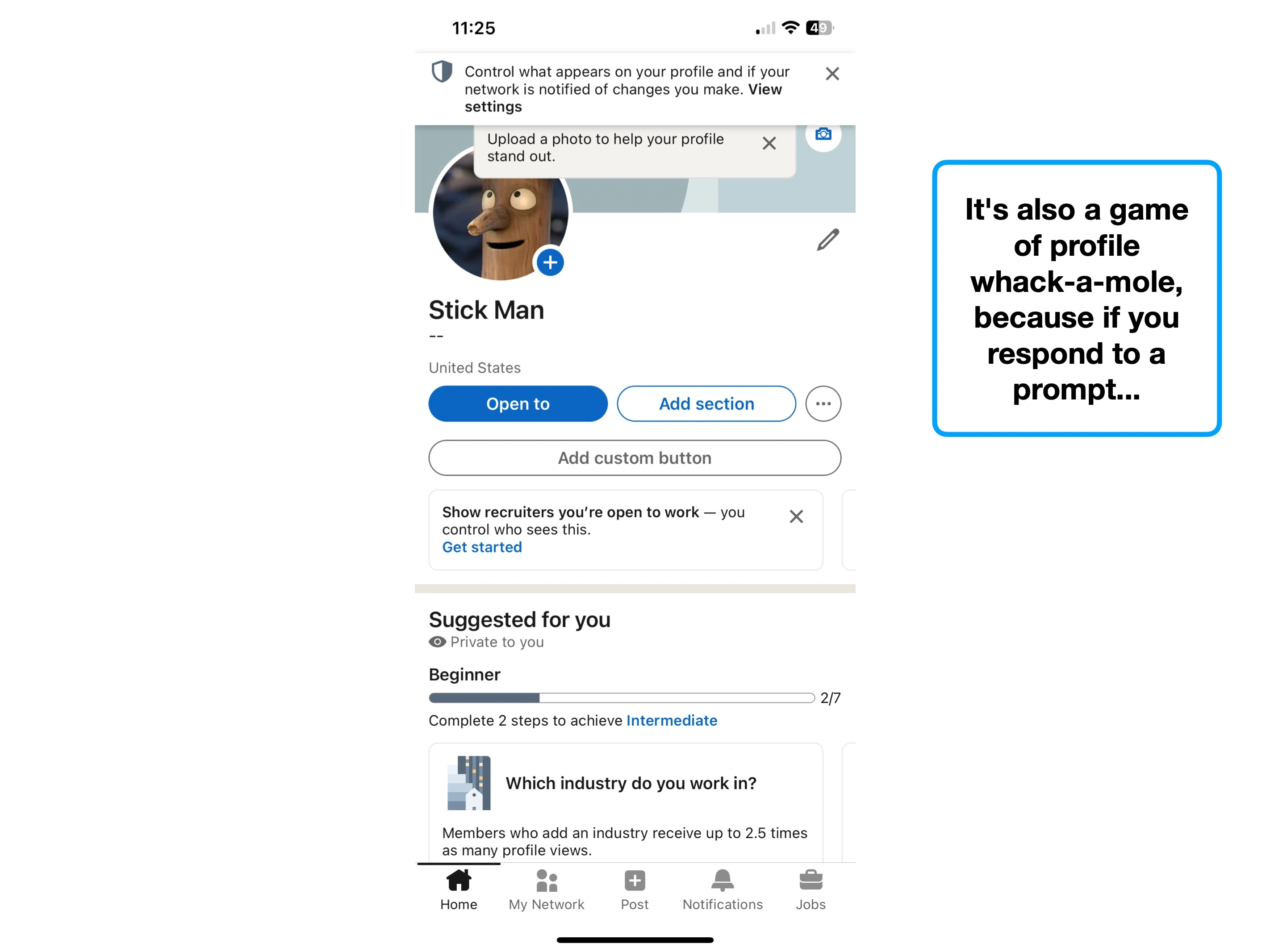
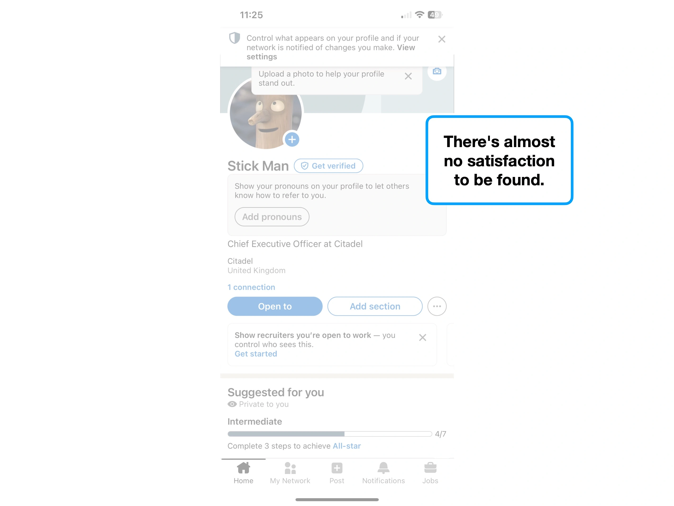
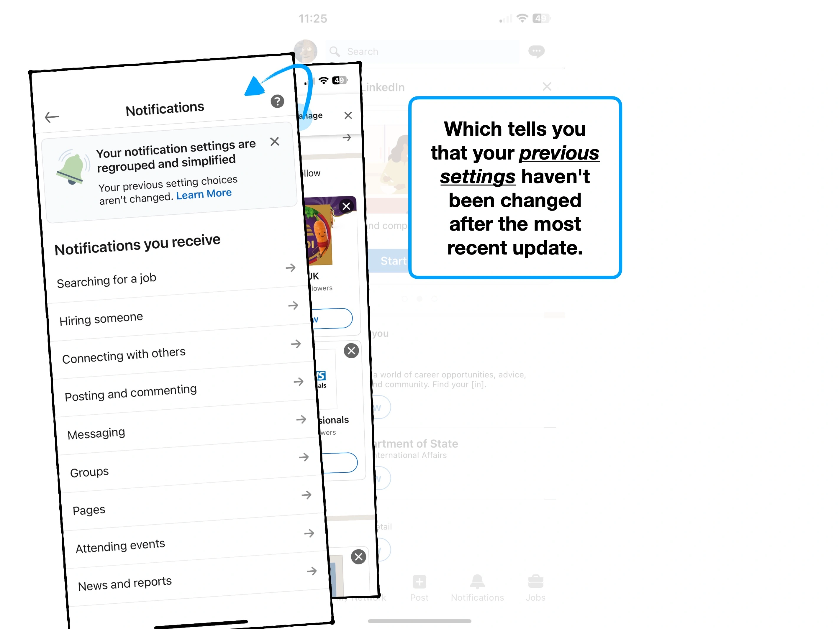
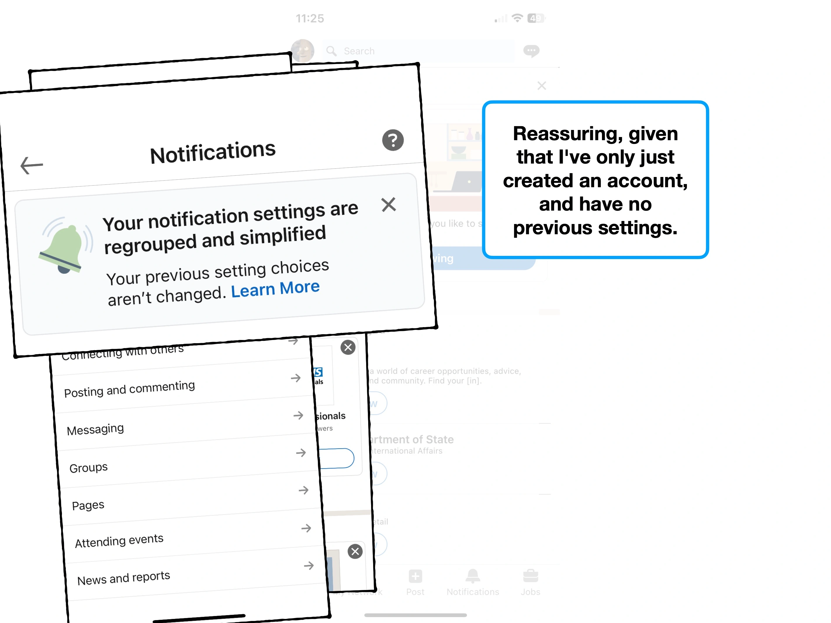
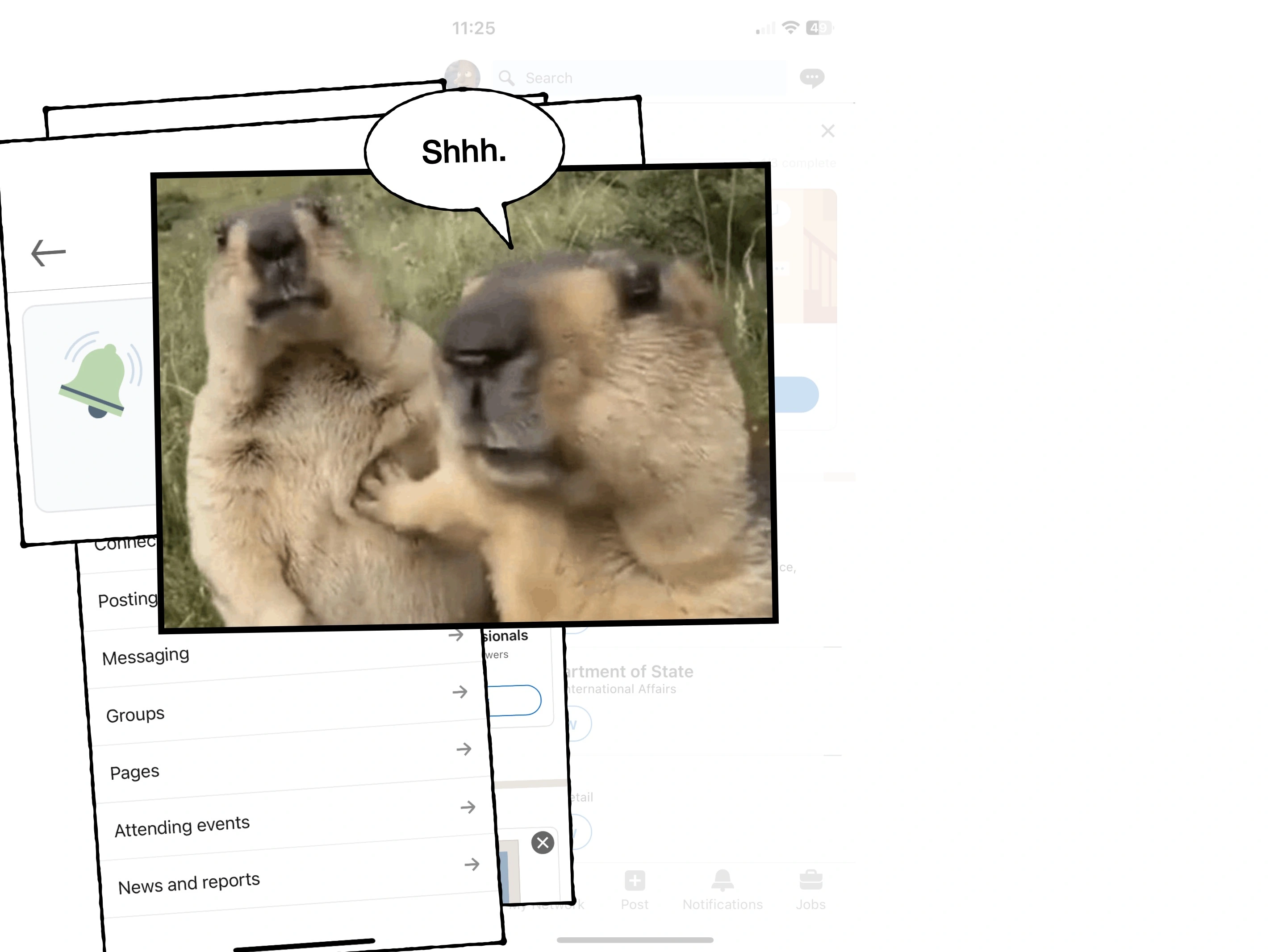
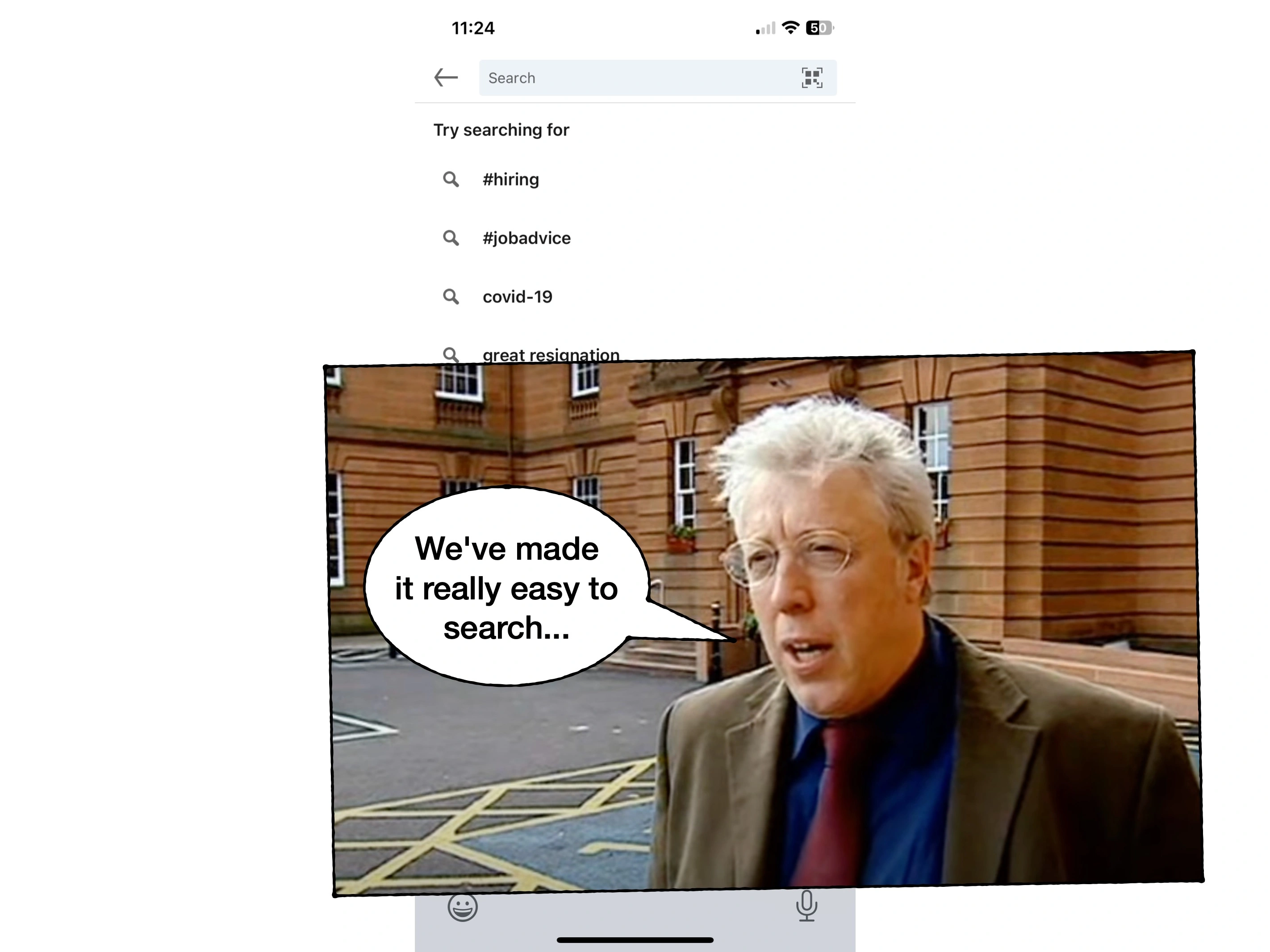
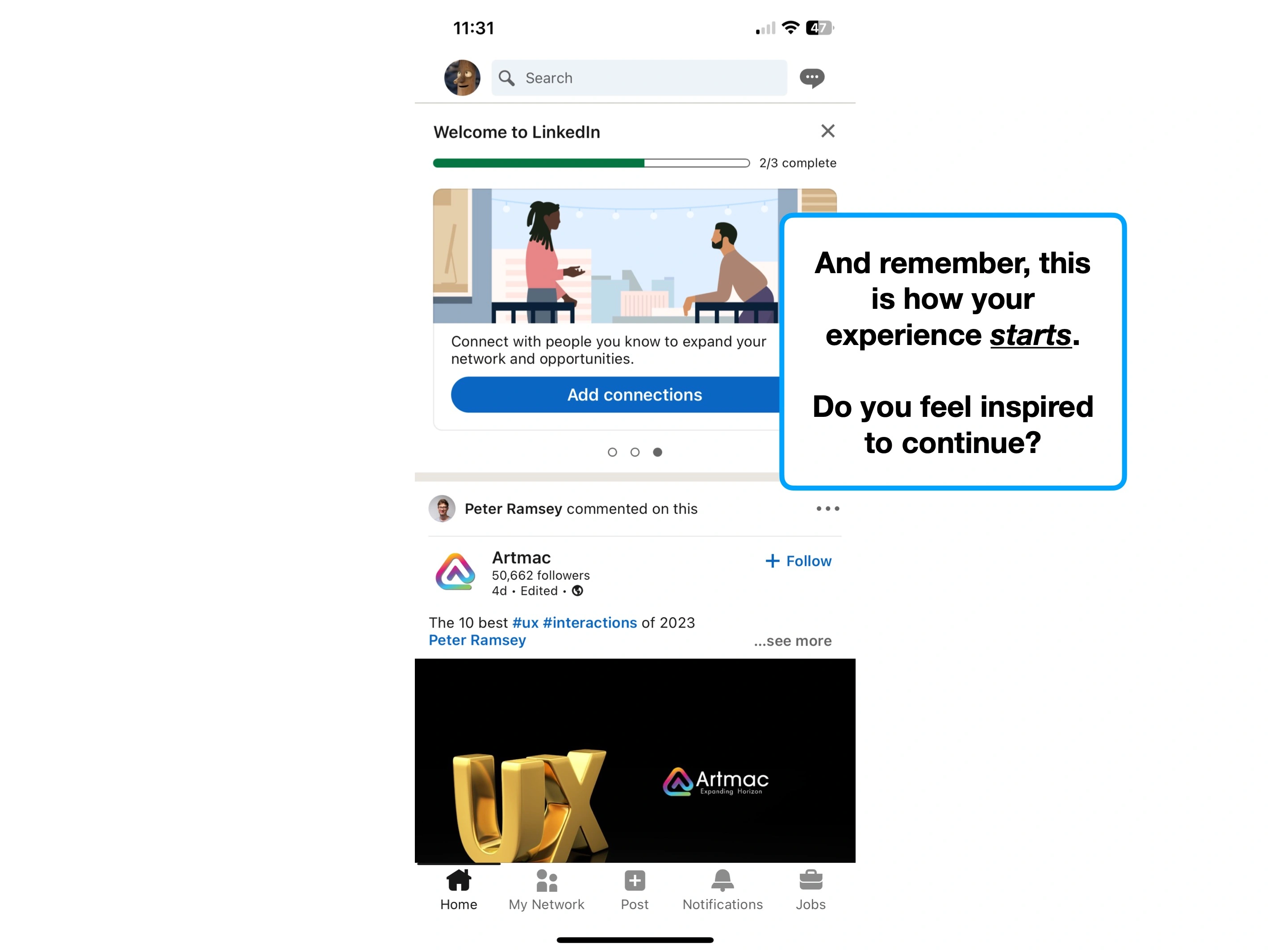
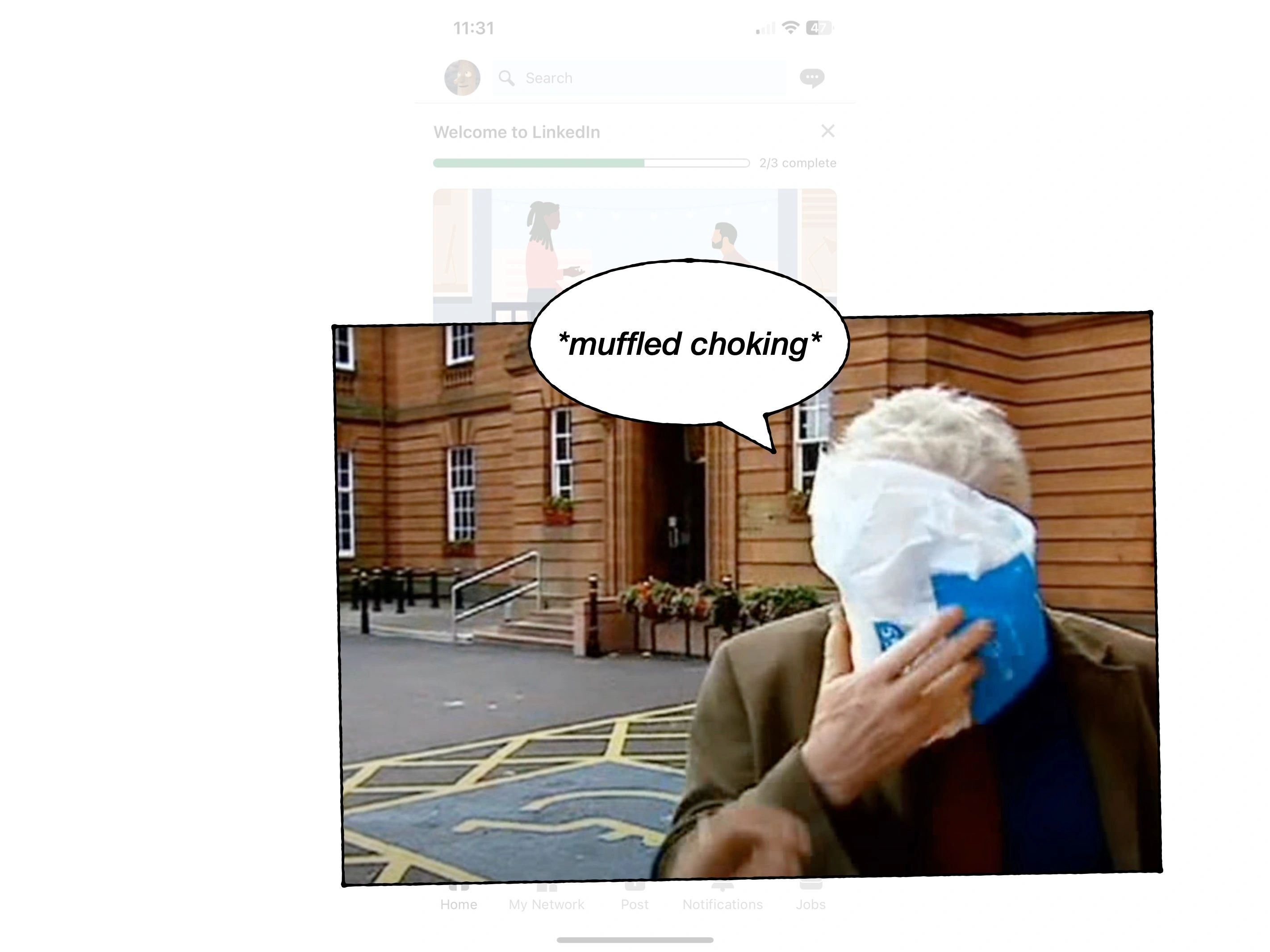
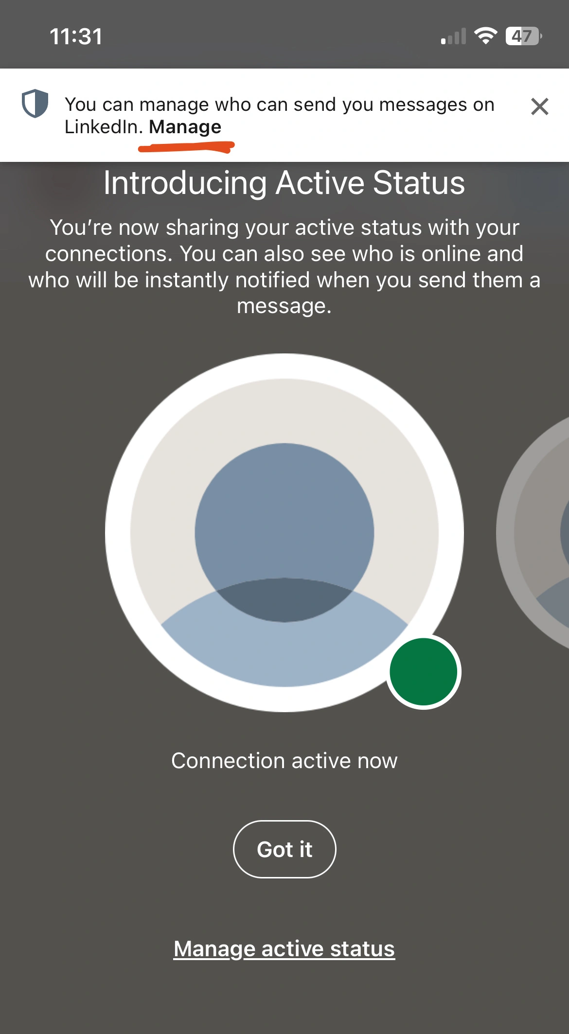
Or in LinkedIn's case, the constant bombardment of notifications and pop-ups.
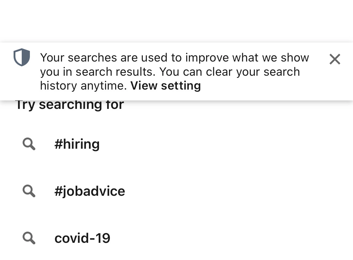
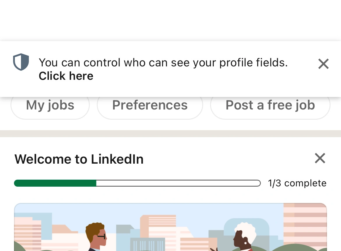
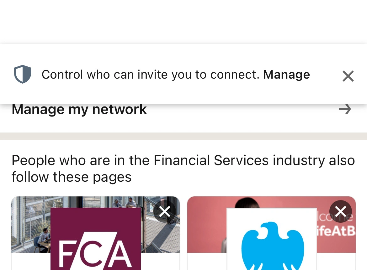
The timing of these are horrible, and the sheer quantity of them is likely dulling their efficacy.
Over the course of a few minutes, I developed a habit of instinctively closing them.
And what I've observed in my consulting career, is that reducing noise (e.g., removing unused features, or resolving minor design inconsistencies) can have a real impact on the underlying business.
Your start-up might need more features, or better advertising, or it may just need less ambient noise.
2. Trigger happy
Next, let's take a closer look at one of the 'noisiest' instruments in the room.
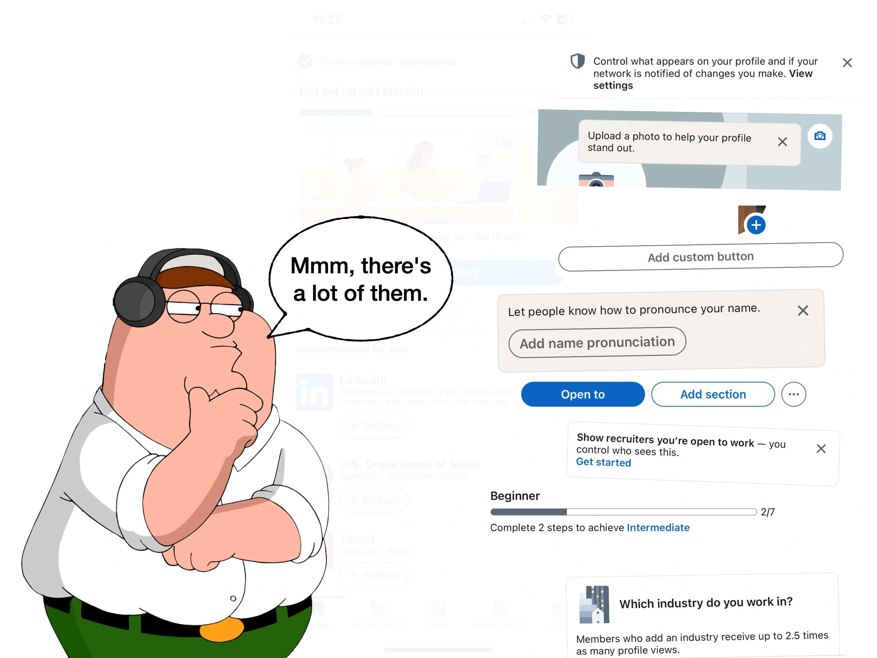
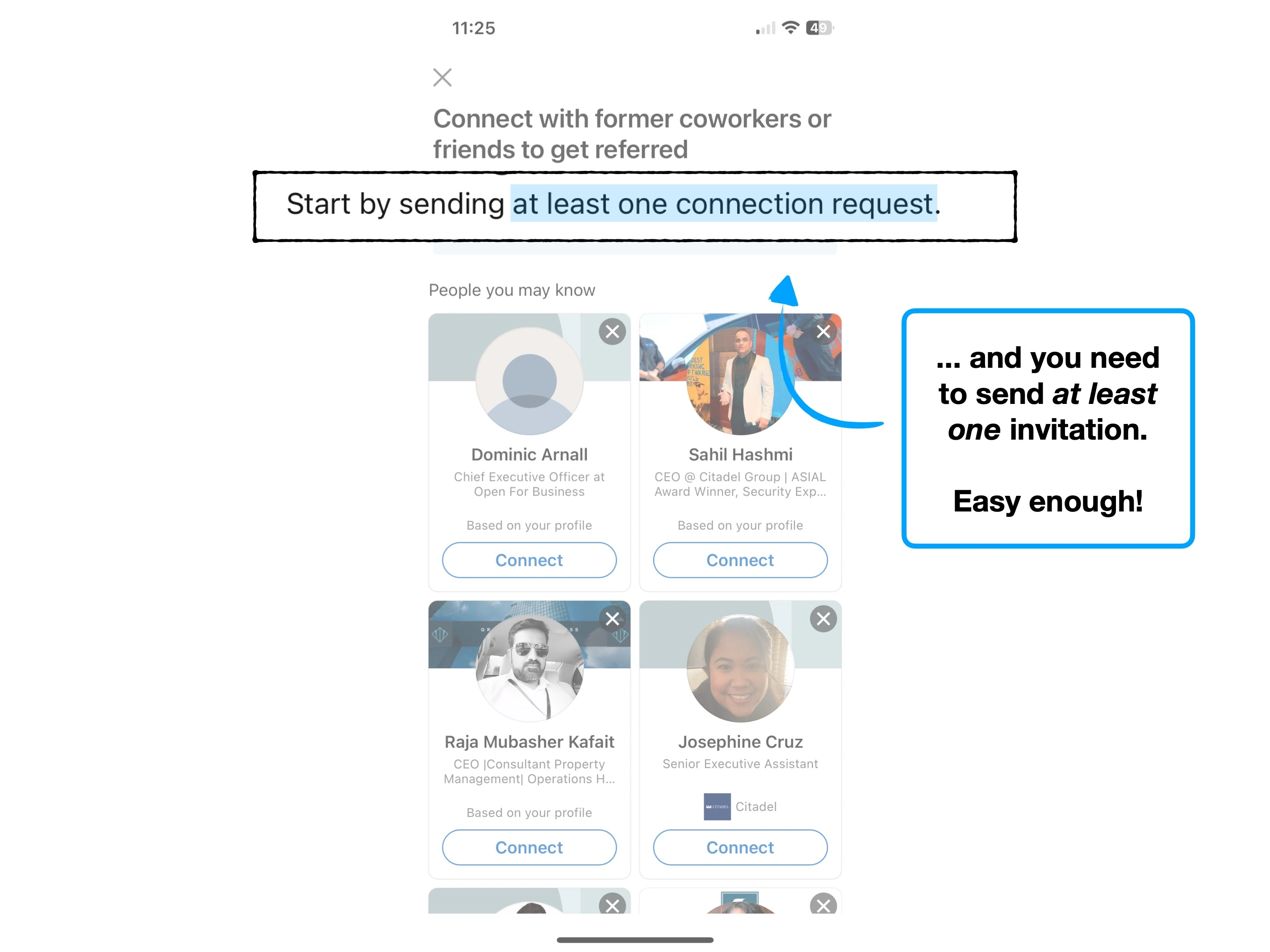
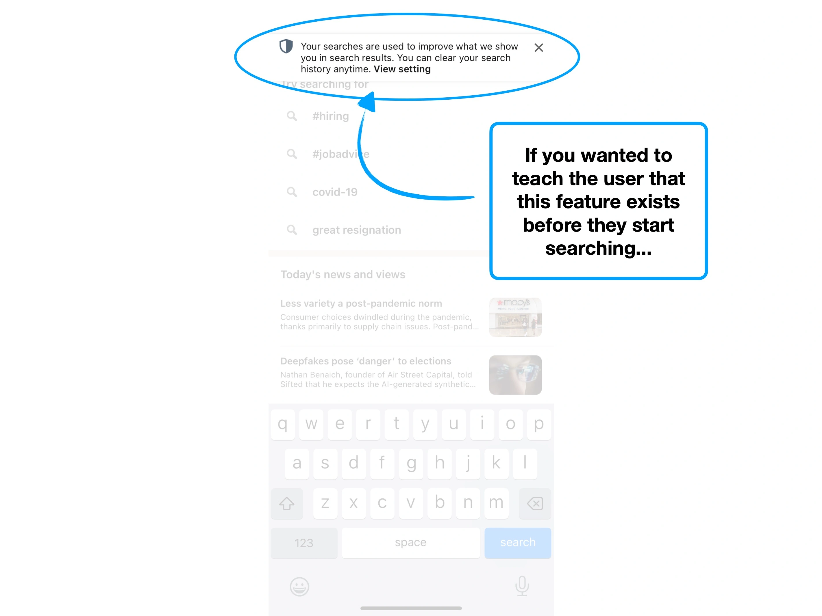
It may sound trivial, but it can actually be fairly easy to lose track of where your onboarding triggers are, and have an accurate oversight of all of the prompts that new users will see.
There are often multiple scripts and external services, dynamic user paths, marketing material that's organised and run by seperate teams and concurrent A/B tests—it gets complicated.
The end result often reminds me of the Simpsons skit, where Sideshow Bob is repeatedly stepping on rakes.

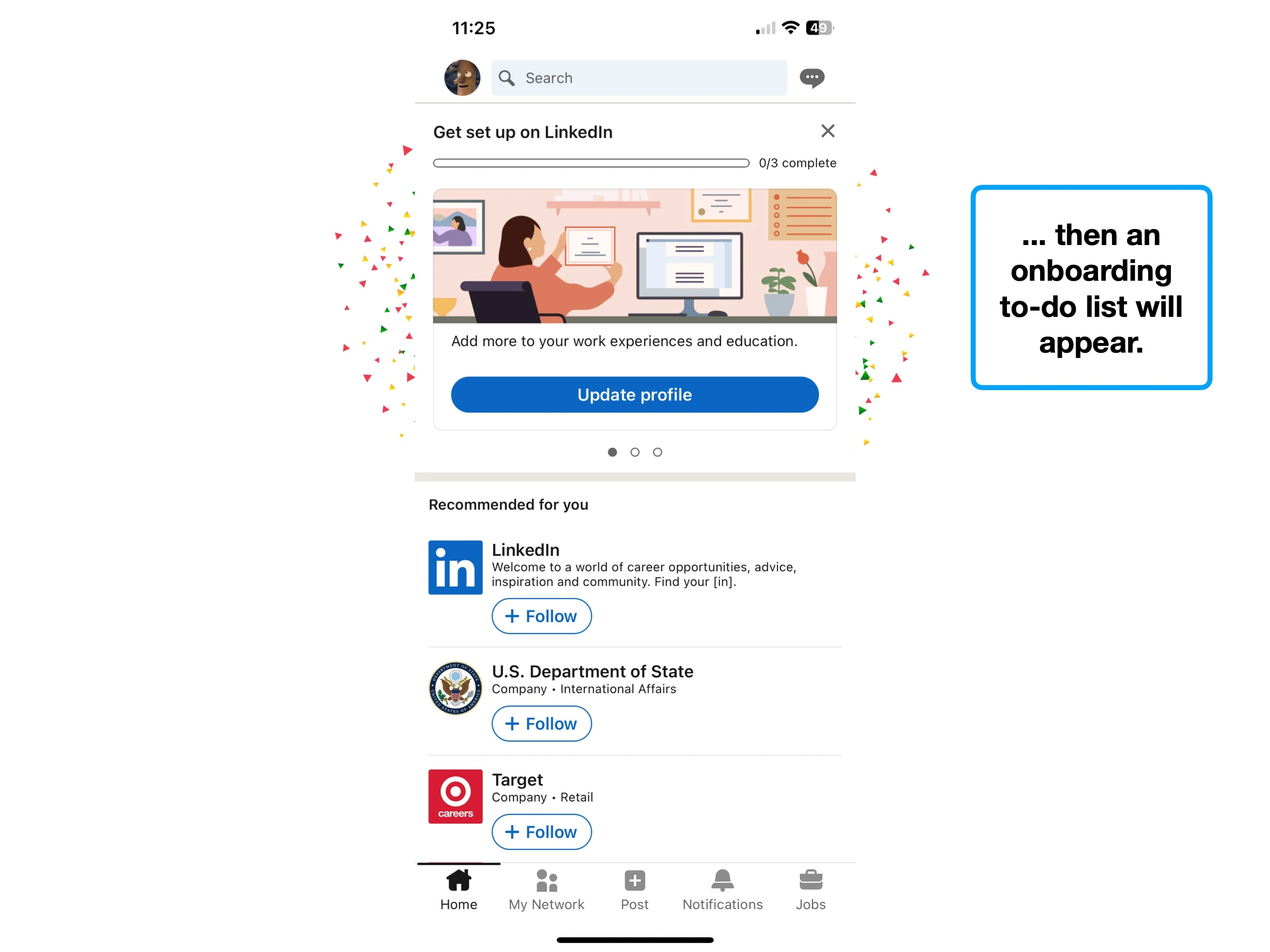
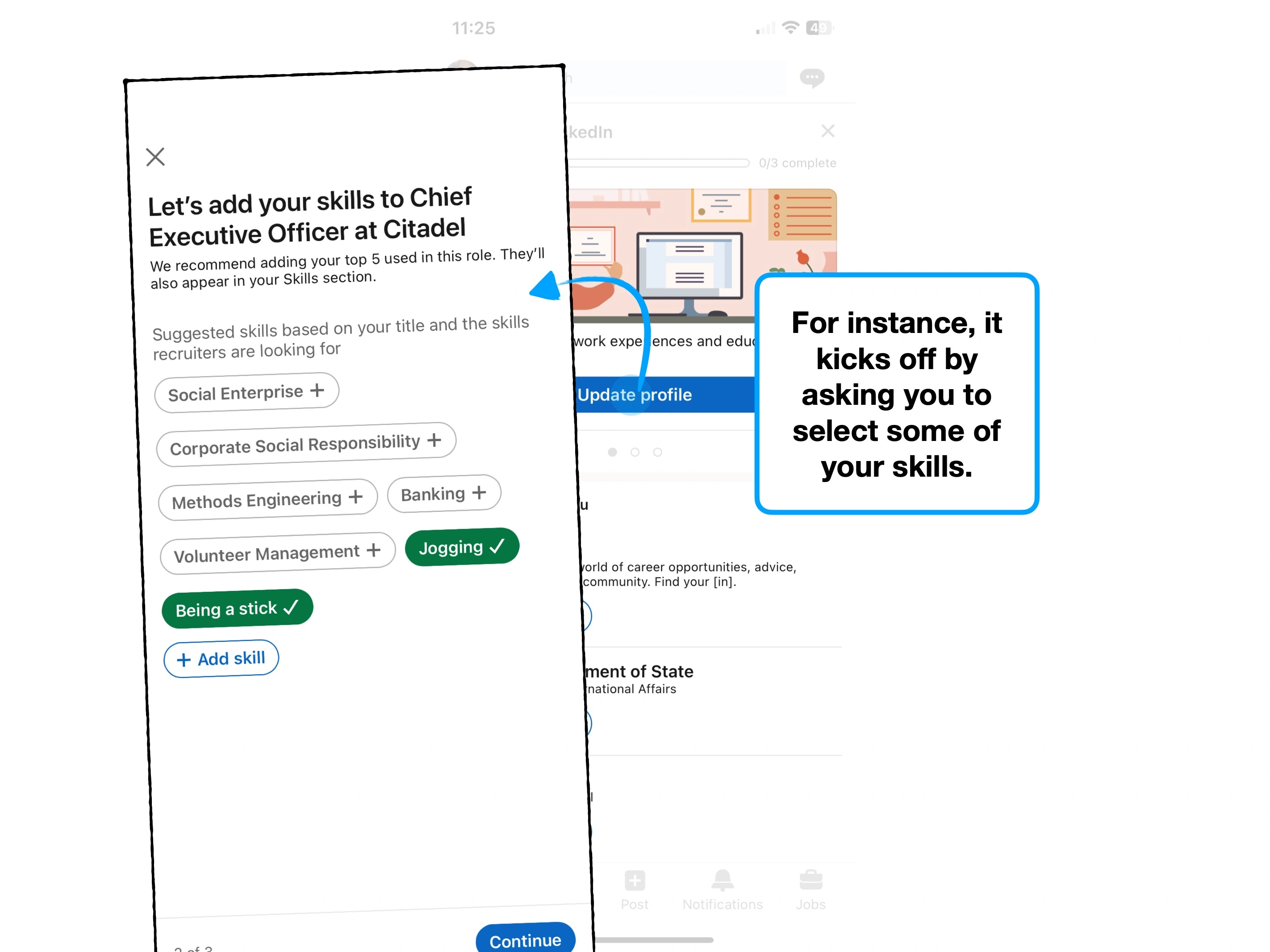
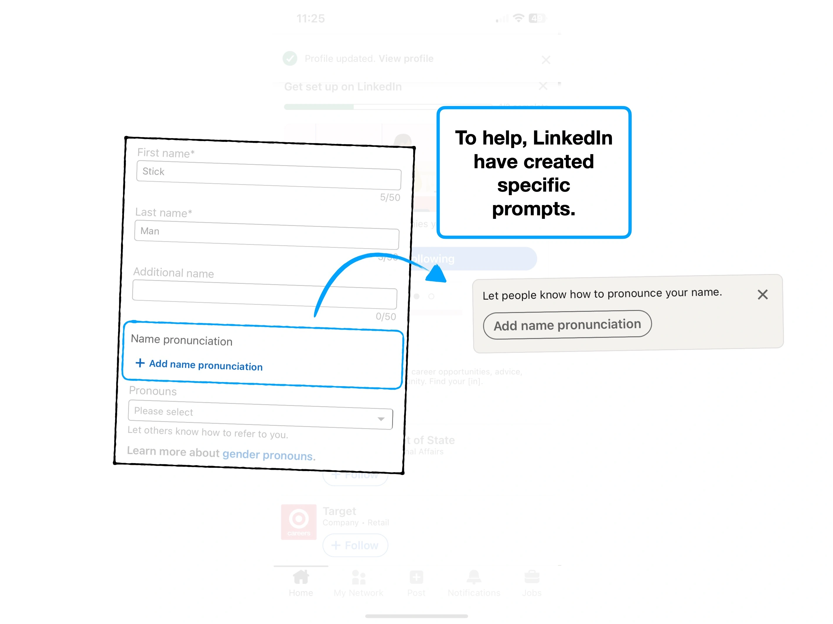
To talk through an example, it's common to set onboarding triggers for the first time that a user interacts with a 'thing'.
e.g., "the first time they open the menu → show a prompt for Feature X".
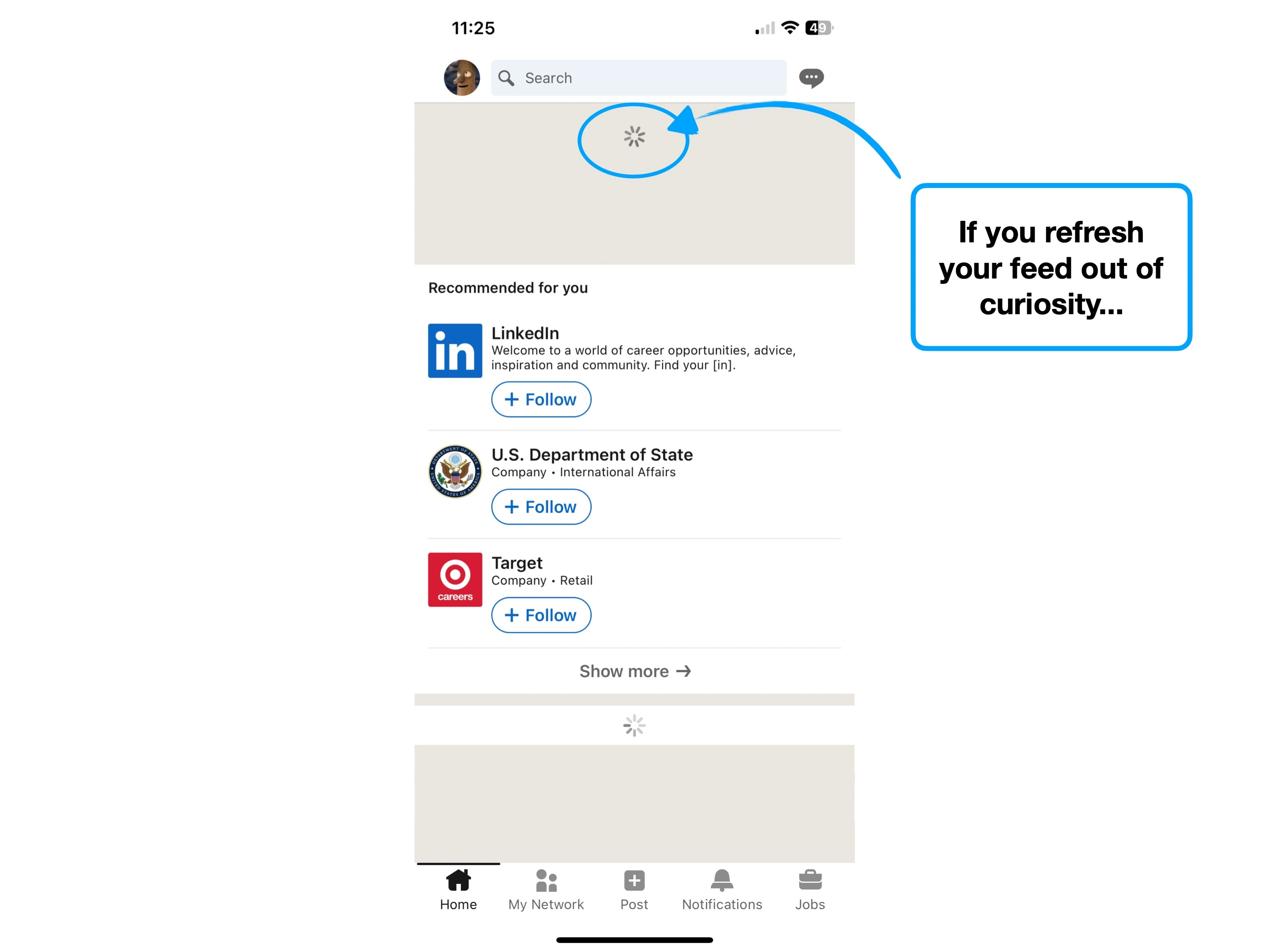
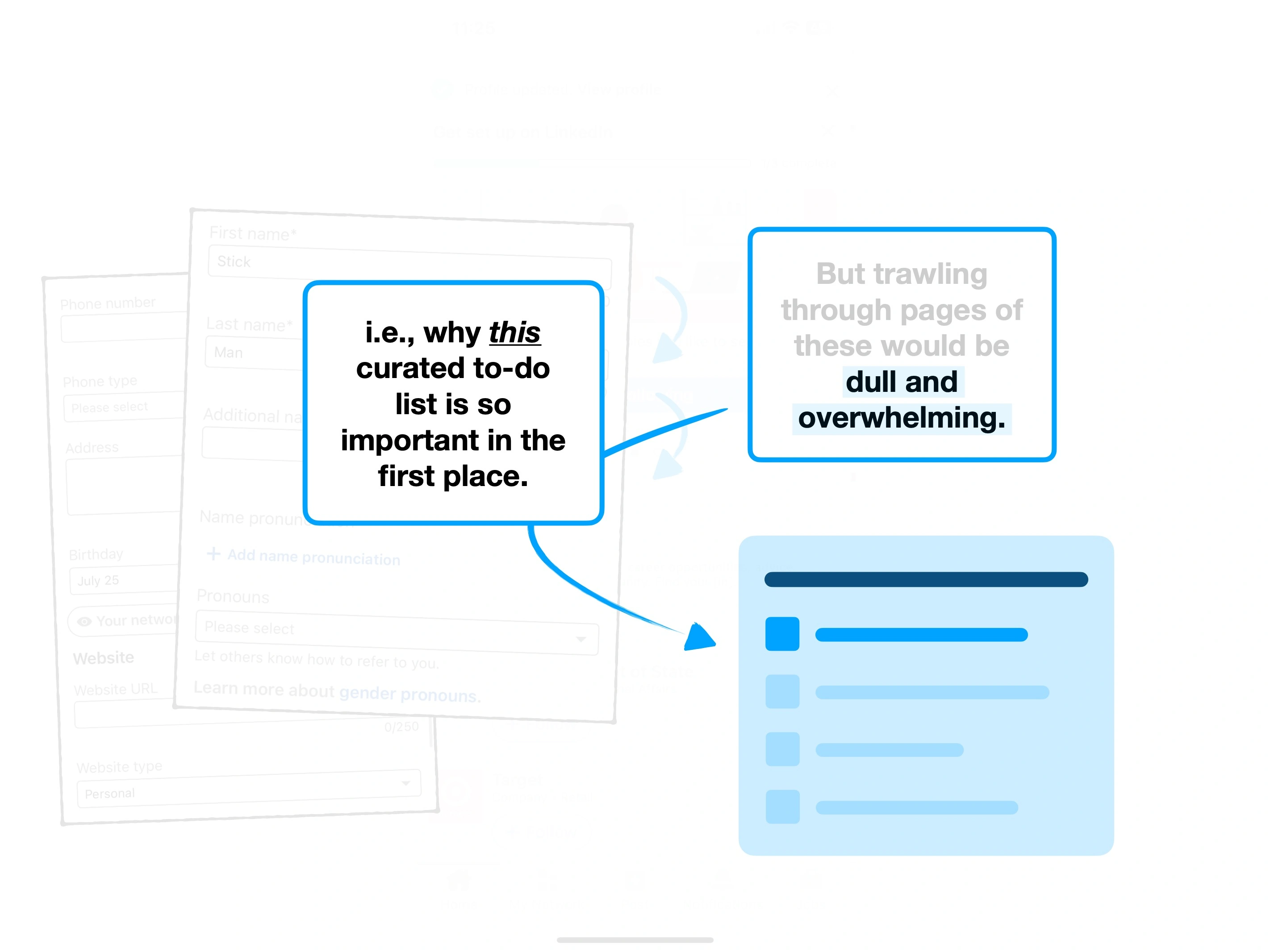
The nuanced problem is that people may trigger the onboarding, with no intention to complete or learn more about whatever it is you're serving up.
It may be curiosity, they might be lost, or perhaps they're trying to stay focused on a very specific task.
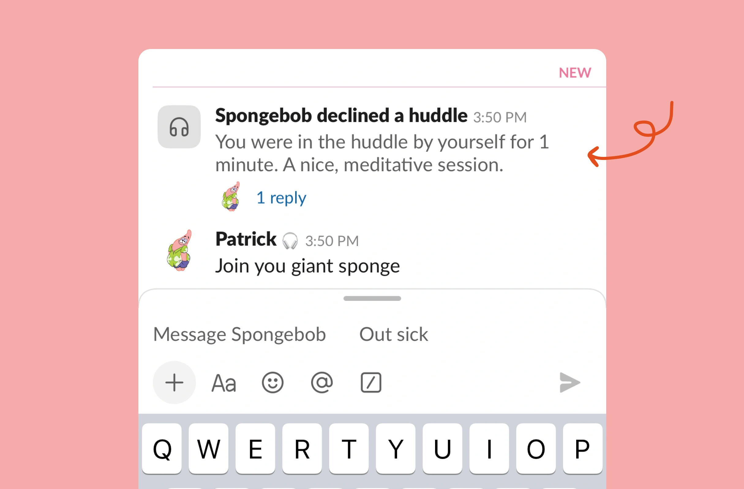
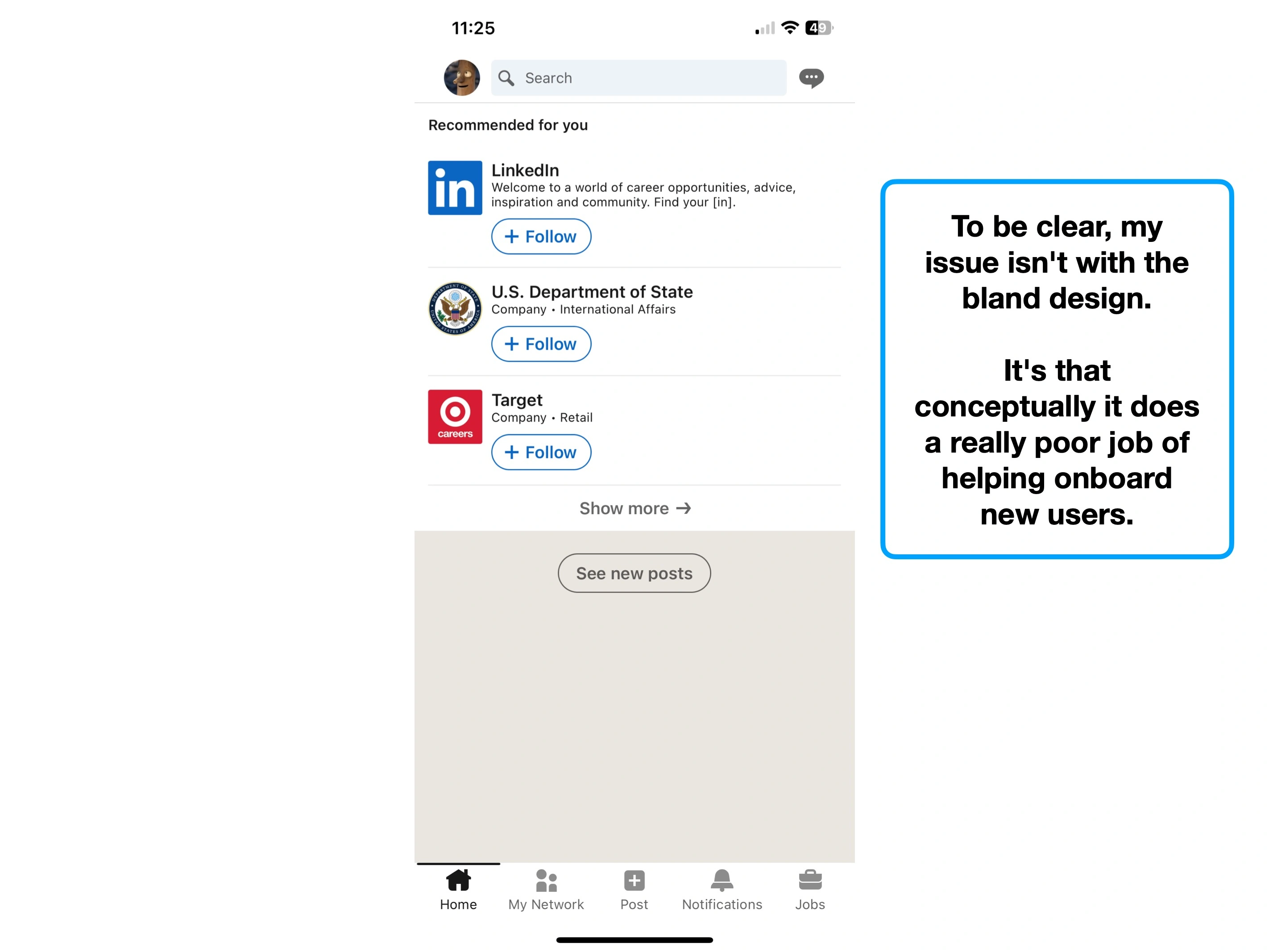
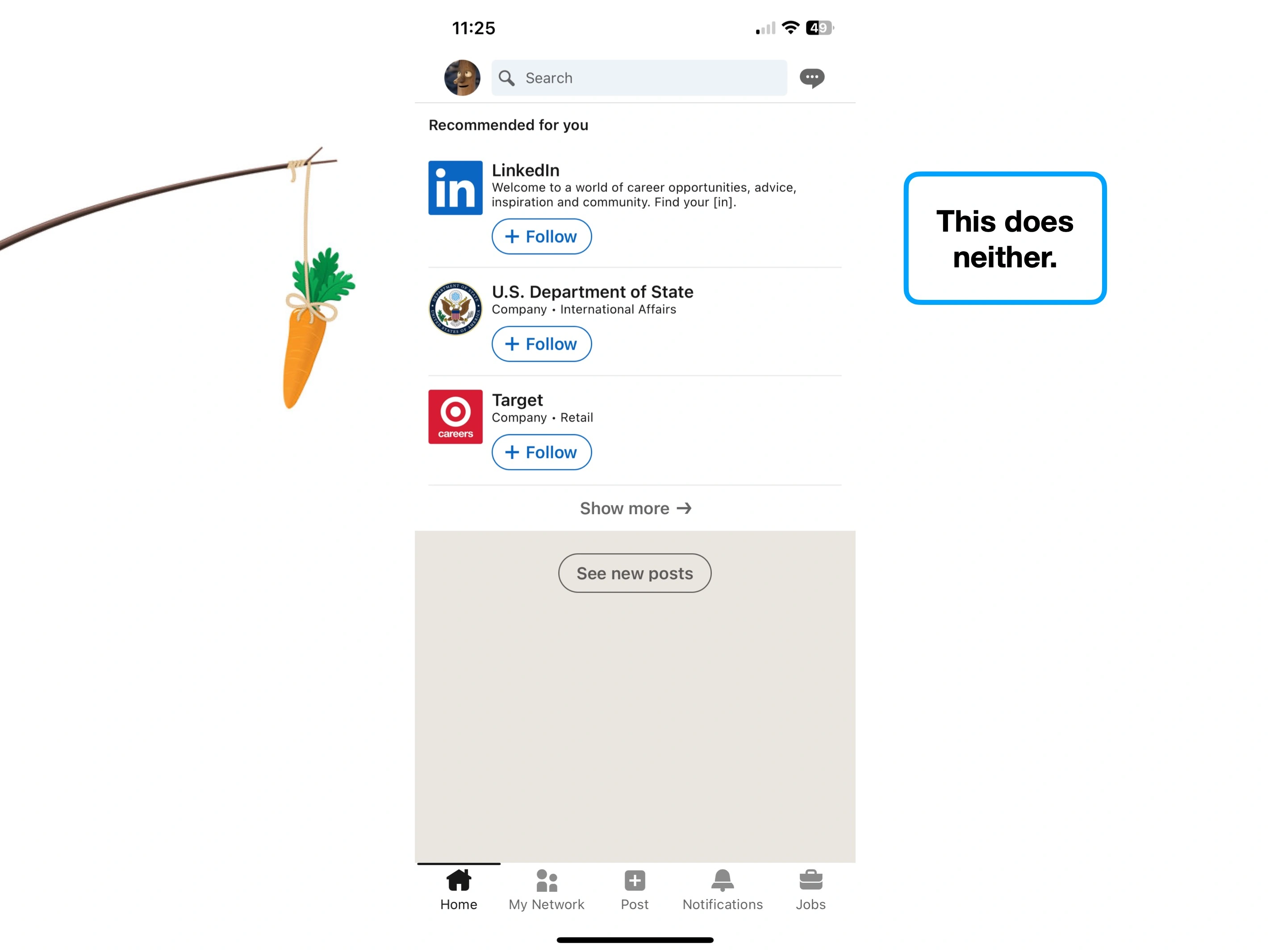
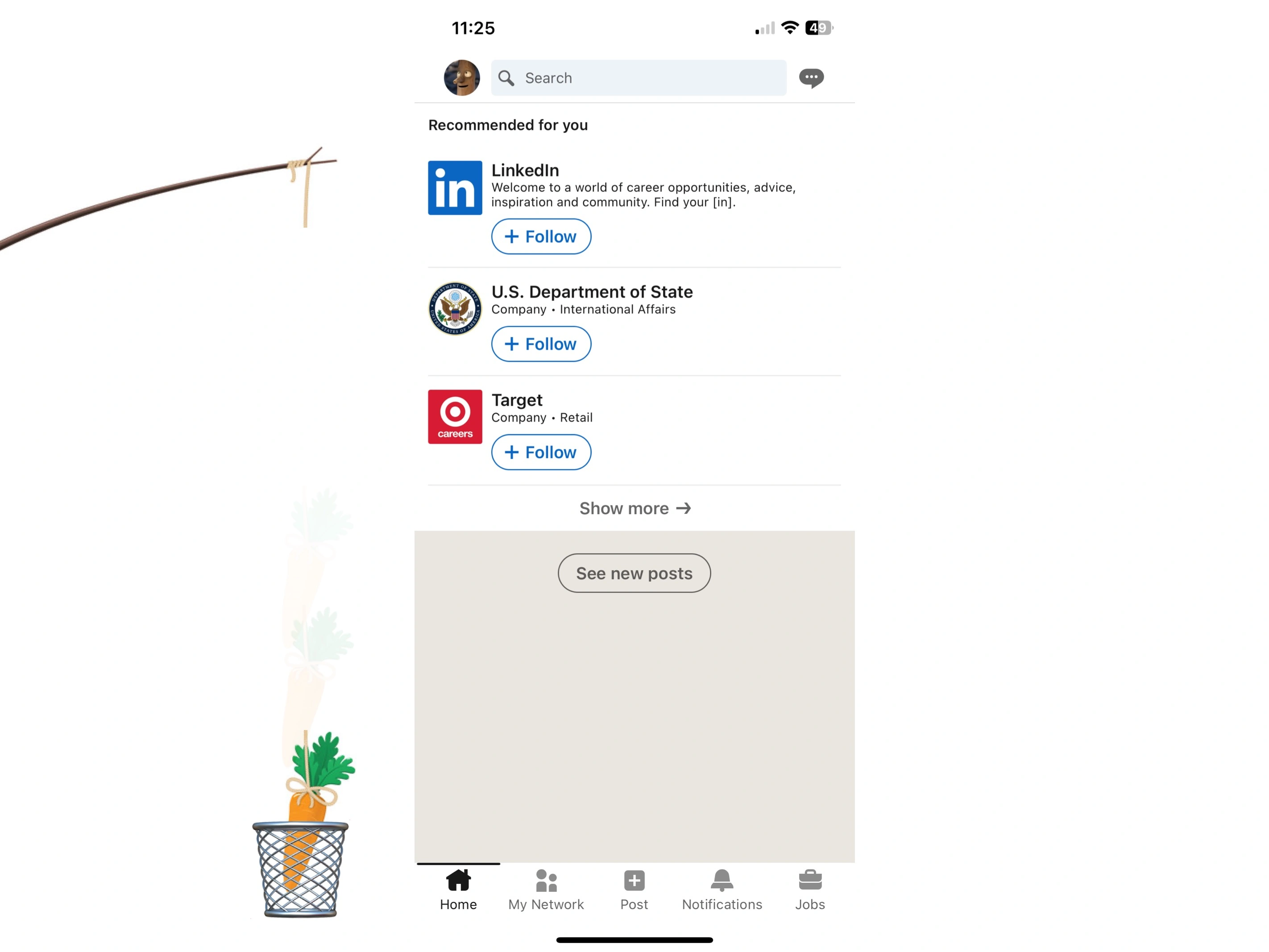
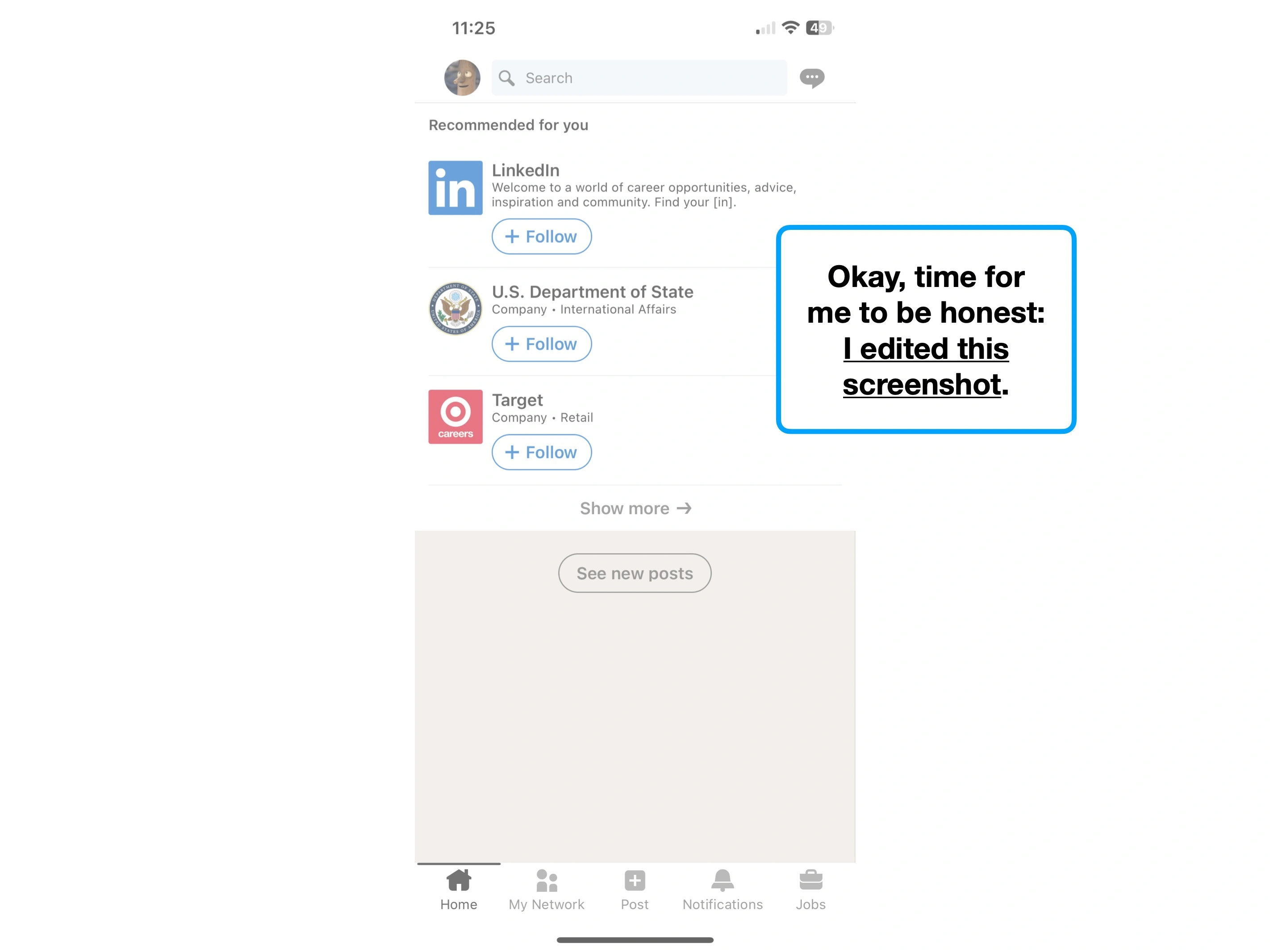
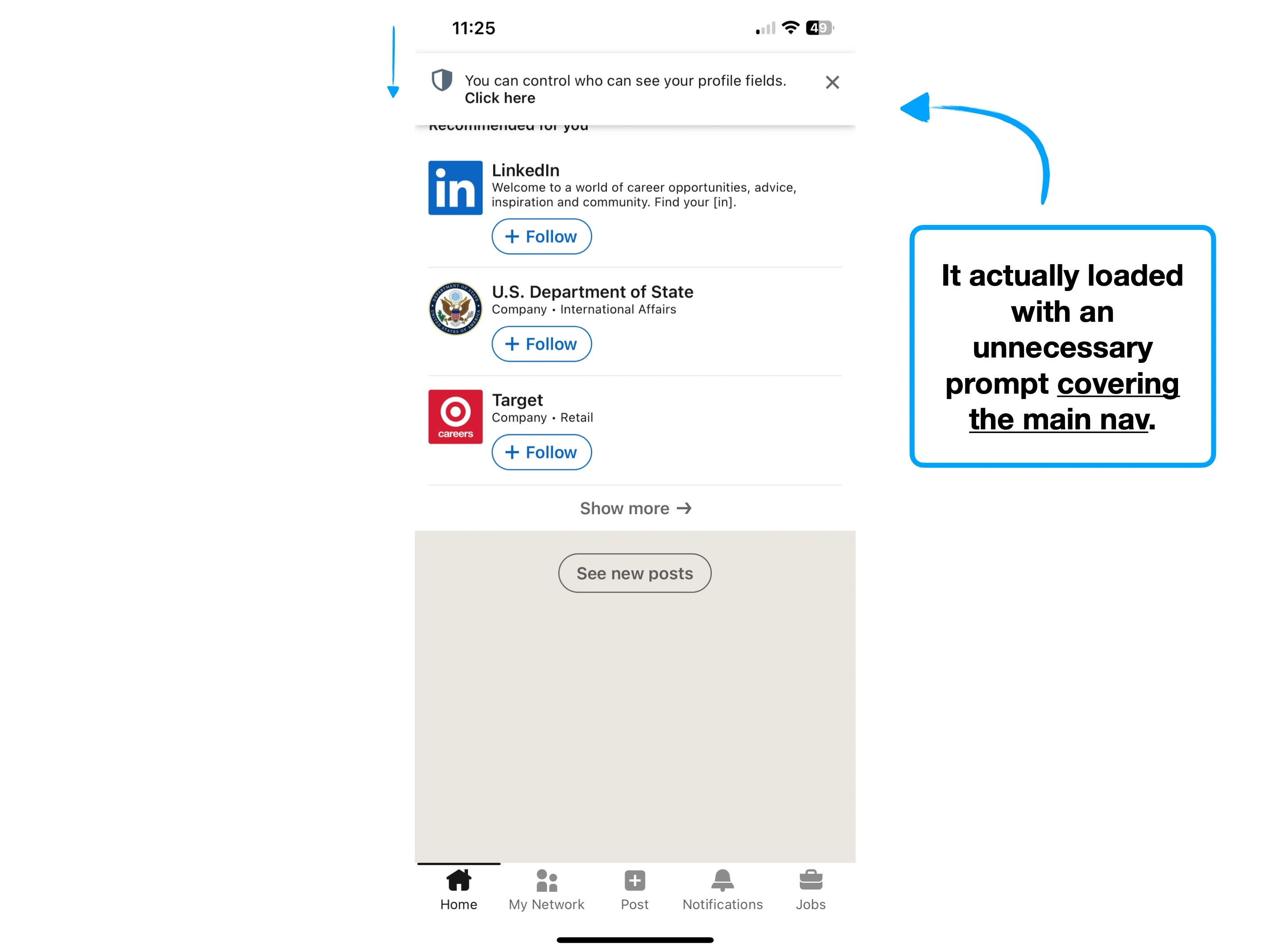
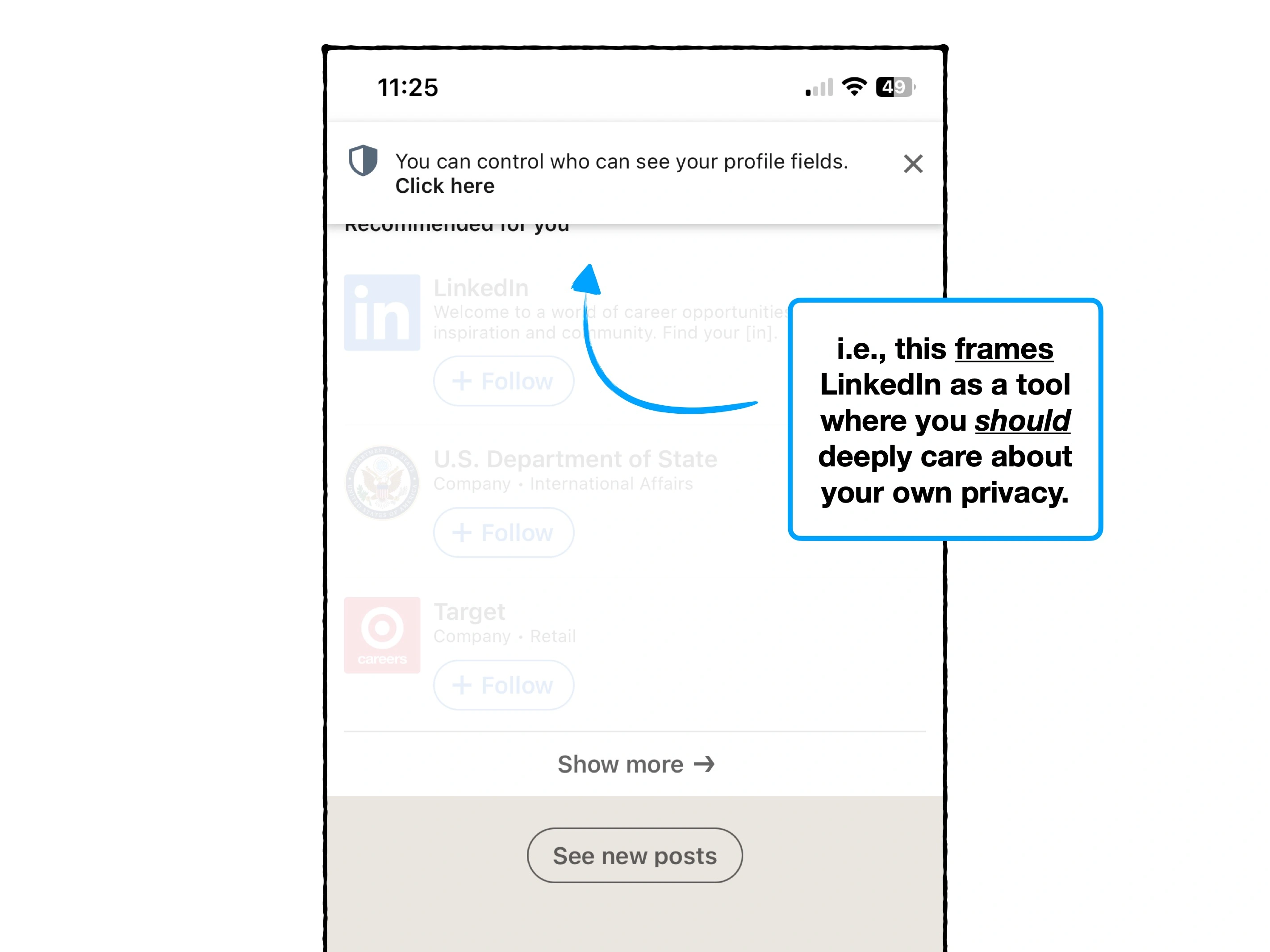
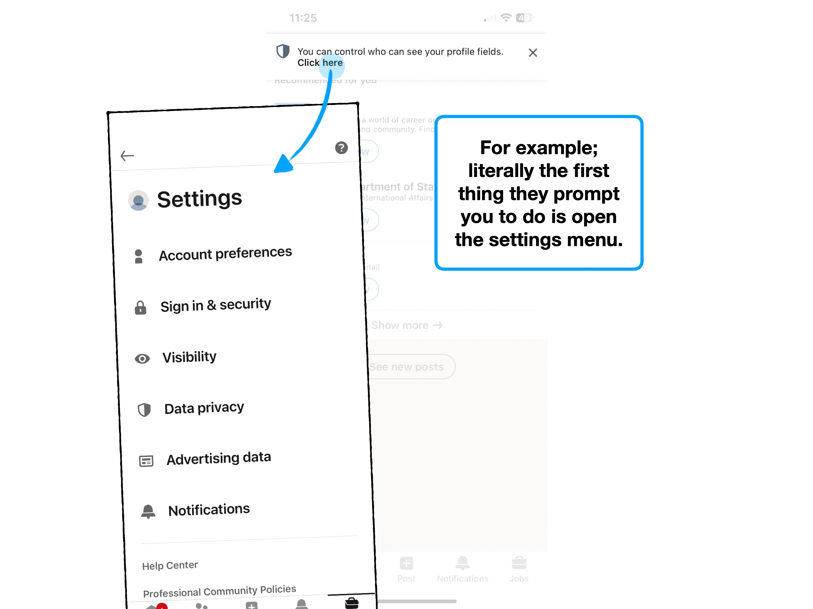
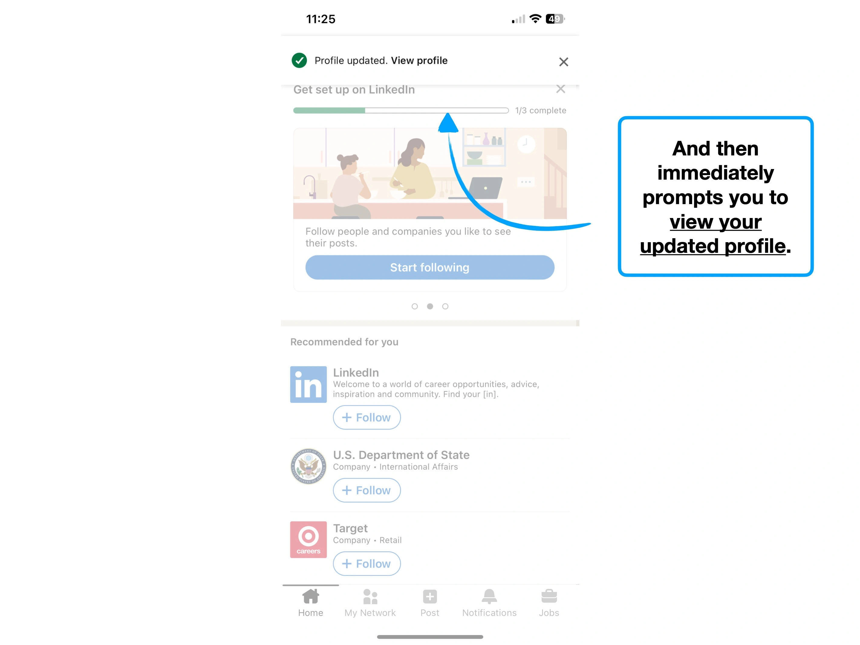
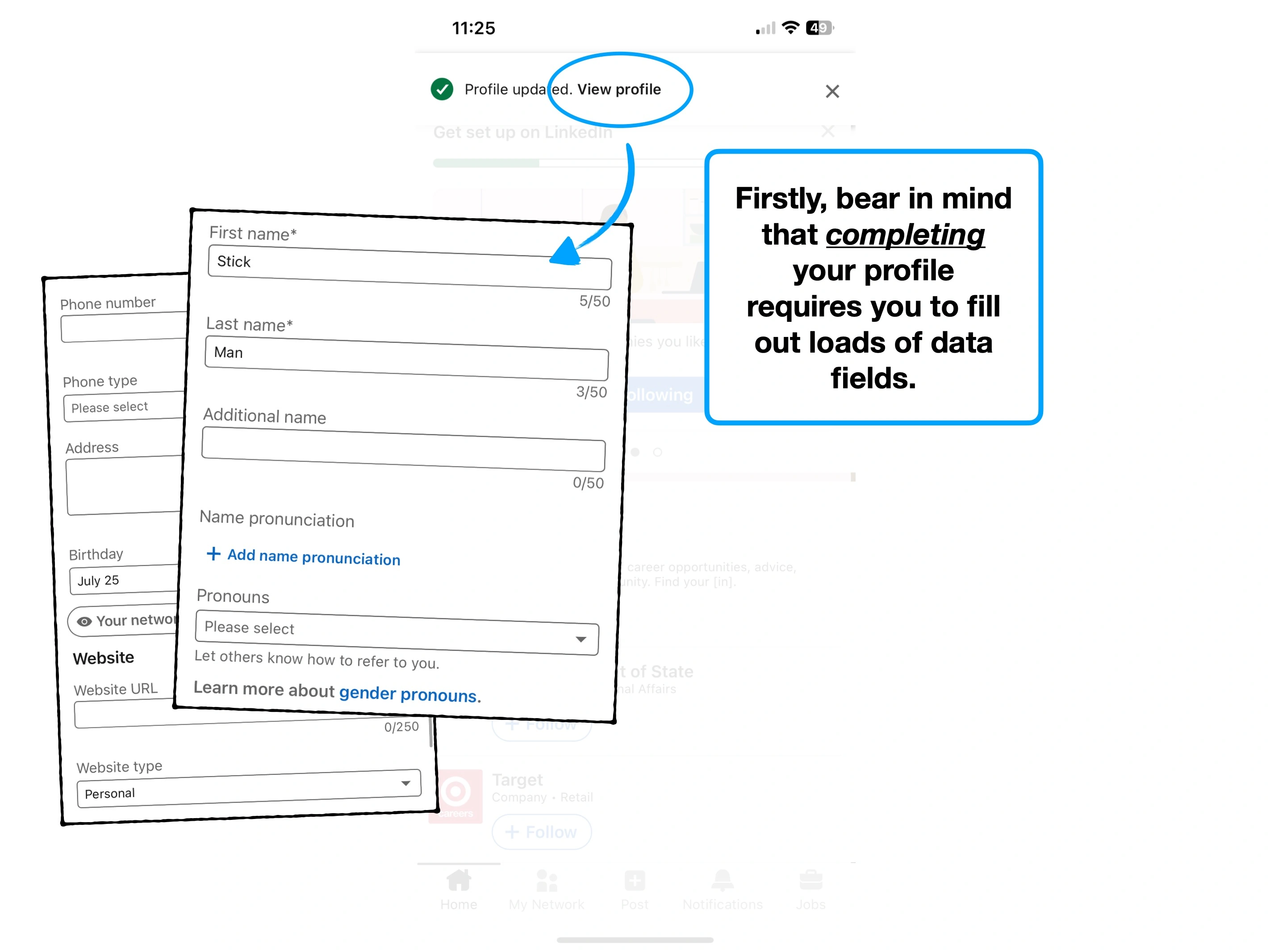
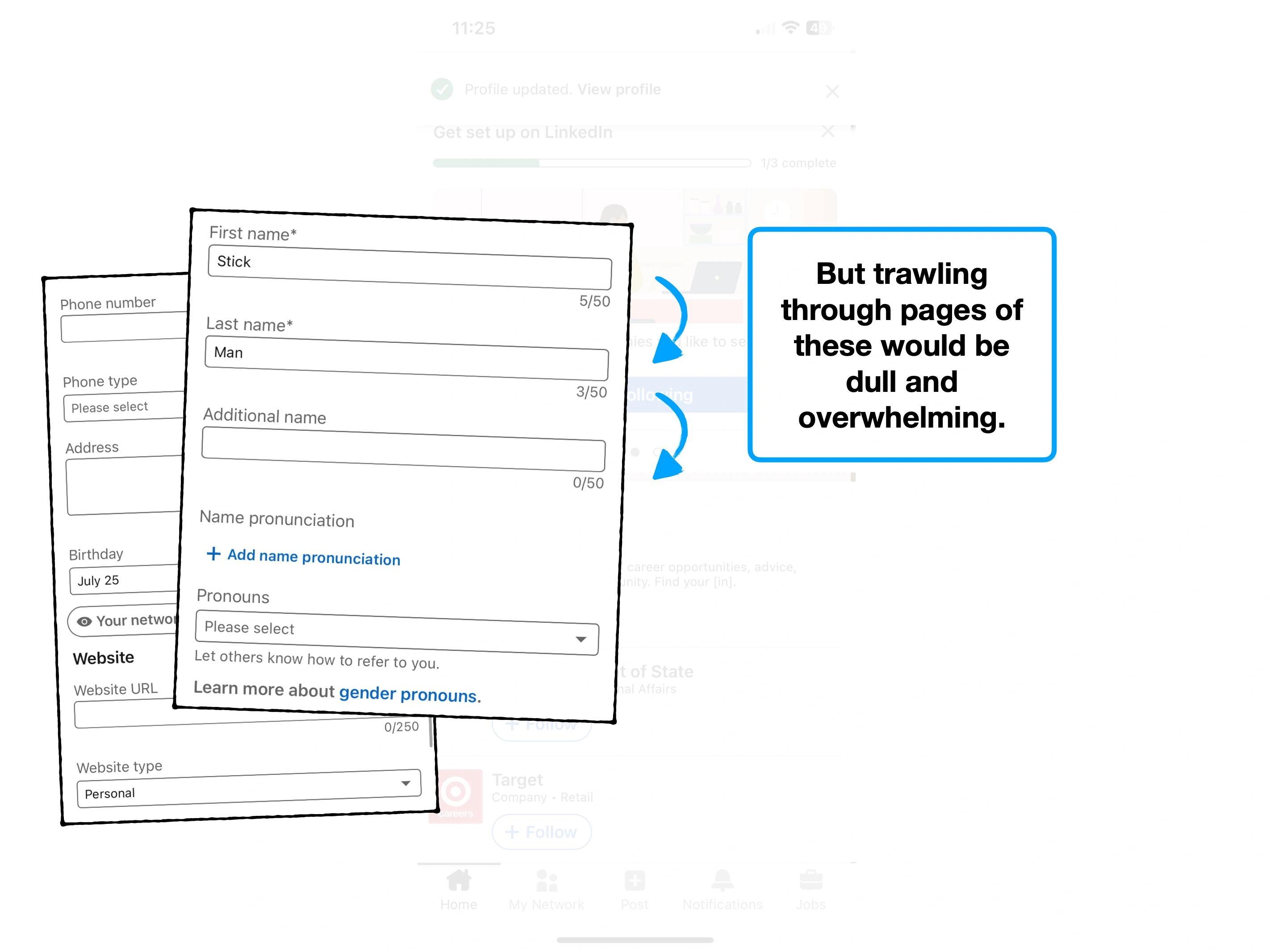
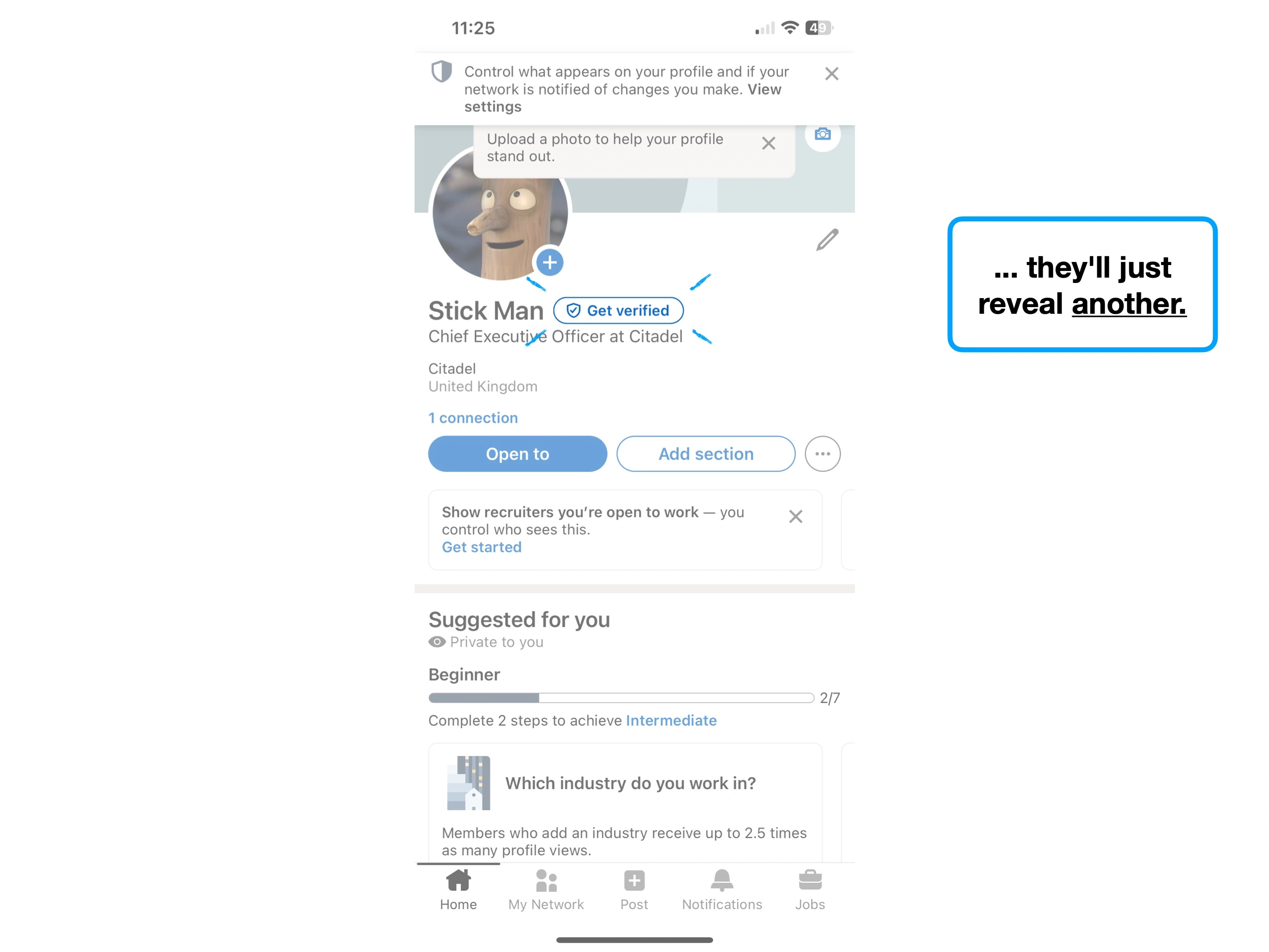
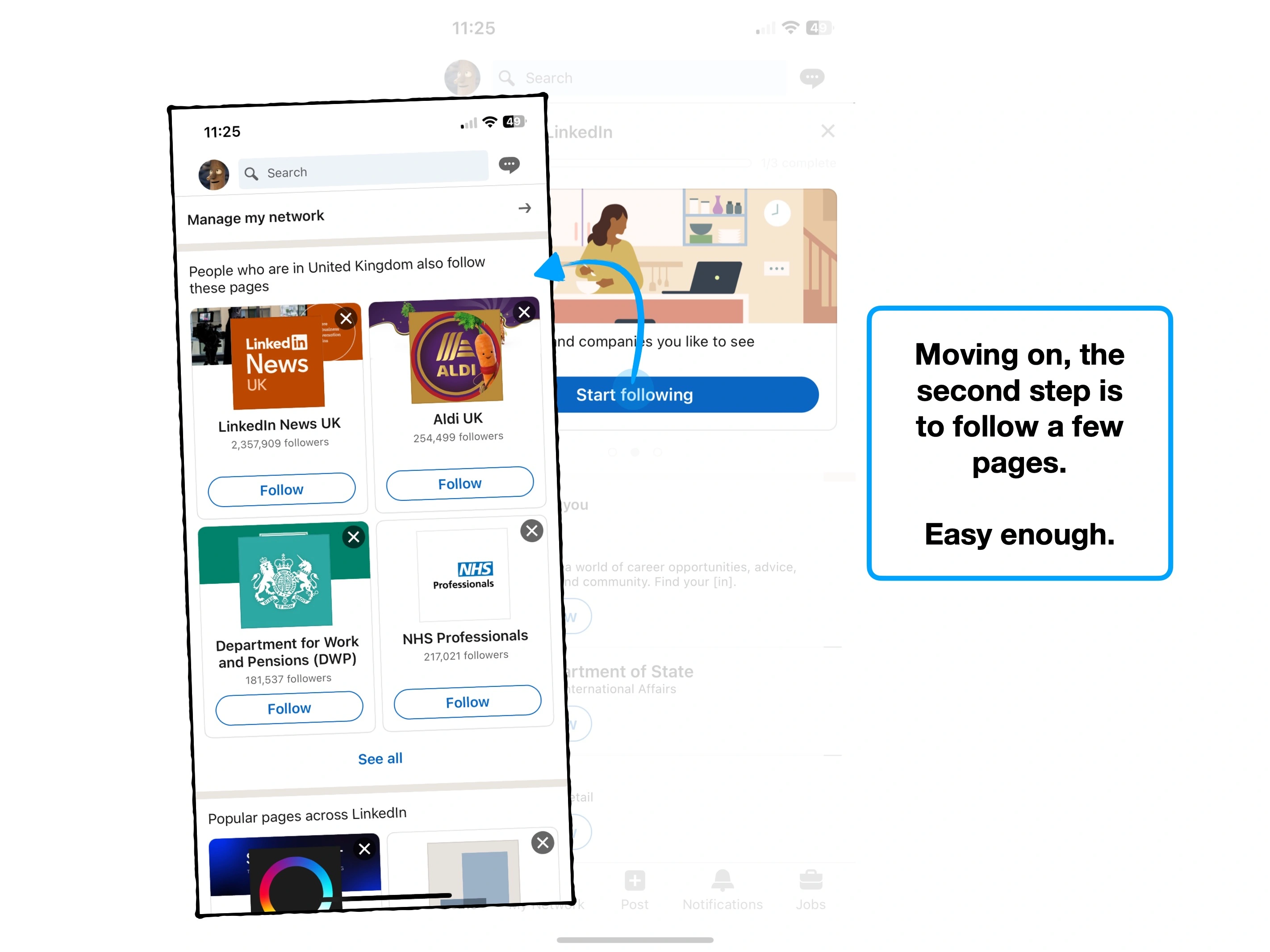
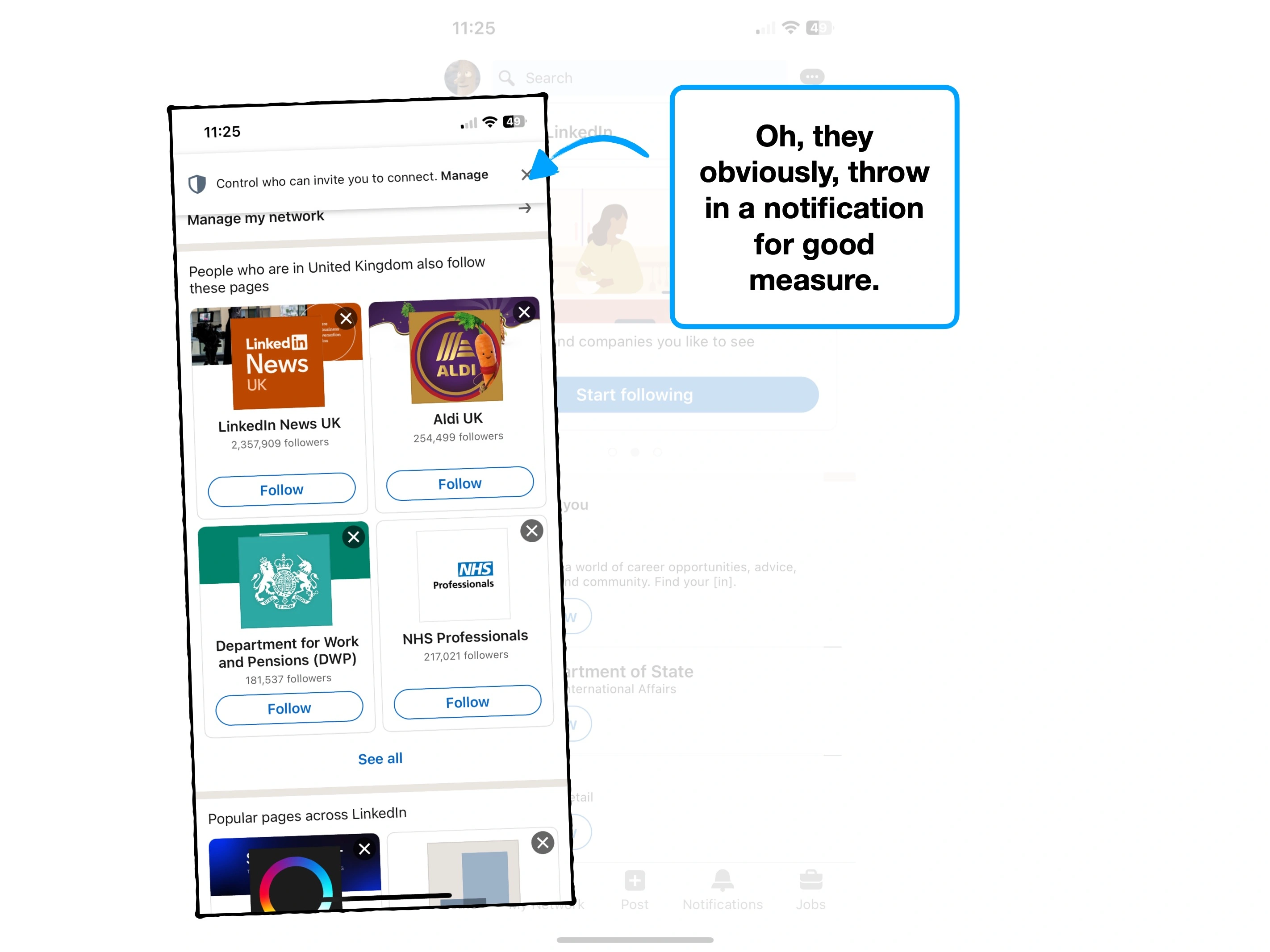
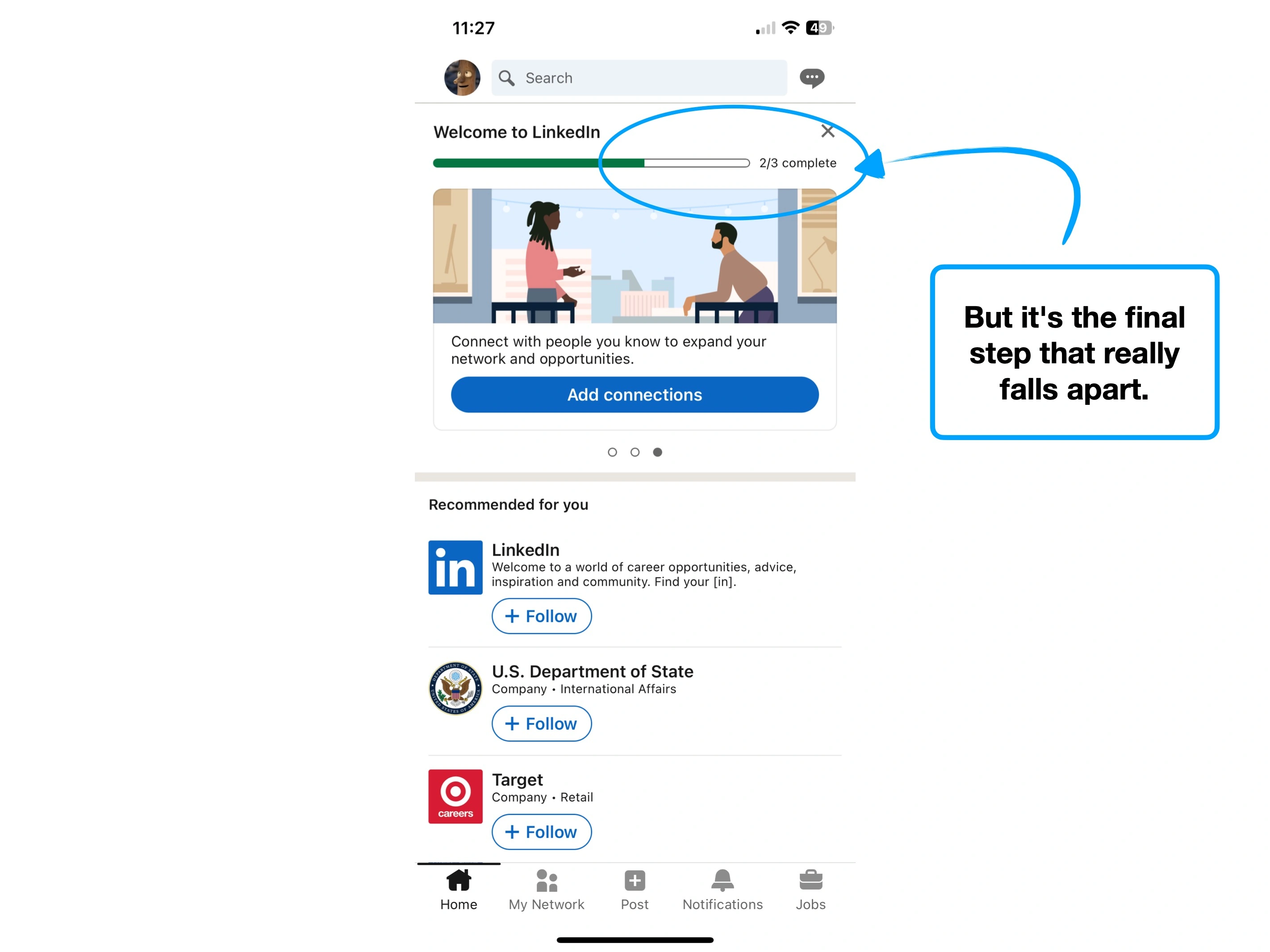
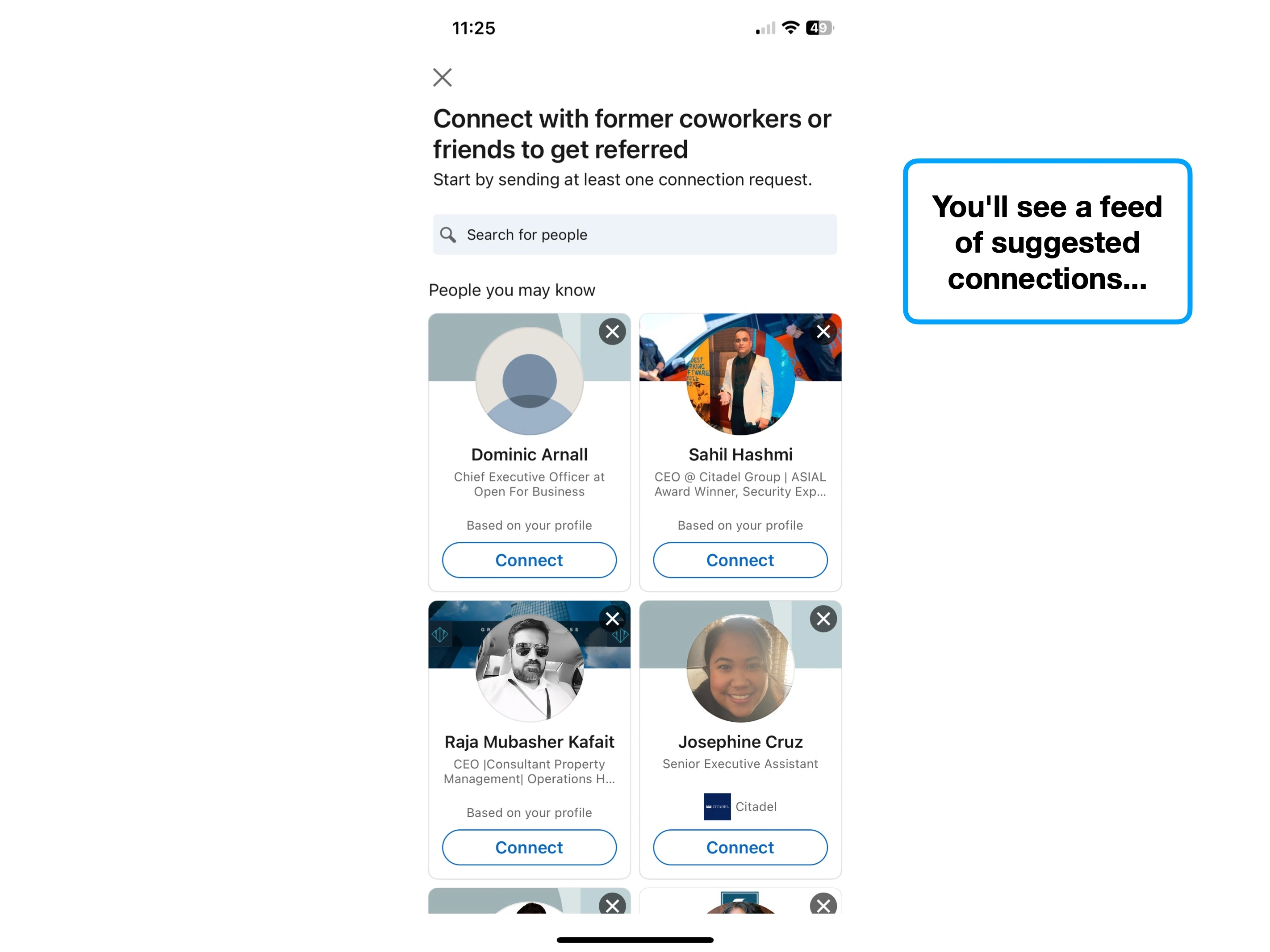
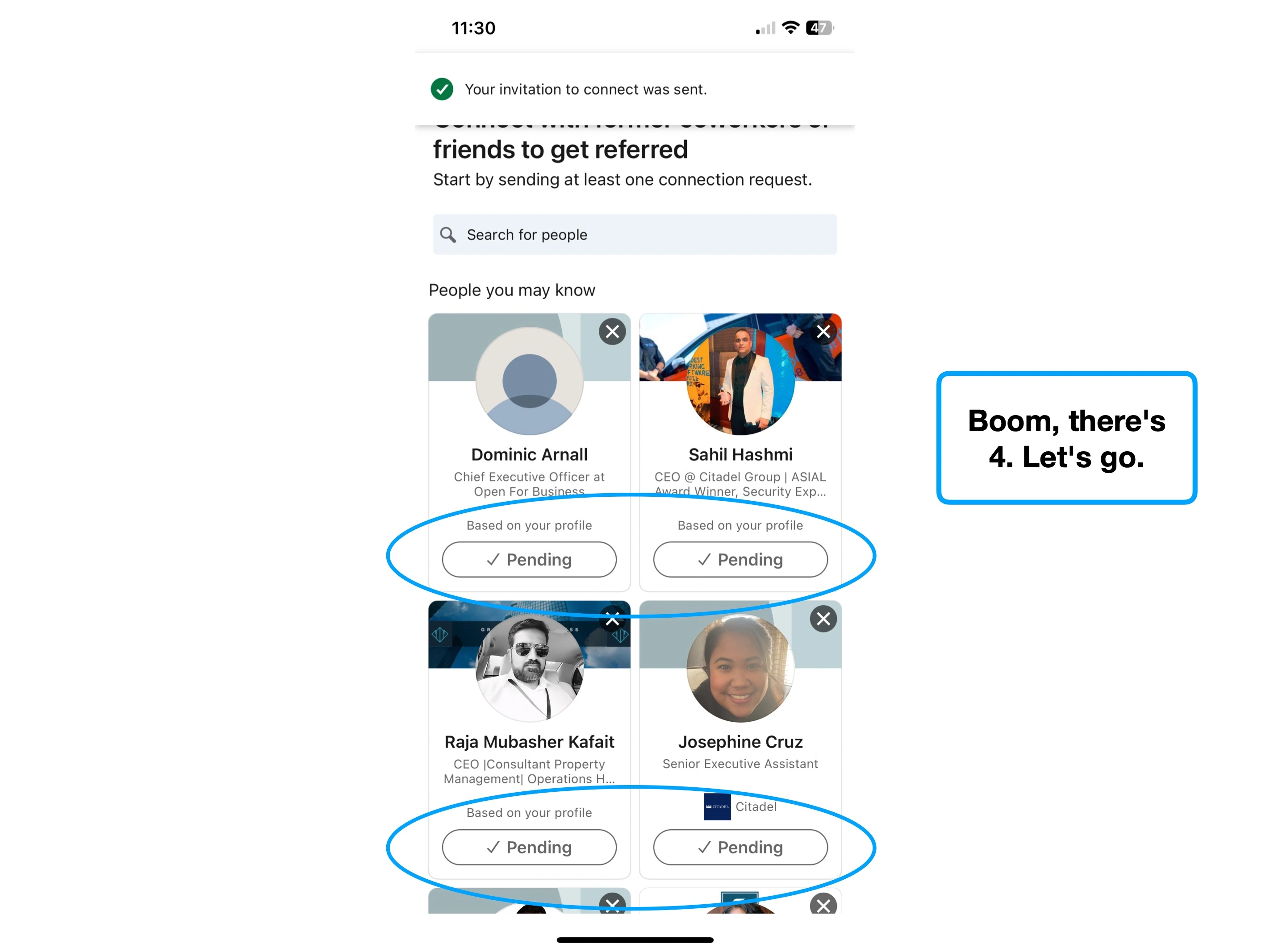
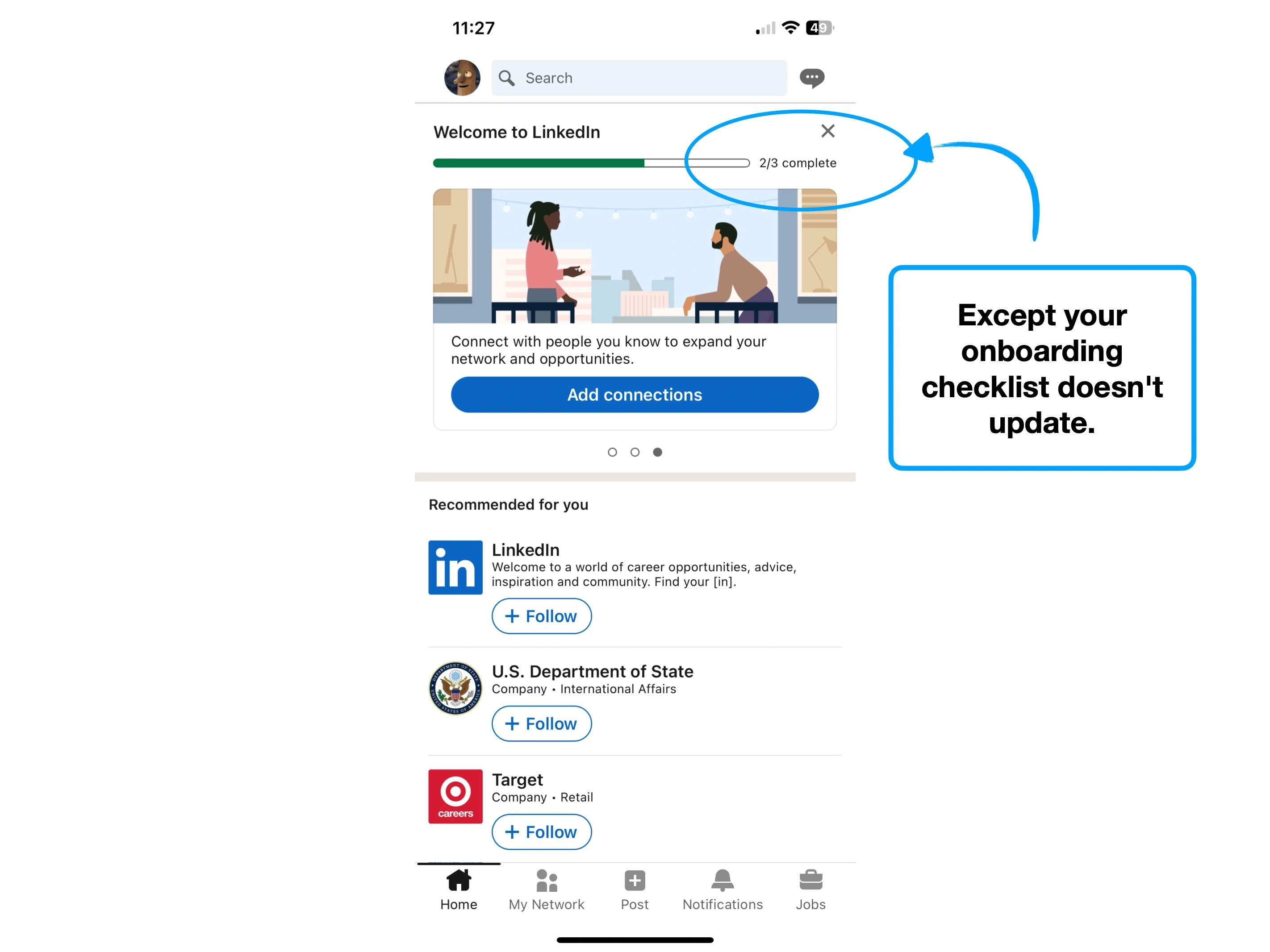
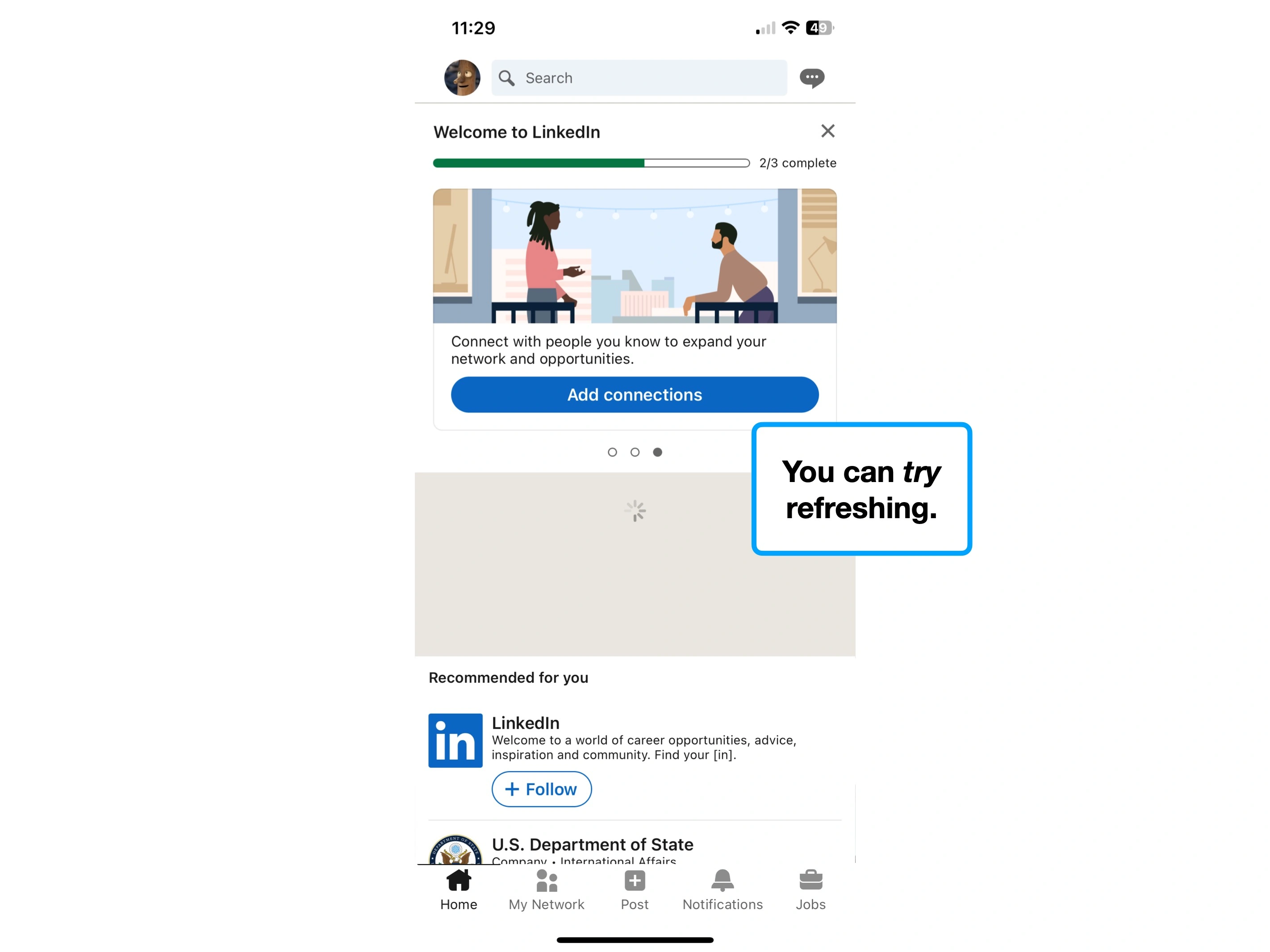
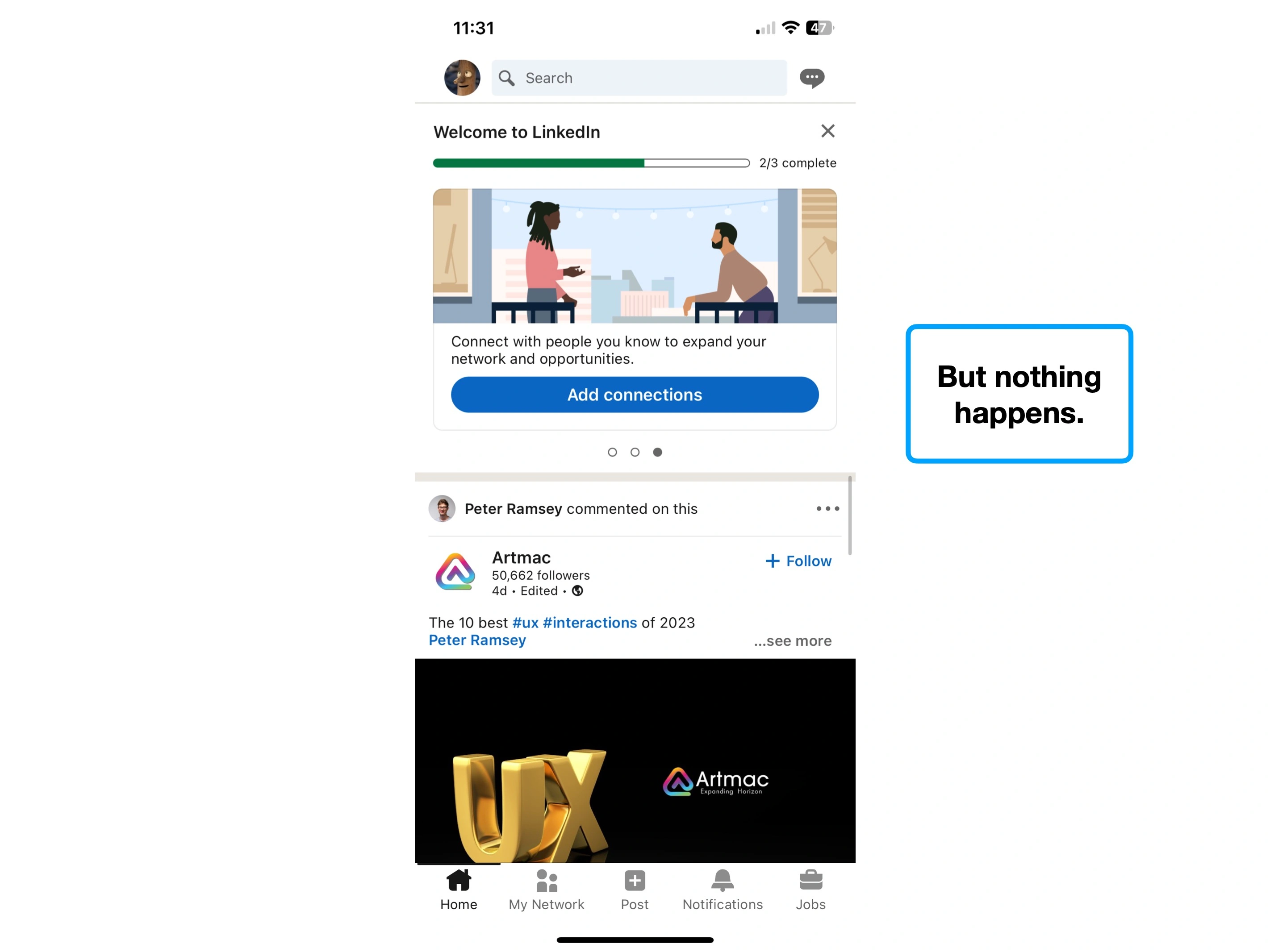
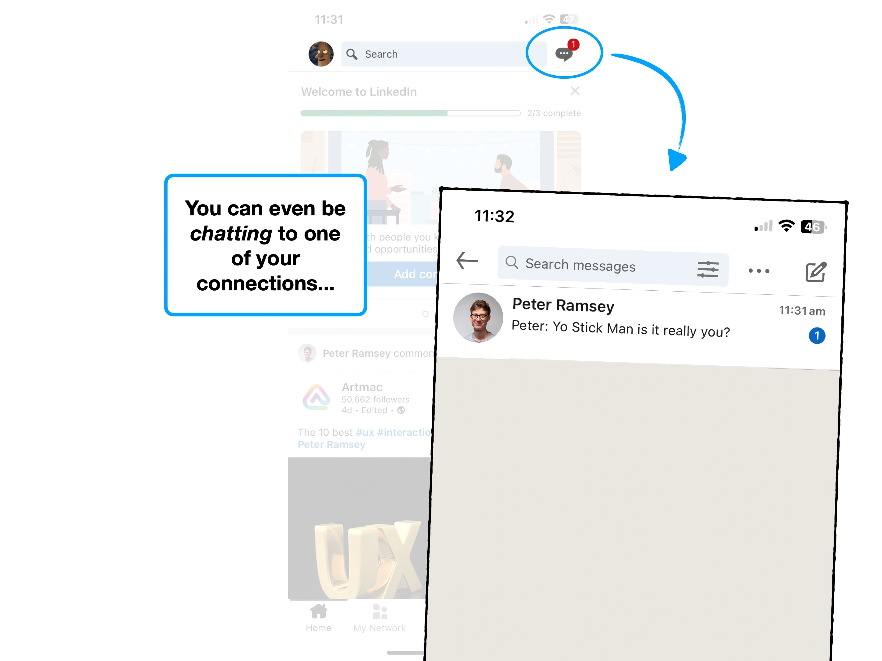
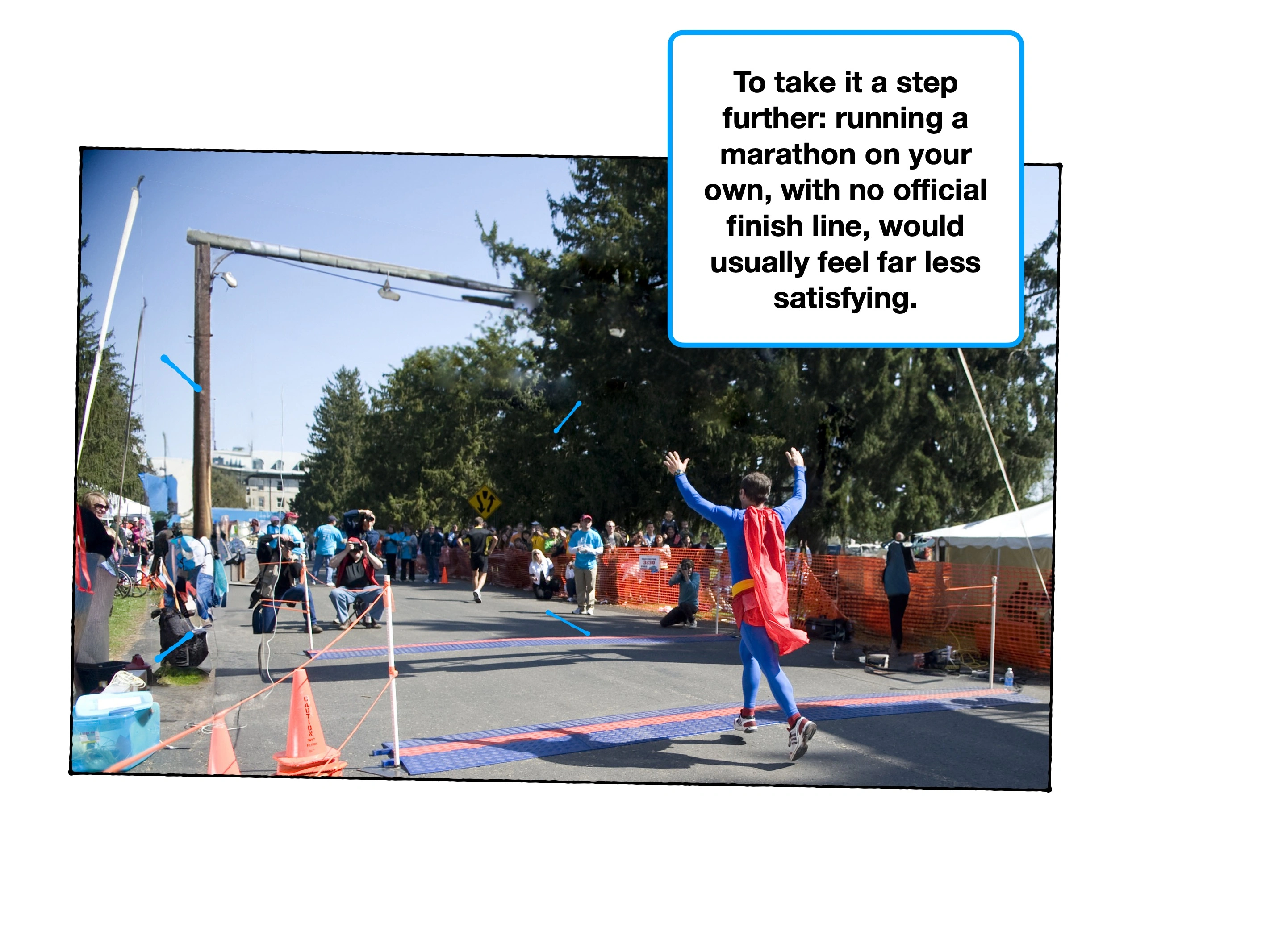
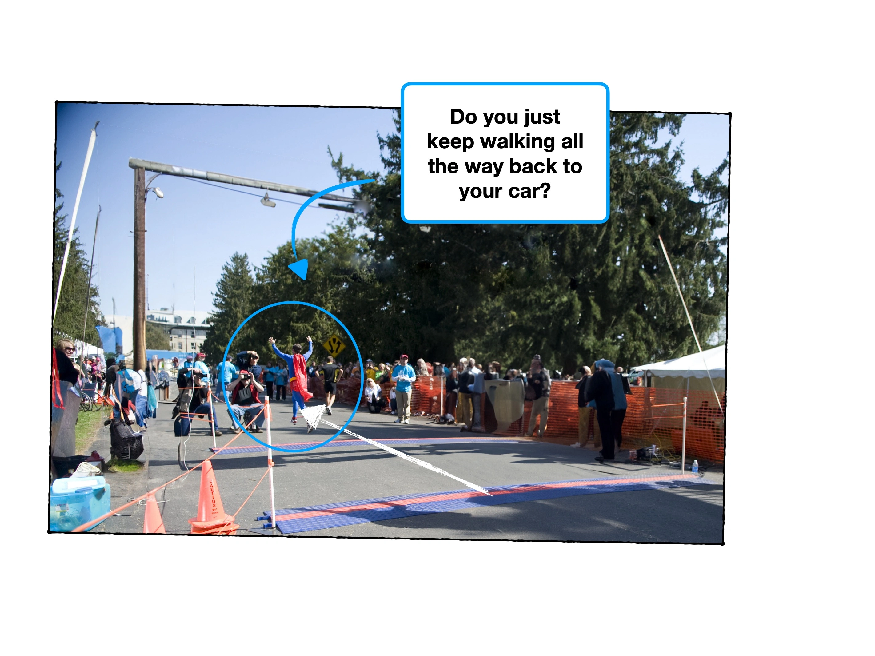
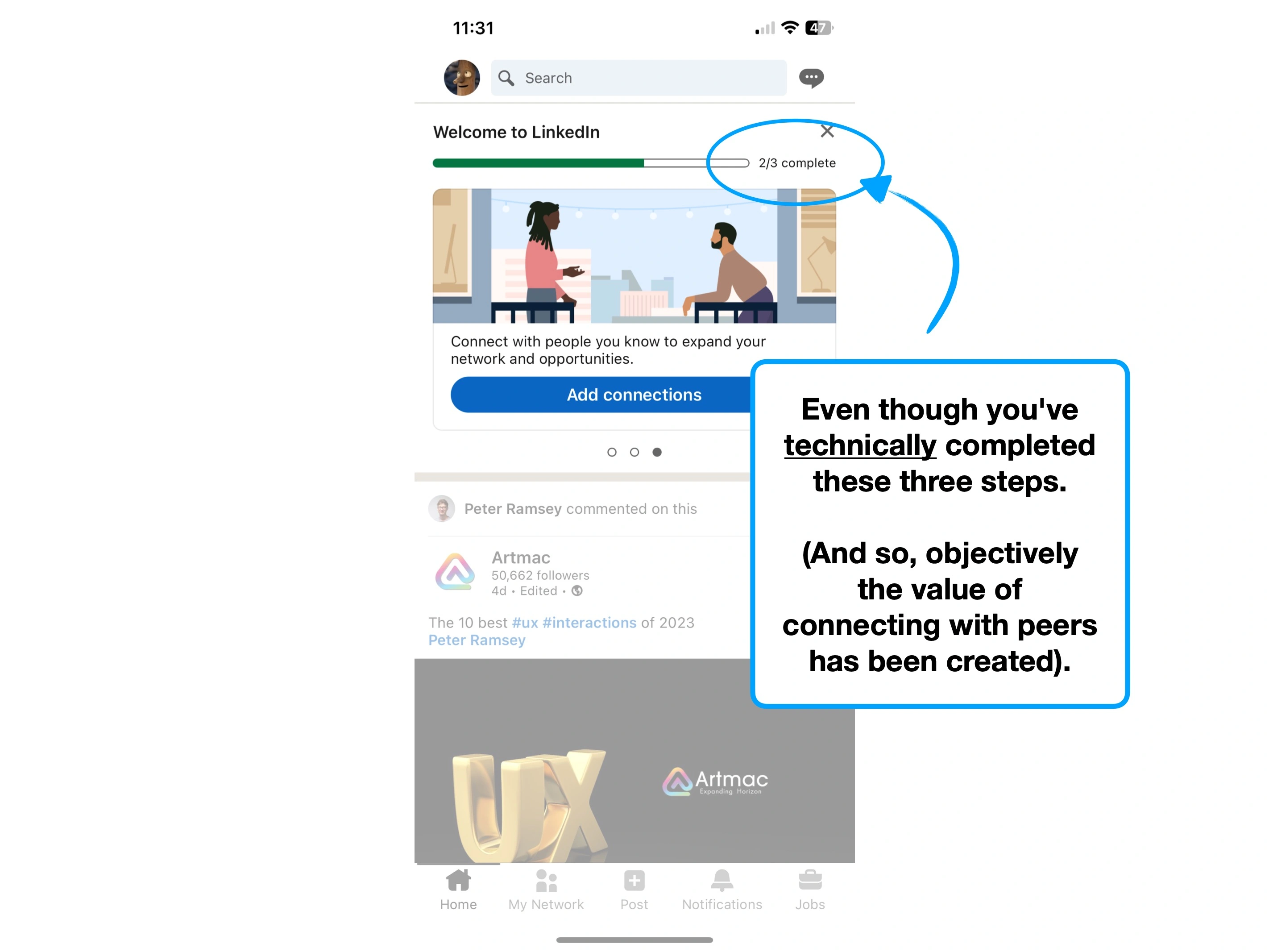
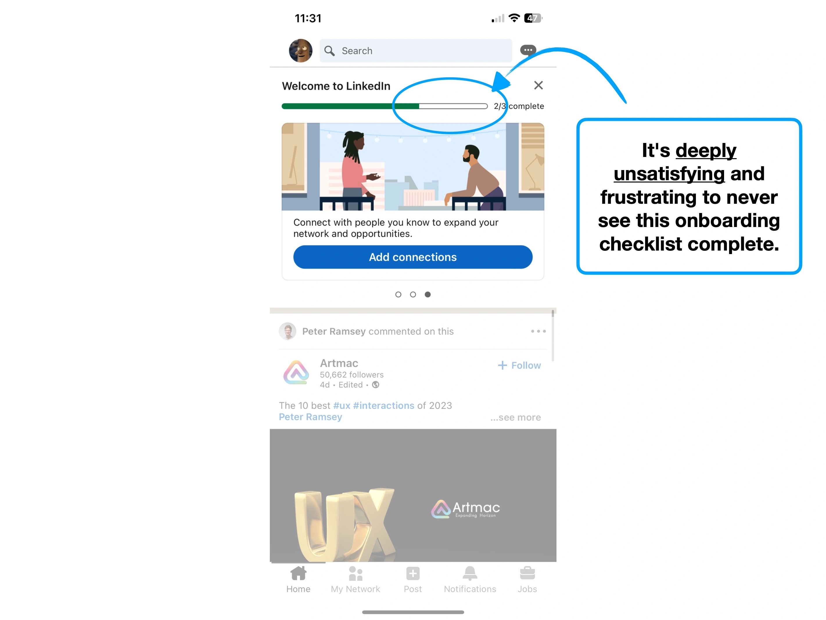
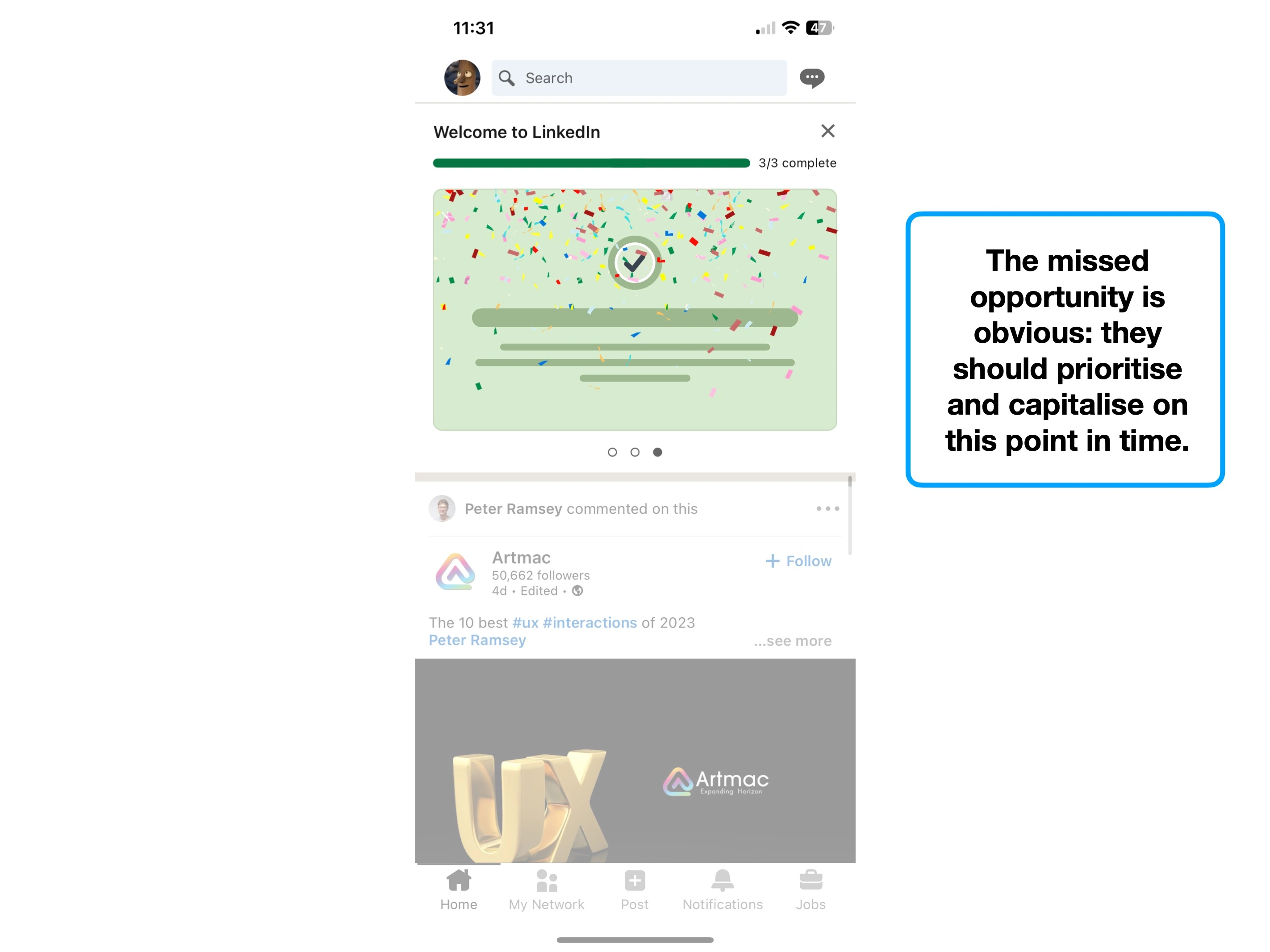
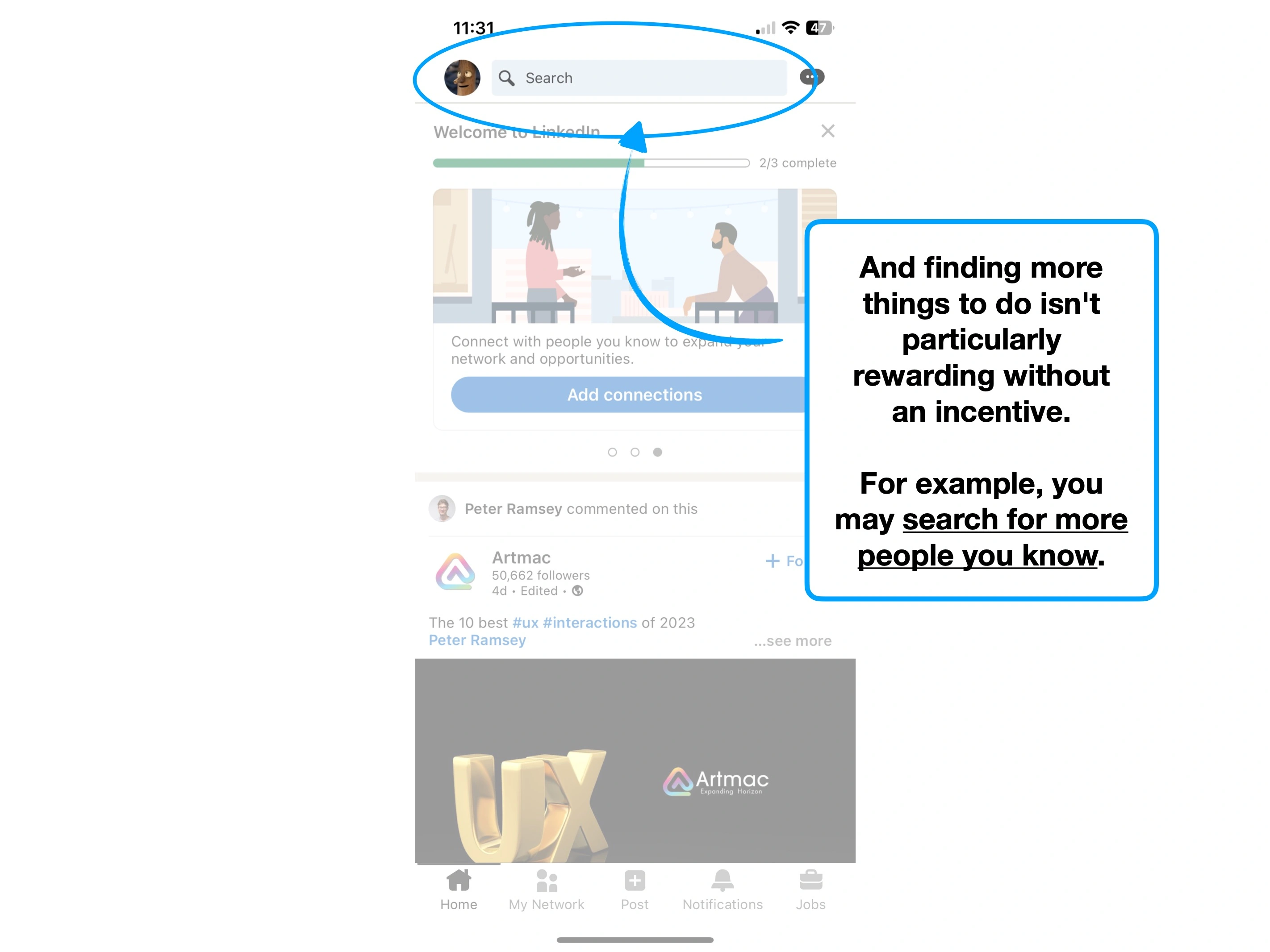
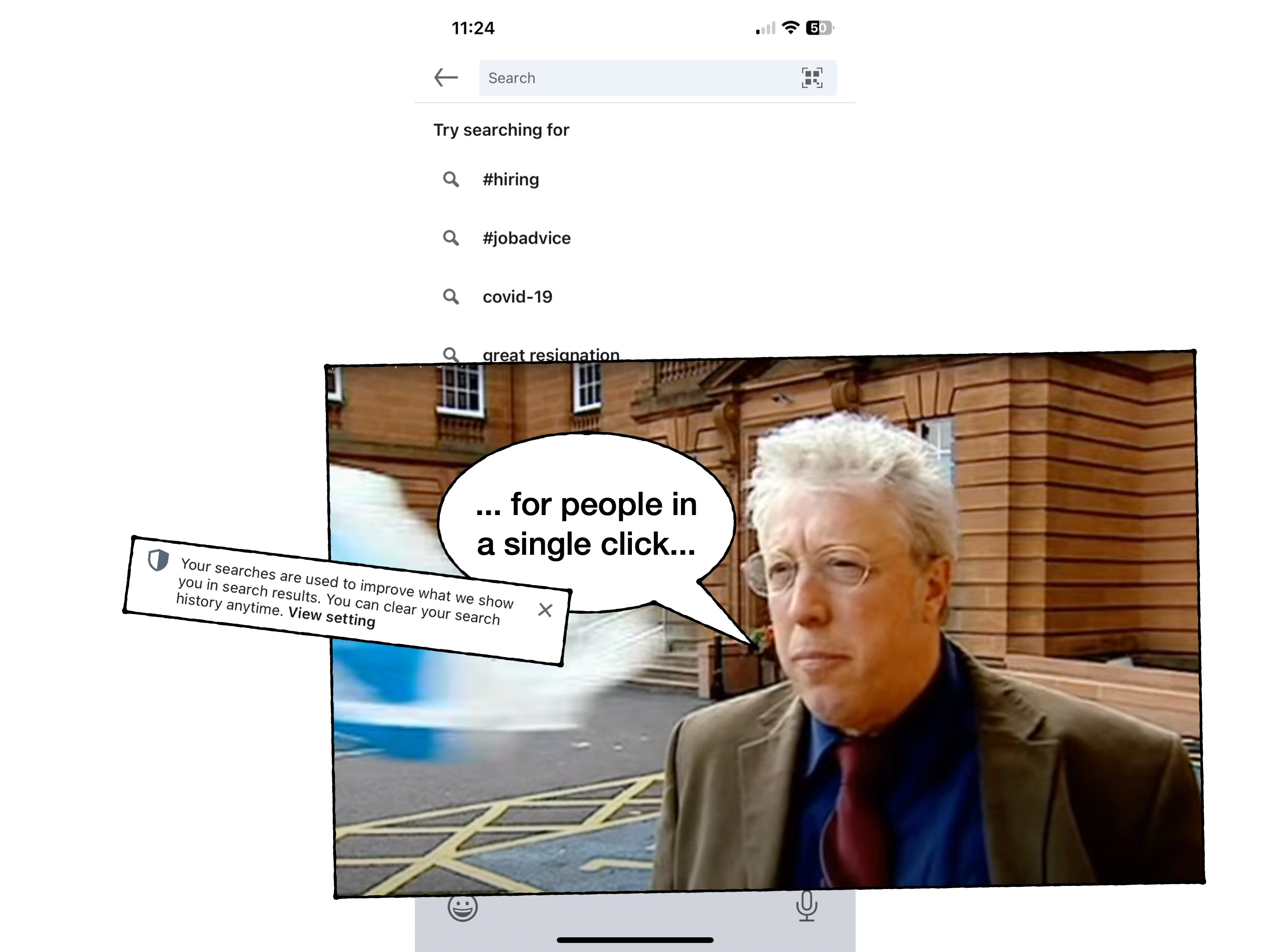
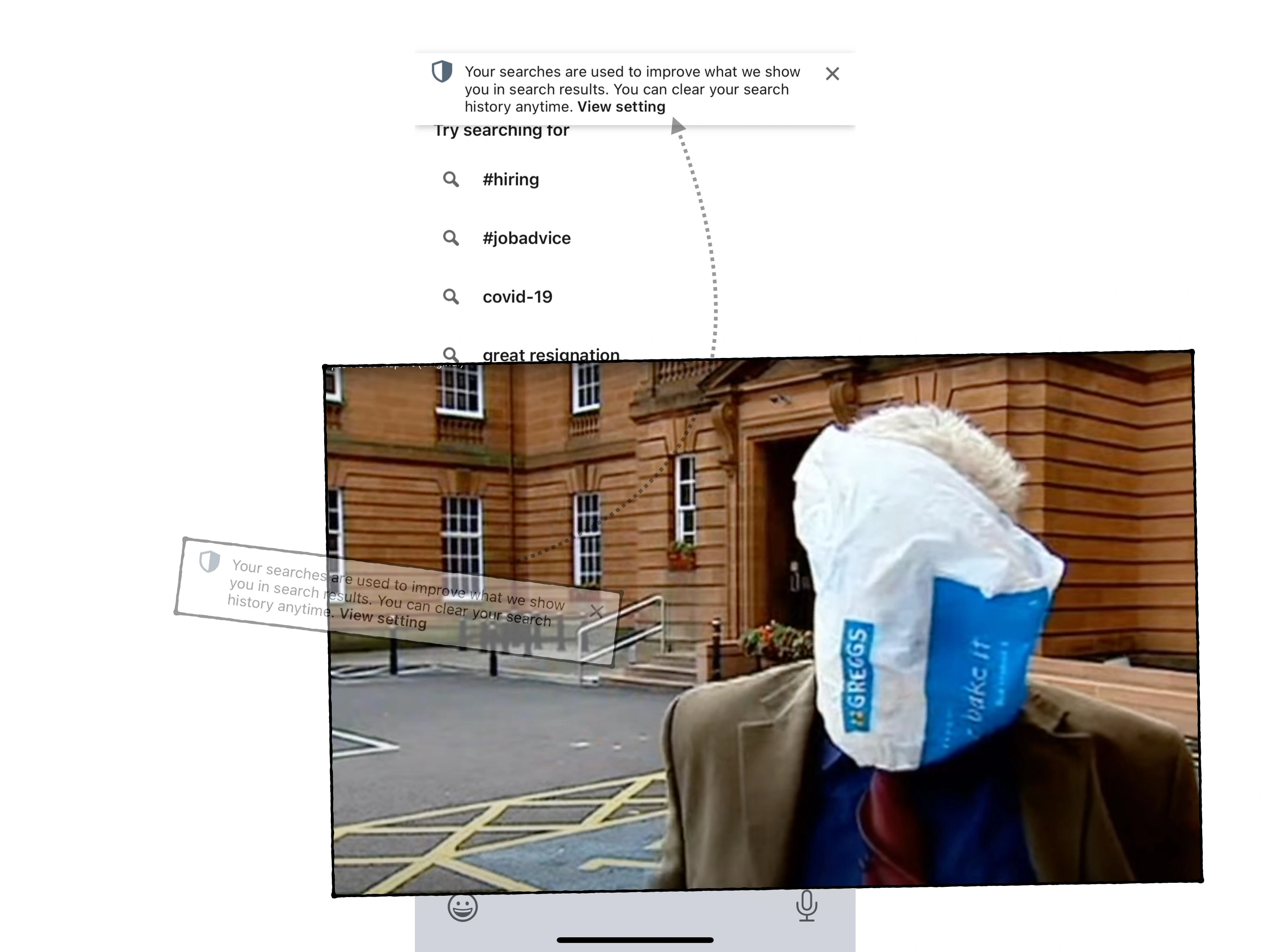
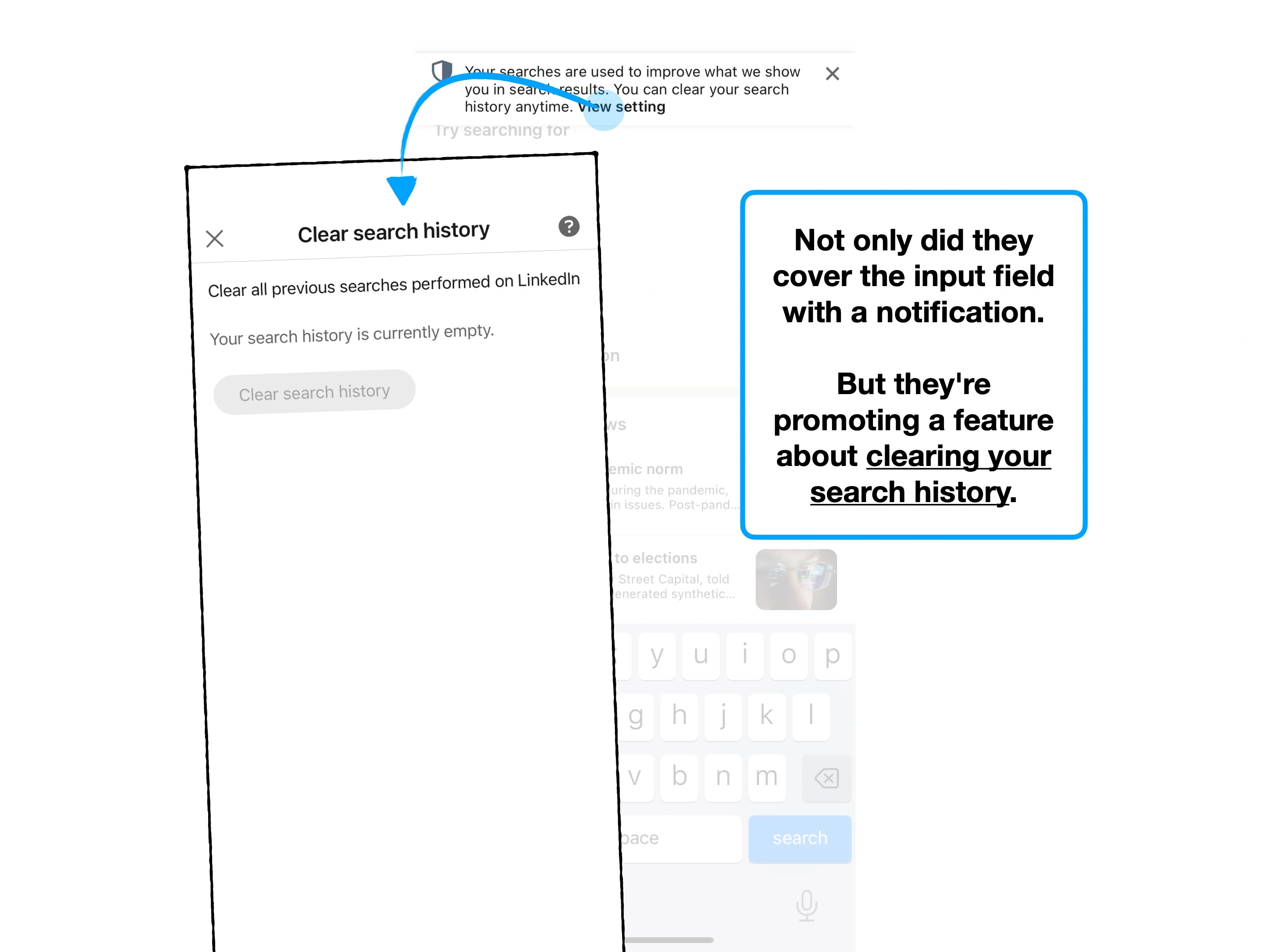
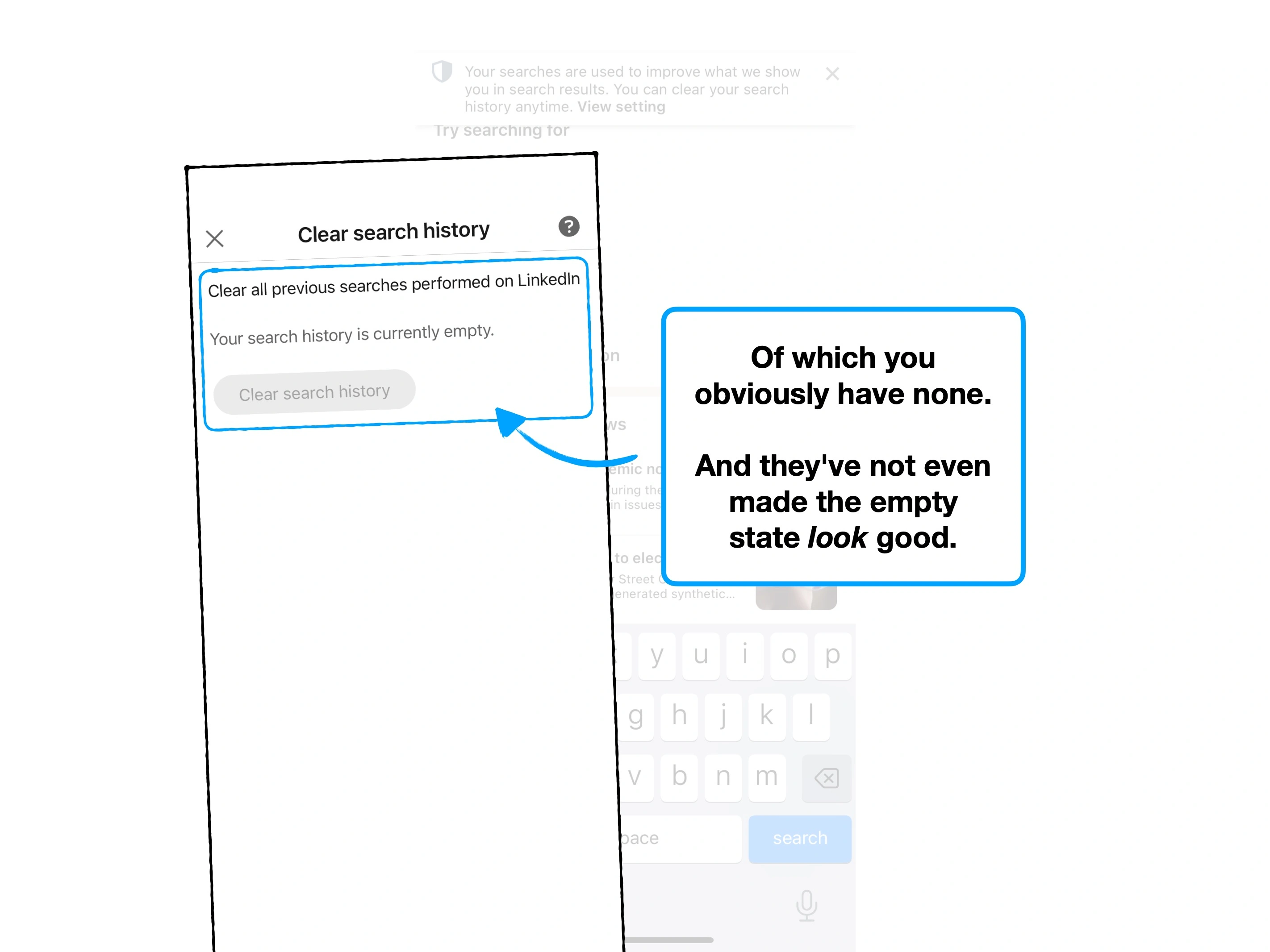
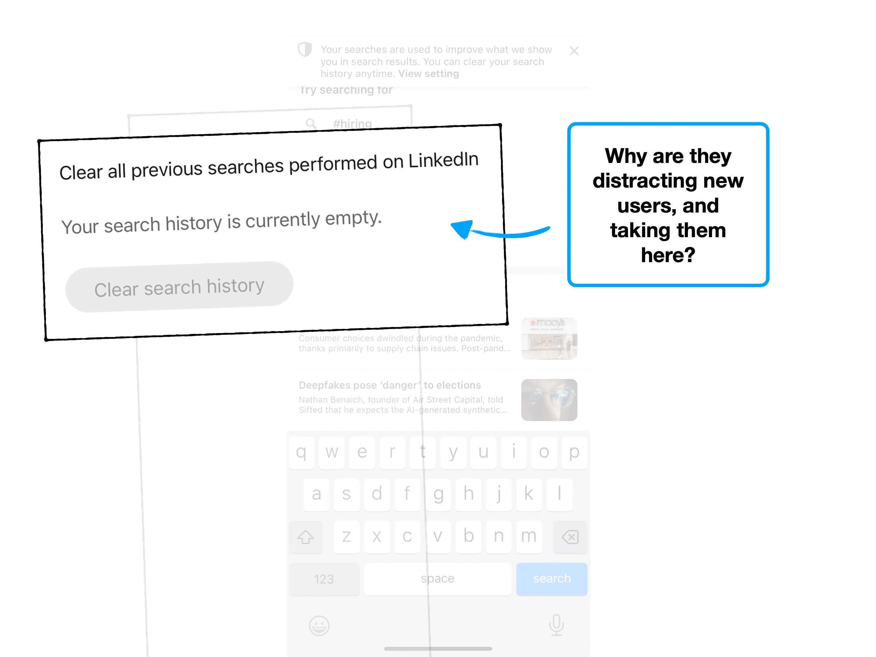
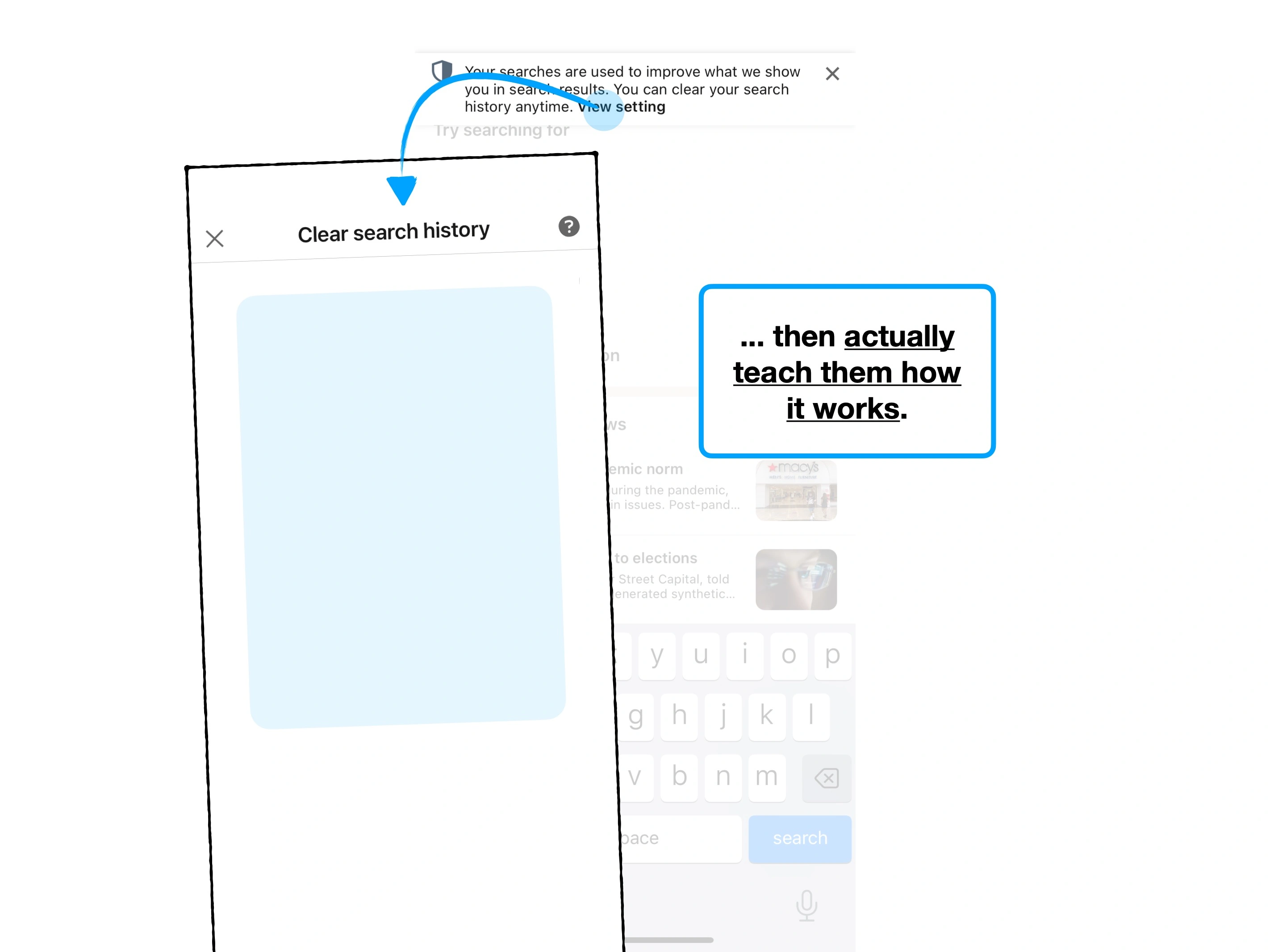
Just look at this: the first time you get a message on LinkedIn, you'll see a little red bubble. This will take you to an onboarding screen, which itself has a notification, that takes you to a settings page, that prompts you to learn more about a very specific archiving mechanic.
Click 1
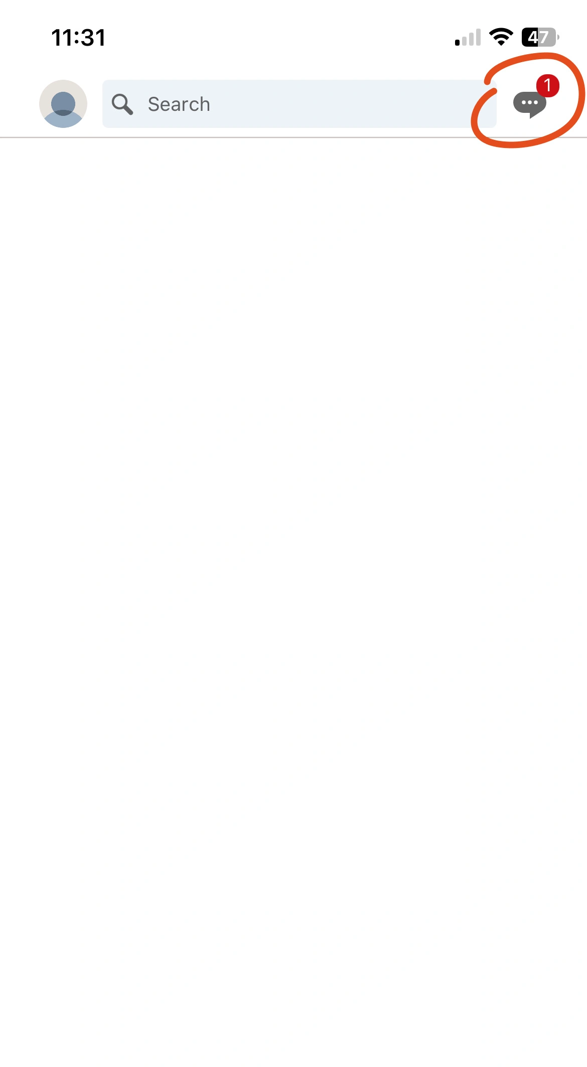
Click 2
Click 3
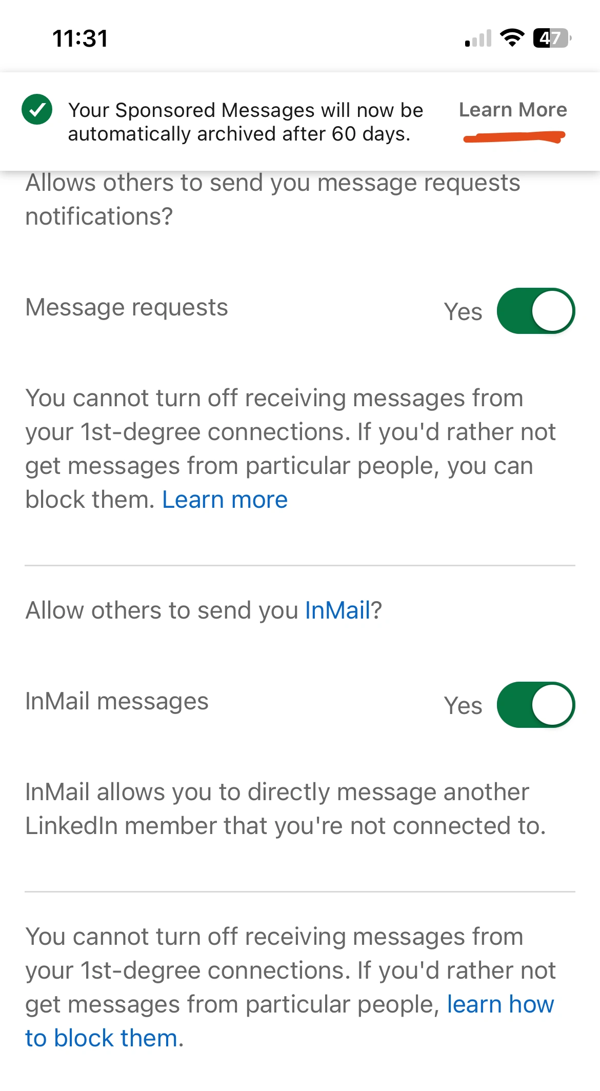
You've triggered multiple concepts, without any feasible way of digesting it all at once. Your attention has been redirected, multiple times.
And all you wanted to do was read a message.
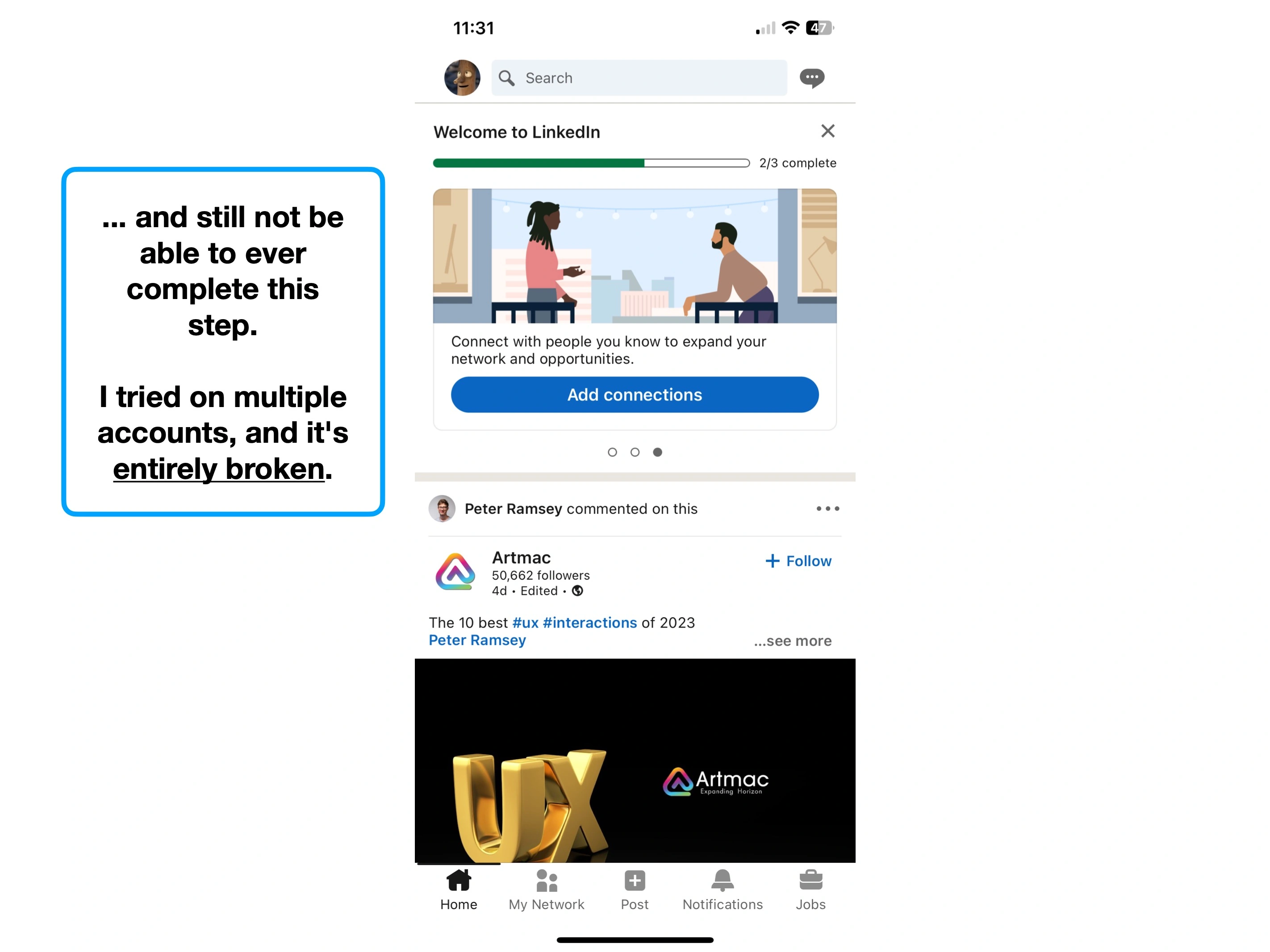
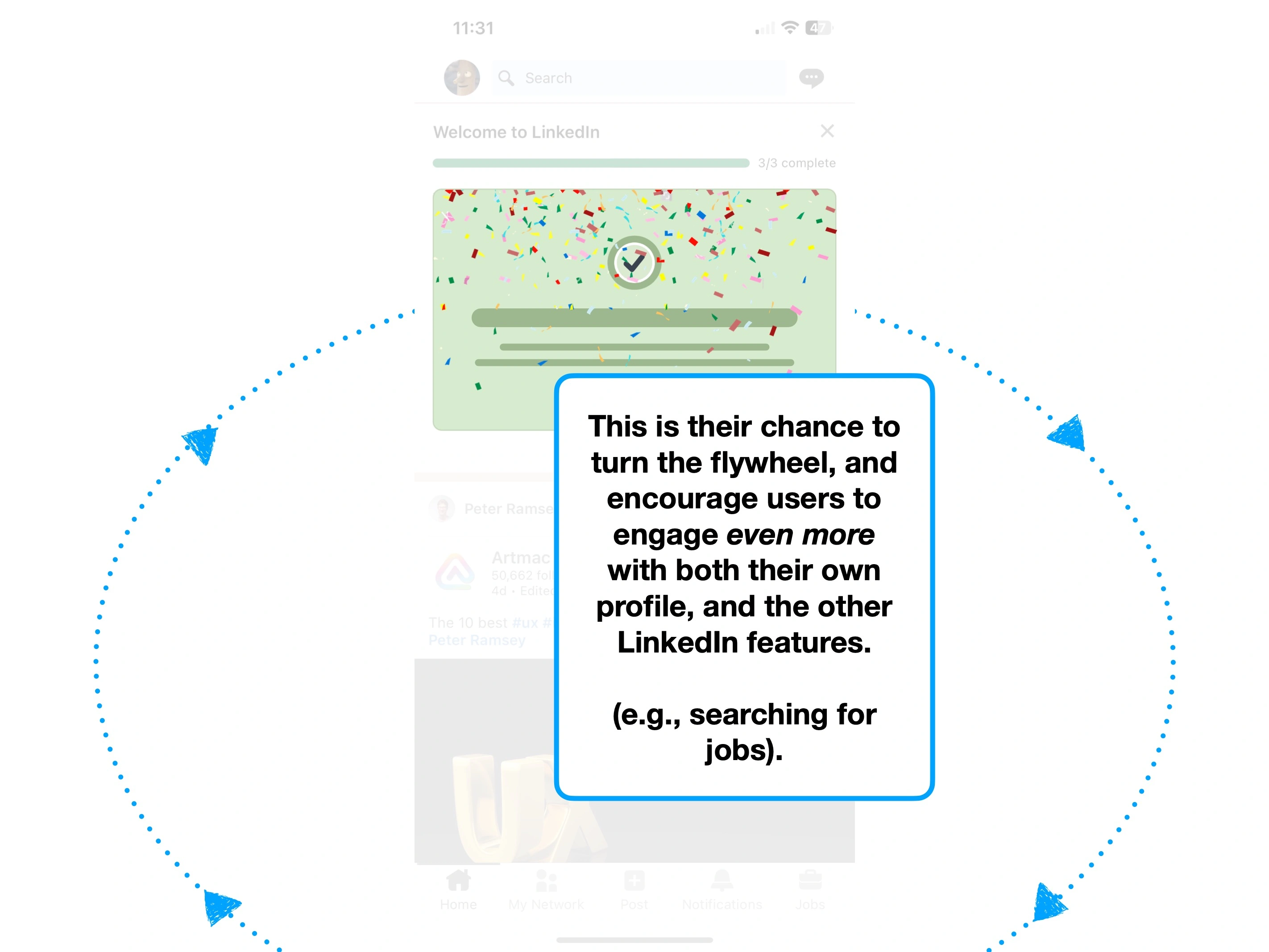
Importantly, if you do come back, that onboarding context won't appear again.
You've kicked a stone into a blueberry bush, and set off every bear trap at once.
For some teams it's plausible to identify and track everything—but that's incredibly rare.
Instead my recommendation is usually just to reduce the number of triggers that you have, occasionally by running a ↩️ Reverse Prototype.
You can't turn it off, but you can turn it down.
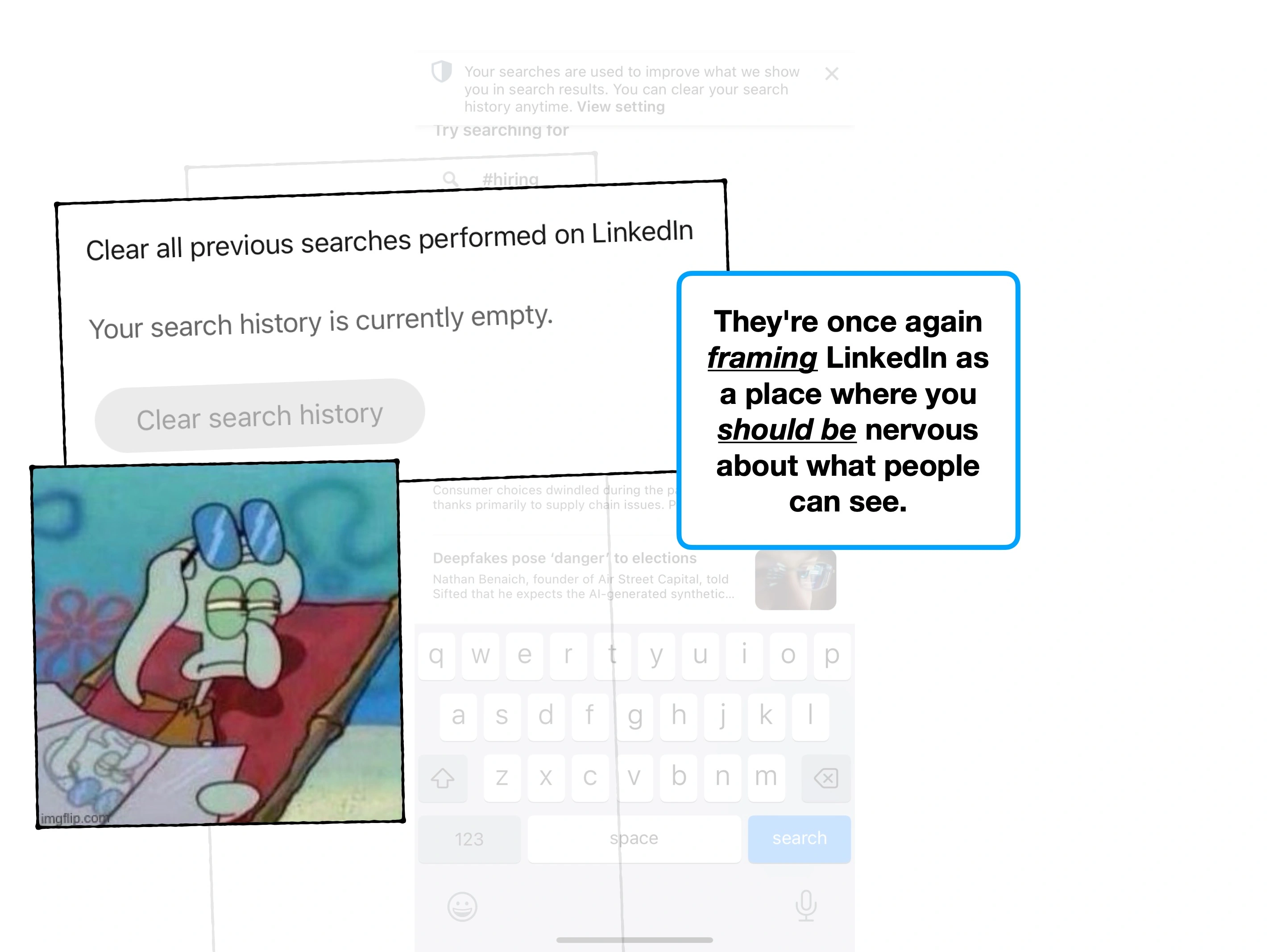
3. Accidental framing
Finally, let's look at another nuance to noise: 🖼 Framing.
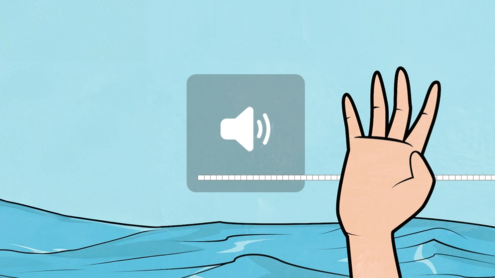
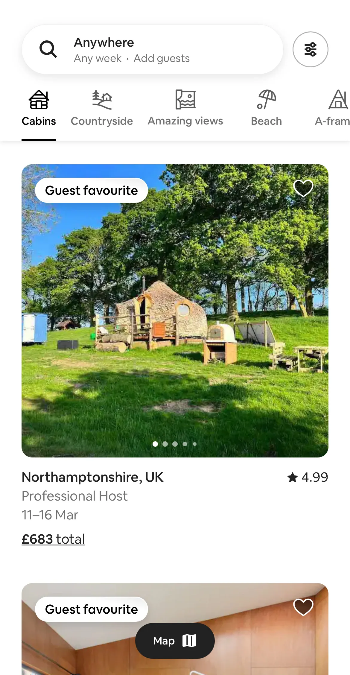
Imagine that you visit Airbnb for the first time, and there's an onboarding module promoting their new, ultra-safe, "Zero Deaths" policy.
How do you feel?
Original
Added noise
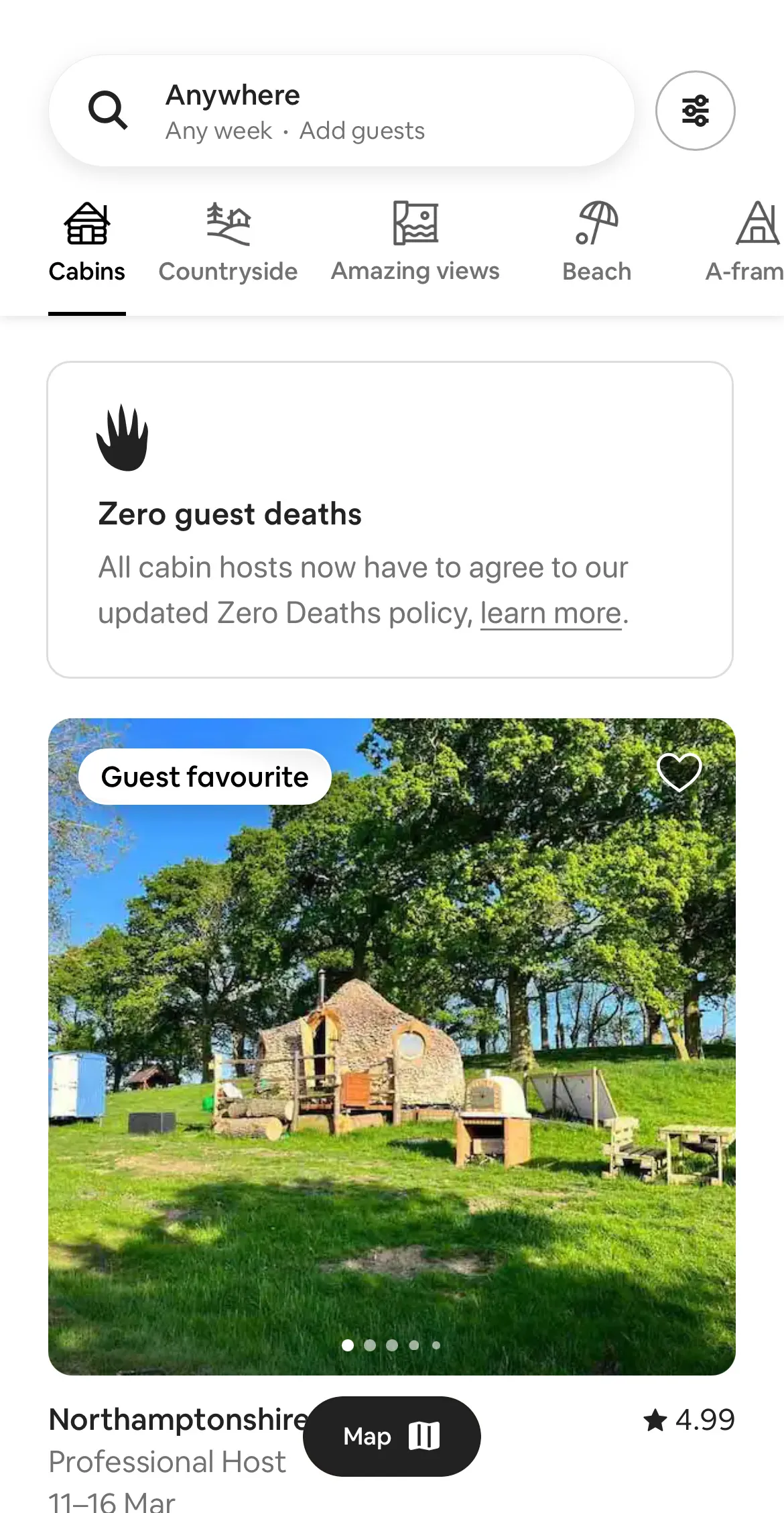
On face value, it should be reassuring, but it isn't.
The subtleties make this unnerving. From the choice of title and icon (the scary hand), the fact that it's for cabin hosts, and the wording; "all cabin hosts now have to...".
Your experience using Airbnb has been framed: you should be considering your own safety, and maybe a remote cabin in the woods is a bad idea.
The point is that onboarding, even if it's a dismissable tooltip, influences how people perceive your product.
Even the order of how features are disclosed to the user, can be influential.
And the danger, is that noise creates opportunities for framing.
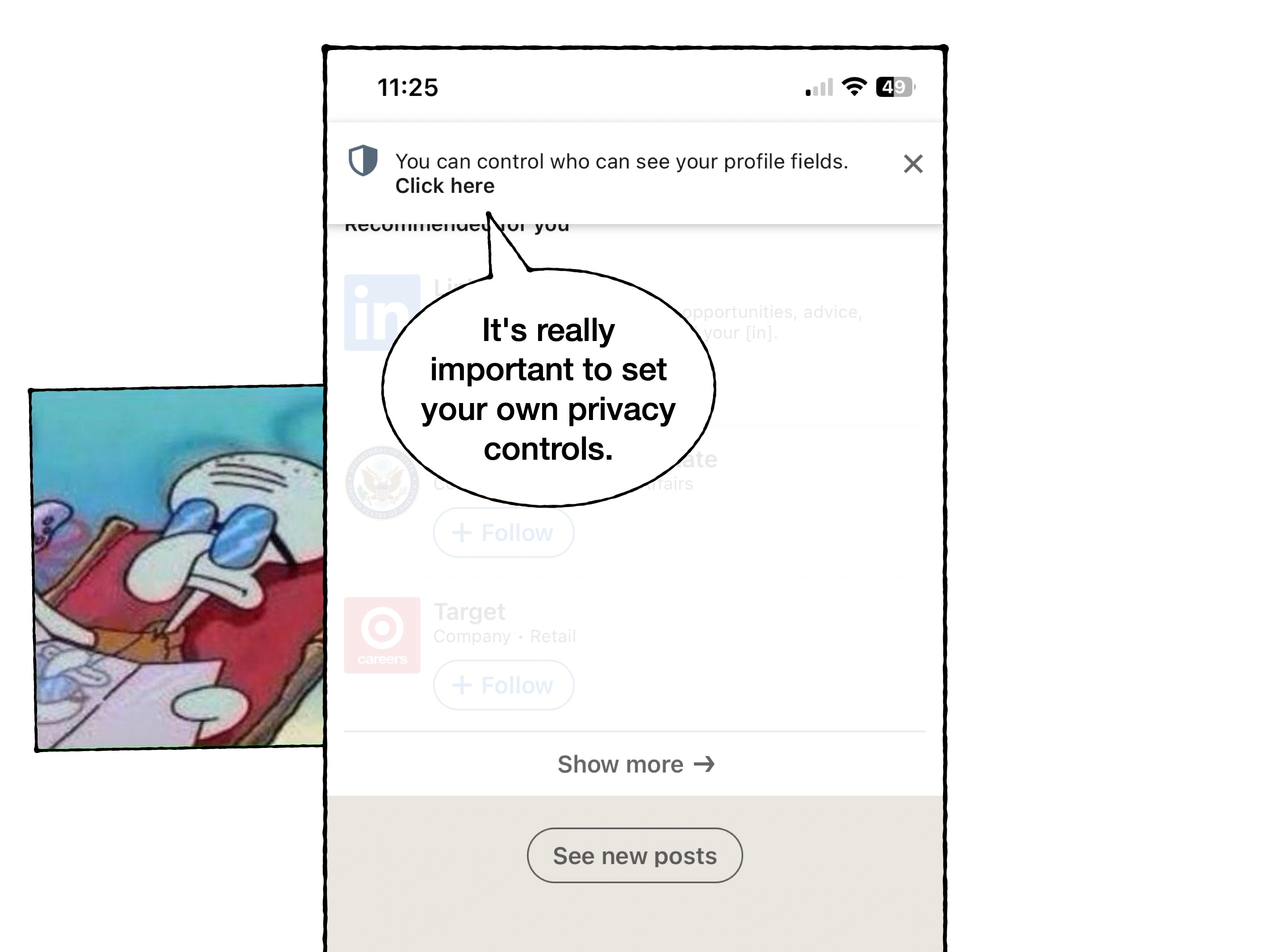
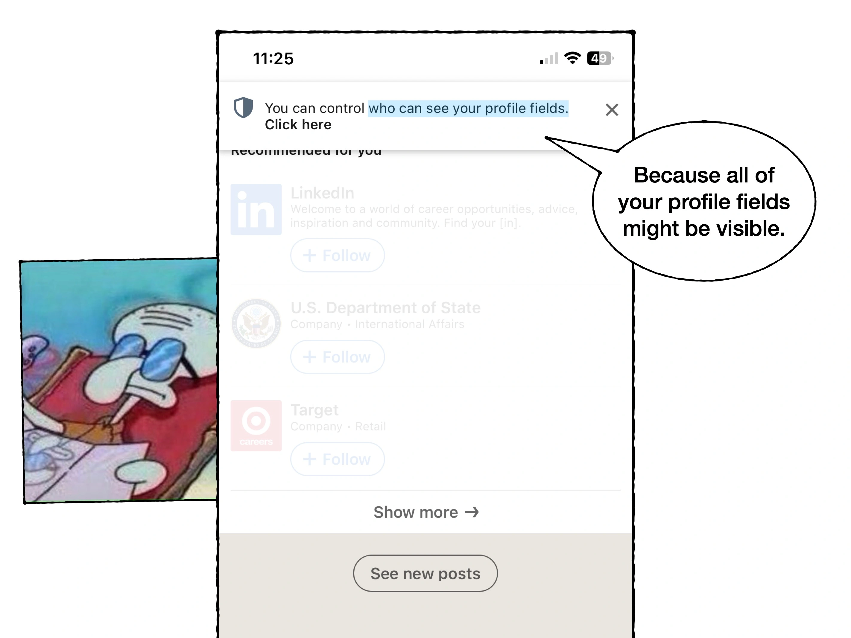
In the case study, I demonstrated how LinkedIn may be altering the willingness for new users to divulge information, with their notification prompts about privacy.
In an attempt to shout about a new feature, they've grabbed the microphone during a party and reminded their guests that the car park closes in an hour.
An observation on noise
I don't want to set unrealistic expectations: noise cannot be entirely removed—nor is that a sensible aspiration.
For example, I could easily reduce the noise on Google's homepage. But is this a more effective design?
Original
Reduced noise

It'd be an interesting A/B test (that they've probably already ran), but you'd likely find that without the smart suggestions, people make fewer searches.
Or, we could look at the Slack example from earlier—as a global enterprise tool, it'd be almost impossible for them to just remove features.
But, in an attempt to help users better triage the conversations happening around them, they are experimenting with a Tinder-style interface to reduce the ambient noise.
The truth is that most product teams are on a perpetual treadmill of shipping new features, and simply adjust to the level of ambient noise.
They'll add 3 or 5 onboarding slides after a splash screen, and "find things" to talk about.
They'll add some super basic tooltip onboarding, unnecessary rows to a Bento Grid, and take a 'newest first' approach to promoting features (i.e., regardless of what requires the most context).
If churn is high, they'll add more.
To be clear it's not usually incompetence. It's because we're all so accustomed to noise, we don't actively register it—we're just quietly burdened by it.
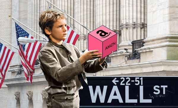
The secrets of a $7.08 welcome bonus
The product psychology behind why Robinhood offer new users $7.08 of free stock, and not $10.
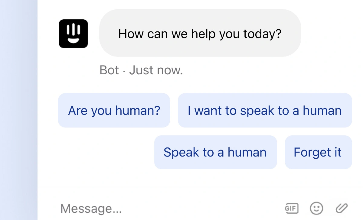
The (not so) subtle reason you hate chatbots
Virtual agents, decision trees and ChatGPT-powered conversations aren't exactly the future of customer service that we were promised.
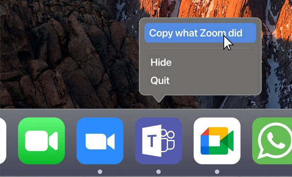
Which is better; Zoom, Teams or Meet?
Three video conferencing tools that are objectively very similar, but that often trigger a cult-like preference. But which has a better UX?