On the web, users are often looking for specific information. For this reason, they do not read every word on the page. Instead, they scan: they fixate their attention on summaries, bullet points, visuals, and bolded text, aiming to quickly locate what they are looking for. Formatting techniques that break up walls of text not only increase scannability but also help readers traverse content efficiently and effectively by drawing their attention to critical information.
Our Research
We recently conducted a usability-testing study to identify techniques that help users consume long-form content—that is, content that exceeds 1,000 words. During each session, participants were asked to perform realistic tasks on either a laptop or mobile device. The following insights emerged from the study.
Thoughtful Planning and Editing Comes First
Delivering valuable content starts with understanding who will consume it and what their goals are. Content developed without thoughtful consideration is often unnecessarily long. When planning new content, think about what people are looking for.
Before jumping into formatting, assess your content to see if it can be refined, reduced, or rewritten. Users appreciate brevity and plain language, hence avoid long-winded sentences to sound sophisticated. Paring down unnecessary details decreases page length and makes your content more compelling.
As you start to edit your content, the following questions can guide you:
- Is the content essential?
- Does the content have a proper level of granularity?
- Can the content be condensed?
- Can the content be rephrased to be more simple or clear?
Basic Structuring Strategies
Formatting and structuring go hand in hand in content planning. While formatting ensures that content is predictable and easy to scan, structuring involves defining an organizational strategy to deliver the content effectively. Strategically structure your content before applying formatting to make sure that it is logical and coherent.
A good content structure helps users form a mental model of the page and navigate it efficiently. The following are some common strategies for structuring content:
- Provide a helpful overview: Allow users to get a sense of the page offering without delving into details by providing them with a table of contents for the page.
- Create content chunks: Break down the content body into digestible sections to support scanning.
- Layer content and disclose information progressively: Allow users to access the first level of the content and disclose the rest upon request (for instance, by using accordions).
- Offer direct access to specific sections: Use in-page links to allow users to skip irrelevant sections and jump to the content of interest.
Five Content-Formatting Techniques
Formatting comes into play after a clear content structure is defined. Our research indicates that the following formatting techniques help users to efficiently navigate and consume long-form content.

Summary
A summary is supposed to communicate the key points of a piece of content.
The purpose of a summary is to help users:
- Decide if they are interested in the content
- Get the gist of your information without reading through all the details
Summaries should be concise and to the point. If your piece has several major takeaways, use a bulleted list to make them scannable and easy to consume.
Your summary section should be easy to distinguish from the rest of the body text. A descriptive heading (e.g., Summary and Key Takeaways) and a distinct visual treatment (such as borders and shading) can draw attention to the summary.
Summaries can have different granularity levels. Even though they most often provide an overview of the entire article, some long-form content can benefit from summaries for each article section.

Summary Placement
The placement of a summary within the article is a critical consideration. A summary can help users in different ways depending on where they are placed within your piece.
At the beginning. A summary at the beginning of the article helps readers quickly determine if the article is relevant to them. Additionally, providing a summary right away gives users a roadmap, informing them of what is to come. This roadmap directs the reader to specific information that they are looking for, and, if the reader plans to read the entire article, it gives them a way to anticipate key points and main arguments.

Throughout the article. Some long articles have summaries for each individual section. These summaries are usually placed at the end of that section to help with scannability and comprehension.
These summaries serve as convenient checkpoints for readers and are particularly valuable for those who are skimming or looking for specific information. They provide a succinct overview of the material covered in that section, allowing readers to quickly gauge the content's high-level points without delving into every detail. Midpoint summaries break the content down into digestible portions, making it easier for readers to identify sections of interest and navigate through the article quickly.
Midpoint summaries also reignite users' interest and help them grasp the key points. As readers progress through an especially long piece, fatigue can set in. Summaries throughout the article serve as brief recaps that direct readers back on track, helping them to leave with a solid understanding of the content.

At the end. A summary at the end of an article offers readers a conclusion, while also reinforcing key points. However, final summaries have low discoverability, as users do not always reach this point before leaving the page.

Bold and Highlight
Bolding and highlighting should be used to call attention to critical information.

Use bolding and highlighting selectively and sparingly. The highlighted text should make up no more than 30% of an article’s text. Highlight or bold only those text fragments capturing the most important points of your article. Do not bold just to strengthen your tone, as it can slow down scanning and cause confusion.
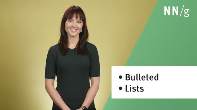
Bullet Points
Bullet points are one of the most common text-formatting techniques on the web.
They support scanning, emphasize key points, and reveal relationships among items. Bullet points can be paired with in-page links to serve as a table of contents for the page.
Bullets stand out and attract attention. When Items in a bulleted list are properly formatted, they are easily perceived as a group due to the human eye’s innate tendency to follow lines and curves on a path. During our study, users commented positively on the usage of bullets on the web. One participant said, I'm a proponent of bullet points. … Although I appreciate good English written well, bullet points are great because they're succinct and I can see what I want to know. I know when a new topic is being introduced right away and it's just easier to follow.
Bullets are a powerful formatting device only if used properly. When the content presented in each bullet point is lengthy, it can still result in an undesirable wall of text.
For example, on a web page about the 2023 NBA Draft, each bullet was followed by a stand-alone paragraph with no further formatting. One study participant looking for information about Victor Wembanyama was not able to find it, even though it was visible on the screen in the fifth bullet. The lengthy, unformatted text in the bullets prevented him from scanning efficiently.

Bullet points are most useful when the content is concise and easy to understand. If the content in each bullet is long (like in the NBA example shown above), incorporate additional formatting such as bolding.

Callouts
A callout refers to a paragraph that is formatted to stand out from the rest of the body text. Callouts leverage visual weight to attract readers’ attention. Indeed, in our study, participants were more likely to notice callout text, whether it highlighted a statistic, a thought-provoking quote, an example, or a definition.

Visuals
Visuals are not just for decoration: they often add information value to a content piece. They are also a formatting tool, as they break up walls of text and diversify the content layout, allowing eyes to rest from reading.
This section will discuss two types of visuals: informational visuals and decorative visuals. Informational visuals (e.g., product photos, infographics) bring value to an article and users will spend time looking at them. In contrast, purely decorative visuals do not communicate useful information. They are often used to create visual interest but can unnecessarily lengthen the page.
Informational Visuals
Informational visuals aid comprehension and increase readers’ interest when they land on the page.
Thoughtful informational visuals can simplify complex concepts and make abstract information tangible, providing context that words alone might struggle to convey. One participant in our study stated, I need an example, I need a picture. I’m a person who always needs a picture for everything.
In some cases, participants chose to share the informational visual, rather than a link to the entire article. Beyond helping with comprehension, these visuals can also make the content interesting, digestible, and approachable.

Decorative Visuals
Decorative visuals don’t necessarily provide informational value to the page, but they can create ambiance and express brand identity. In our research, some participants appreciated the added visual interest that helped them keep their attention during reading.
Despite these occasional benefits of decorative images, countless studies show that people tend to dodge decorative images because they do not deliver information and lengthen the page, especially on mobile. For this reason, the use of purely decorative images should be kept at a minimum, to avoid disrupting the discoverability or the scannability of the other content.
In addition, decorative graphics that don’t match the tone and voice of the page are distracting and receive negative feedback in our study.
When considering adding visuals to your content, instead of using generic meaningless imagery, consider images with informational value that are relevant and appropriate to the context.

Conclusion
Reading is the primary action people perform online, but people strive to read as little as possible. They rely on scanning instead. Scanning must be supported through thoughtful editing, strategic structuring, and effective formatting of long-form content. Use the 5 formatting tactics discussed in this article—summaries, bold and highlight, bullet points, callouts, and visuals—to break down your content and create a dynamic and engaging reading experience.